Answering Common Questions About Interpreting Page Speed Reports
This article has been kindly supported by our dear friends at DebugBear, who help optimize web performance to improve user experience. Thank you!
Running a performance check on your site isn’t too terribly difficult. It may even be something you do regularly with Lighthouse in Chrome DevTools, where testing is freely available and produces a very attractive-looking report.

Lighthouse is only one performance auditing tool out of many. The convenience of having it tucked into Chrome DevTools is what makes it an easy go-to for many developers.
But do you know how Lighthouse calculates performance metrics like First Contentful Paint (FCP), Total Blocking Time (TBT), and Cumulative Layout Shift (CLS)? There’s a handy calculator linked up in the report summary that lets you adjust performance values to see how they impact the overall score. Still, there’s nothing in there to tell us about the data Lighthouse is using to evaluate metrics. The linked-up explainer provides more details, from how scores are weighted to why scores may fluctuate between test runs.
Why do we need Lighthouse at all when Google also offers similar reports in PageSpeed Insights (PSI)? The truth is that the two tools were fairly distinct until PSI was updated in 2018 to use Lighthouse reporting.

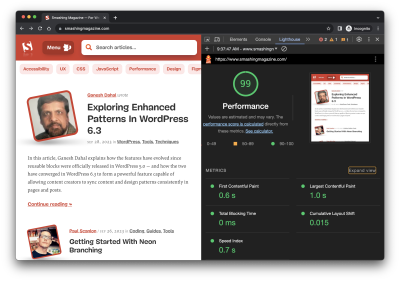
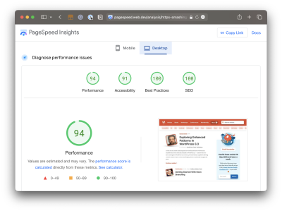
Did you notice that the Performance score in Lighthouse is different from that PSI screenshot? How can one report result in a near-perfect score while the other appears to find more reasons to lower the score? Shouldn’t they be the same if both reports rely on the same underlying tooling to generate scores?
That’s what this article is about. Different tools make different assumptions using different data, whether we are talking about Lighthouse, PageSpeed Insights, or commercial services like DebugBear. That’s what accounts for different results. But there are more specific reasons for the divergence.
Let’s dig into those by answering a set of common questions that pop up during performance audits.
What Does It Mean When PageSpeed Insights Says It Uses “Real-User Experience Data”?
This is a great question because it provides a lot of context for why it’s possible to get varying results from different performance auditing tools. In fact, when we say “real user data,” we’re really referring to two different types of data. And when discussing the two types of data, we’re actually talking about what is called real-user monitoring, or RUM for short.
Type 1: Chrome User Experience Report (CrUX)
What PSI means by “real-user experience data” is that it evaluates the performance data used to measure the core web vitals from your tests against the core web vitals data of actual real-life users. That real-life data is pulled from the Chrome User Experience (CrUX) report, a set of anonymized data collected from Chrome users — at least those who have consented to share data.
CrUX data is important because it is how web core vitals are measured, which, in turn, are a ranking factor for Google’s search results. Google focuses on the 75th percentile of users in the CrUX data when reporting core web vitals metrics. This way, the data represents a vast majority of users while minimizing the possibility of outlier experiences.
But it comes with caveats. For example, the data is pretty slow to update, refreshing every 28 days, meaning it is not the same as real-time monitoring. At the same time, if you plan on using the data yourself, you may find yourself limited to reporting within that floating 28-day range unless you make use of the CrUX History API or BigQuery to produce historical results you can measure against. CrUX is what fuels PSI and Google Search Console, but it is also available in other tools you may already use.
Barry Pollard, a web performance developer advocate for Chrome, wrote an excellent primer on the CrUX Report for Smashing Magazine.
Type 2: Full Real-User Monitoring (RUM)
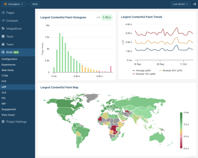
If CrUX offers one flavor of real-user data, then we can consider “full real-user data” to be another flavor that provides even more in the way individual experiences, such as specific network requests made by the page. This data is distinct from CrUX because it’s collected directly by the website owner by installing an analytics snippet on their website.
Unlike CrUX data, full RUM pulls data from other users using other browsers in addition to Chrome and does so on a continual basis. That means there’s no waiting 28 days for a fresh set of data to see the impact of any changes made to a site.
You can see how you might wind up with different results in performance tests simply by the type of real-user monitoring (RUM) that is in use. Both types are useful, but
“
Does Lighthouse Use RUM Data, Too?
It does not! It uses synthetic data, or what we commonly call lab data. And, just like RUM, we can explain the concept of lab data by breaking it up into two different types.
Type 1: Observed Data
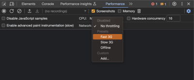
Observed data is performance as the browser sees it. So, instead monitoring real information collected from real users, observed data is more like defining the test conditions ourselves. For example, we could add throttling to the test environment to enforce an artificial condition where the test opens the page on a slower connection. You might think of it like racing a car in virtual reality, where the conditions are decided in advance, rather than racing on a live track where conditions may vary.

Type 2: Simulated Data
While we called that last type of data “observed data,” that is not an official industry term or anything. It’s more of a necessary label to help distinguish it from simulated data, which describes how Lighthouse (and many other tools that include Lighthouse in its feature set, such as PSI) applies throttling to a test environment and the results it produces.
The reason for the distinction is that there are different ways to throttle a network for testing. Simulated throttling starts by collecting data on a fast internet connection, then estimates how quickly the page would have loaded on a different connection. The result is a much faster test than it would be to apply throttling before collecting information. Lighthouse can often grab the results and calculate its estimates faster than the time it would take to gather the information and parse it on an artificially slower connection.
Simulated And Observed Data In Lighthouse
Simulated data is the data that Lighthouse uses by default for performance reporting. It’s also what PageSpeed Insights uses since it is powered by Lighthouse under the hood, although PageSpeed Insights also relies on real-user experience data from the CrUX report.
However, it is also possible to collect observed data with Lighthouse. This data is more reliable since it doesn’t depend on an incomplete simulation of Chrome internals and the network stack. The accuracy of observed data depends on how the test environment is set up. If throttling is applied at the operating system level, then the metrics match what a real user with those network conditions would experience. DevTools throttling is easier to set up, but doesn’t accurately reflect how server connections work on the network.
Limitations Of Lab Data
Lab data is fundamentally limited by the fact that it only looks at a single experience in a pre-defined environment. This environment often doesn’t even match the average real user on the website, who may have a faster network connection or a slower CPU. Continuous real-user monitoring can actually tell you how users are experiencing your website and whether it’s fast enough.
So why use lab data at all?
“
Google CrUX data only reports metric values with no debug data telling you how to improve your metrics. In contrast, lab reports contain a lot of analysis and recommendations on how to improve your page speed.
Why Is My Lighthouse LCP Score Worse Than The Real User Data?
It’s a little easier to explain different scores now that we’re familiar with the different types of data used by performance auditing tools. We now know that Google reports on the 75th percentile of real users when reporting web core vitals, which includes LCP.
“By using the 75th percentile, we know that most visits to the site (3 of 4) experienced the target level of performance or better. Additionally, the 75th percentile value is less likely to be affected by outliers. Returning to our example, for a site with 100 visits, 25 of those visits would need to report large outlier samples for the value at the 75th percentile to be affected by outliers. While 25 of 100 samples being outliers is possible, it is much less likely than for the 95th percentile case.”
— Brian McQuade
On the flip side, simulated data from Lighthouse neither reports on real users nor accounts for outlier experiences in the same way that CrUX does. So, if we were to set heavy throttling on the CPU or network of a test environment in Lighthouse, we’re actually embracing outlier experiences that CrUX might otherwise toss out. Because Lighthouse applies heavy throttling by default, the result is that we get a worse LCP score in Lighthouse than we do PSI simply because Lighthouse’s data effectively looks at a slow outlier experience.
Why Is My Lighthouse CLS Score Better Than The Real User Data?
Just so we’re on the same page, Cumulative Layout Shift (CLS) measures the “visible stability” of a page layout. If you’ve ever visited a page, scrolled down it a bit before the page has fully loaded, and then noticed that your place on the page shifts when the page load is complete, then you know exactly what CLS is and how it feels.
The nuance here has to do with page interactions. We know that real users are capable of interacting with a page even before it has fully loaded. This is a big deal when measuring CLS because layout shifts often occur lower on the page after a user has scrolled down the page. CrUX data is ideal here because it’s based on real users who would do such a thing and bear the worst effects of CLS.
Lighthouse’s simulated data, meanwhile, does no such thing. It waits patiently for the full page load and never interacts with parts of the page. It doesn’t scroll, click, tap, hover, or interact in any way.
This is why you’re more likely to receive a lower CLS score in a PSI report than you’d get in Lighthouse. It’s not that PSI likes you less, but that the real users in its report are a better reflection of how users interact with a page and are more likely to experience CLS than simulated lab data.
Why Is Interaction to Next Paint Missing In My Lighthouse Report?
This is another case where it’s helpful to know the different types of data used in different tools and how that data interacts — or not — with the page. That’s because the Interaction to Next Paint (INP) metric is all about interactions. It’s right there in the name!
The fact that Lighthouse’s simulated lab data does not interact with the page is a dealbreaker for an INP report. INP is a measure of the latency for all interactions on a given page, where the highest latency — or close to it — informs the final score. For example, if a user clicks on an accordion panel and it takes longer for the content in the panel to render than any other interaction on the page, that is what gets used to evaluate INP.
So, when INP becomes an official core web vitals metric in March 2024, and you notice that it’s not showing up in your Lighthouse report, you’ll know exactly why it isn’t there.
Note: It is possible to script user flows with Lighthouse, including in DevTools. But that probably goes too deep for this article.
Why Is My Time To First Byte Score Worse For Real Users?
The Time to First Byte (TTFB) is what immediately comes to mind for many of us when thinking about page speed performance. We’re talking about the time between establishing a server connection and receiving the first byte of data to render a page.

TTFB identifies how fast or slow a web server is to respond to requests. What makes it special in the context of core web vitals — even though it is not considered a core web vital itself — is that it precedes all other metrics. The web server needs to establish a connection in order to receive the first byte of data and render everything else that core web vitals metrics measure. TTFB is essentially an indication of how fast users can navigate, and core web vitals can’t happen without it.
You might already see where this is going. When we start talking about server connections, there are going to be differences between the way that RUM data observes the TTFB versus how lab data approaches it. As a result, we’re bound to get different scores based on which performance tools we’re using and in which environment they are. As such, TTFB is more of a “rough guide,” as Jeremy Wagner and Barry Pollard explain:
“Websites vary in how they deliver content. A low TTFB is crucial for getting markup out to the client as soon as possible. However, if a website delivers the initial markup quickly, but that markup then requires JavaScript to populate it with meaningful content […], then achieving the lowest possible TTFB is especially important so that the client-rendering of markup can occur sooner. […] This is why the TTFB thresholds are a “rough guide” and will need to be weighed against how your site delivers its core content.”
— Jeremy Wagner and Barry Pollard
So, if your TTFB score comes in higher when using a tool that relies on RUM data than the score you receive from Lighthouse’s lab data, it’s probably because of caches being hit when testing a particular page. Or perhaps the real user is coming in from a shortened URL that redirects them before connecting to the server. It’s even possible that a real user is connecting from a place that is really far from your web server, which takes a little extra time, particularly if you’re not using a CDN or running edge functions. It really depends on both the user and how you serve data.
Why Do Different Tools Report Different Core Web Vitals? What Values Are Correct?
This article has already introduced some of the nuances involved when collecting web vitals data. Different tools and data sources often report different metric values. So which ones can you trust?
When working with lab data, I suggest preferring observed data over simulated data. But you’ll see differences even between tools that all deliver high-quality data. That’s because no two tests are the same, with different test locations, CPU speeds, or Chrome versions. There’s no one right value. Instead, you can use the lab data to identify optimizations and see how your website changes over time when tested in a consistent environment.
Ultimately, what you want to look at is how real users experience your website. From an SEO standpoint, the 28-day Google CrUX data is the gold standard. However, it won’t be accurate if you’ve rolled out performance improvements over the last few weeks. Google also doesn’t report CrUX data for some high-traffic pages because the visitors may not be logged in to their Google profile.
Installing a custom RUM solution on your website can solve that issue, but the numbers won’t match CrUX exactly. That’s because visitors using browsers other than Chrome are now included, as are users with Chrome analytics reporting disabled.
Finally, while Google focuses on the fastest 75% of experiences, that doesn’t mean the 75th percentile is the correct number to look at. Even with good core web vitals, 25% of visitors may still have a slow experience on your website.
Wrapping Up
This has been a close look at how different performance tools audit and report on performance metrics, such as core web vitals. Different tools rely on different types of data that are capable of producing different results when measuring different performance metrics.
So, if you find yourself with a CLS score in Lighthouse that is far lower than what you get in PSI or DebugBear, go with the Lighthouse report because it makes you look better to the big boss. Just kidding! That difference is a big clue that the data between the two tools is uneven, and you can use that information to help diagnose and fix performance issues.

Are you looking for a tool to track lab data, Google CrUX data, and full real-user monitoring data? DebugBear helps you keep track of all three types of data in one place and optimize your page speed where it counts.

