Easy SVG Customization And Animation: A Practical Guide

Email Newsletter
Weekly tips on front-end & UX.
Trusted by 200,000+ folks.


 Flexible CMS. Headless & API 1st
 Register!

Scalable Vector Graphics (SVG) have been a staple in Web Development for quite some time, and for a good reason. They can be scaled up or down without loss of quality due to their vector properties. They can be compressed and optimized due to the XML format. They can also be easily edited, styled, animated, and changed programmatically.
At the end of the day, SVG is a markup language. And just as we can use CSS and JavaScript to enhance our HTML, we can use them the same on SVGs. We could add character and flourishes to our graphic elements, add interactions, and shape truly delightful and memorable user experiences. This optional but crucial detail is often overlooked when building projects, so SVGs end up somewhat underutilized beyond their basic graphical use cases.
How can we even utilize SVGs beyond just using them statically in our projects?
Take the “The State of CSS 2021” landing page, for example. This SVG Logo has been beautifully designed and animated by Christopher Kirk-Nielsen. Although this logo would have looked alright just as a static image, it wouldn’t have had as much of an impact and drawn attention without this intricate animation.
Let’s go even further — SVG, HTML, CSS, and JavaScript can be combined and used to create delightful, interactive, and stunning projects. Check out Sarah Drasner’s incredible work. She has also written a book and has a video course on the topic.
See the Pen [Vue Time Comparison [forked]](https://codepen.io/smashingmag/pen/ExpENmo) by Sarah Drasner.
Developers often feel discouraged to play around with SVG animations, either because of time constraints, or they believe that they need to master design, SVG markup, and one of many complex JavaScript-based animation libraries, or because of some other reason.
Even if you are completely unfamiliar with SVG markup, this quick 3-minute intro by Fireship is more than enough to get you up to speed.
Many impressive JavaScript-based animation libraries can be used to create stunning and complex SVG animations but in this article, we’ll stick to basics and showcase how few additional lines of CSS and JavaScript can make all the difference. Let’s make these seemingly advanced and often overlooked concepts accessible, so you can create delightful and meaningful SVG animations and interactions on the fly.
SVG Workflow Tips
Before we dive into SVG animations, let’s go over some essential SVG tips and tricks. These should help you get a better grasp of SVG styling and ease you into the concepts of editing SVG markup, which we’ll rely on in later examples.
Utilizing CSS currentColor For SVG Icons
Let’s start with a simple example. We have a monochromatic SVG of the star icon that we want to use in our button component.
<svg width="24" height="24" viewBox="0 0 80 80" fill="none" xmlns="http://www.w3.org/2000/svg">
  <path d="..." fill="#C2CCDE" />
</svg>
Let’s add it to our HTML and create a simple button component.
<button type="button">
  <svg width="24" height="24" viewBox="0 0 80 80" fill="none" xmlns="http://www.w3.org/2000/svg" aria-hidden="true"><path d="..." fill="#C2CCDE" /></svg>
  Add to favorites
</button>
Our button already has some background and text color styles applied to it so let’s see what happens when we add our SVG star icon to it.
Our SVG icon has a fill property applied to it, more specifically, a fill="#C2CCDE" in SVG’s path element. This icon could have come from the SVG library or even exported from a design file, so it makes sense for a color to be exported alongside other graphical properties.
SVG elements can be targeted by CSS like any HTML element, so developers usually reach for the CSS and override the fill color.
.button svg * {
  fill: var(--color-text);
}
However, this is not an ideal solution as this is a greedy selector, and overriding the fill attribute on all elements can have unintended consequences, depending on the SVG markup. Also, fill is not the only property that affects the element’s color.
Let’s showcase this downside by creating a new button and adding a Google logo icon. SVG markup is a bit more complex than our star icon, as it has multiple path elements. SVG elements don’t have to be all visible, there are cases when we want to use them in different ways (as a clipping region, for example), but we won’t go into that. Just keep in mind that greedy selectors that target SVG elements and override their fill properties can produce unexpected results.
 <svg aria-hidden="true" xmlns="http://www.w3.org/2000/svg" height="24" viewBox="0 0 24 24" width="24">
  <path d="..." fill="#4285F4" />
  <path d="..." fill="#34A853" />
  <path d="..." fill="#FBBC05" />
  <path d="..." fill="#EA4335" />
  <path d="..." fill="none" />
 </svg>

We can look at the issue from a different perspective. Instead of looking for a silver bullet CSS solution, we can simply edit our SVG. We already know that the fill property affects the SVG element’s color so let’s see what we can do to make our icons more customizable.
Let’s use a very underutilized CSS value: currentColor. I’ve talked about this awesome value in one of my previous articles.
Often referred to as “the first CSS variable,”currentColoris a value equal to the element’scolorproperty. It can be used to assign a value equal to the value of thecolorproperty to any CSS property which accepts a color value. It forces a CSS property to inherit the value of thecolorproperty.
See the Pen [currentColor svg](https://codepen.io/smashingmag/pen/MWQjEKN) by Smashing Magazine.
We can simply use the CSS color property to change SVG’s fill property simply by assigning it the currentColor value. This comes in very handy when SVG fill color needs to match text color and respond to various states, like hover and focus.
<!-- BEFORE -->
<path d="..." fill="#C2CCDE" />

<!-- AFTER-->
<path d="..." fill="currentColor" />
We can do the same for our Google logo. We need to make sure to avoid replacing the fill="none" value as this element shouldn’t be visible.
<path d="..." fill="currentColor" />
<path d="..." fill="currentColor" />
<path d="..." fill="currentColor" />
<path d="..." fill="currentColor" />
<path d="..." fill="none" />
And we can safely remove our .button svg * selector as our SVGs will respond to the CSS color property value. Check out the following demo to see currentColor in action, and feel free to play around and experiment with it.
See the Pen [SVG button example [forked]](https://codepen.io/smashingmag/pen/JjBLbzw) by Adrian Bece.
By avoiding the override, we retain complete control over the icon styling. For example, if we needed to keep the original Google logo colors in the icon, we simply wouldn’t edit the SVG. If we decided to stick with the initial idea of overriding styles, we’d have to override the override to put the fill colors back or write a separate selector for that button, resulting in code duplication or unnecessarily increasing specificity.
If you are using Figma to create or export SVG icons, consider using a plugin to automatically replace all visible color values in an SVG with the currentColor value. Here are a few Figma plugins that support this, alongside some other neat tricks for optimizing SVGs for the Web:
SVG Optimization
SVG elements can be optimized just like any other markup language — we can minify it and remove unnecessary formatting and metadata, we can remove unnecessary properties and invisible elements, and so on.
These optimizations can be done automatically, depending on your tech stack. SVGO is the most popular tool for optimizing SVGs and can be easily integrated with pretty much any tech stack. If you are looking for a handy web tool for quick manual optimization, Jake Archibald’s SVGOMG has been a go-to choice for many developers, including myself.

If you are looking for more, CSS-Tricks keeps a comprehensive list of various SVG optimization tools with plenty of information and articles on the topic.
Using SVGs With Popular JavaScript-Based Frameworks
Many popular JavaScript frameworks like React have fully integrated SVG in their toolchains to make the developer experience easier. In React, this could be as simple as importing the SVG as a component, and the toolkit would do all the heavy lifting optimizing it.
import React from 'react';
import {ReactComponent as ReactLogo} from './logo.svg';

const App = () => {
  return (
    <div className="App">
      <ReactLogo />
    </div>
  );
}
export default App;
However, as Jason Miller and many other developers have noted, including the SVG markup in JSX bloats the JavaScript bundle and makes the SVG less performant as a result. Instead of just having the browser parse and render an SVG, with JSX, we have expensive extra steps added to the browser. Remember, JavaScript is the most expensive Web resource, and by injecting SVG markup into JSX, we’ve made SVG as expensive as well.
One solution would be to create SVG symbol objects and include them with SVG use. That way, we’ll be defining the SVG icon library in HTML, and we can instantiate it and customize it in React as much as we need to.
<!-- Definition -->
<svg viewBox="0 0 128 128" xmlns="http://www.w3.org/2000/svg">
  <symbol id="myIcon" width="24" height="24" viewBox="0 0 24 24">
      <!-- ... -->
  </symbol>
  <!-- ... -->
</svg>

<!-- Usage -->
<svg viewBox="0 0 24 24" xmlns="http://www.w3.org/2000/svg">
  <use href="#myIcon" />
</svg>
Breathing Life Into SVGs
Animating SVGs can be easy and fun. It takes just a few minutes to create some simple and effective animations and interactions. If you are unsure which animation would be ideal for a graphic or should you animate it at all, it’s best to consult with the designer. You can even look for some similar examples and use cases on Dribble or other similar websites.
It’s also important to keep in mind that animations should be tasteful, add to the overall user experience, and serve some purpose (draw the user’s attention, for example).
We’ll cover various use cases that you might encounter on your projects. Let’s start with a really sweet example.
Animating A Cookie Banner
Some years ago, I was working on a project where a designer made an adorable cookie graphic for an unobtrusive cookie consent popup to make the element more prominent. This cookie graphic was whimsical and a bit different from the general design of the website.
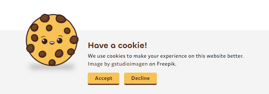
I’ve created the element and added the graphic, but when looking at the page as a whole, it felt kind of lifeless, and it didn’t stand out as much as we thought it will. The user needed to accept cookies as the majority of website functionality depended on cookies. We wanted to create an unobtrusive banner that doesn’t block user navigation from the outset, so I decided to animate it to make it more prominent and add a bit of flourish and character.
I’ve decided to create three animations that’ll be applied to the cookie SVG:
- Quick and snappy rolling fade-in entry animation;
- Repeated wiggle animation with a good amount of delay in between;
- Repeating and subtle eye sparkle animation.
Here’s the final result of the element that we’ll be creating. We’ll cover each animation step by step.
Now, this looks much better, doesn’t it? Let’s see what it adds to it:
- Animation matches the whimsical nature of the graphic itself.
- Movement feels natural enough, although JavaScript-based animation libraries would produce better results.
- Animation is tasteful and not intrusive, but it draws attention. It acts as a gentle reminder for a user to make a decision.
Let’s have a quick look at the markup (some markup here is removed for clarity). You can check out the complete markup and CSS in the CodePen demo.
We’ll animate the svg element itself and two path elements inside the SVG. Notice that the animation also features a shadow located in a span element, but we’ll focus only on our SVG elements as shadow just boils down to adding a simple CSS animation to an HTML element.
<figure role="presentation" class="cookie-notice__graphic-container">
  <span class="cookie-notice__shadow"></span>
  <svg class="cookie-notice__graphic" aria-hidden="true" xmlns="http://www.w3.org/2000/svg" width="300" height="300" viewBox="0 0 223.233 228.464">
    <path fill="#f8c256" d="..." />
    <!-- ... -->
  </svg>
</figure>
Entry Animation
For the entry animation, we want the cookie to roll in from the left side of the screen and fade in as it rolls into place. Banner content is centered on the screen, so we cannot just roll the cookie from off-screen — it would look alright on smaller screens, but on larger screens, the movement would be jarring, so we’ll add a fade-in to keep the animation nice and snappy:
opacity: controls fade-in,transform: controls horizontal movement and rotation.
@keyframes enter {
  0% {
    opacity: 0;
    transform: translate3d(-60%, 0, 0) rotateZ(-50deg);
  }

  100% {
    opacity: 1;
    transform: translate3d(0, 0, 0) rotateZ(17deg);
  }
}
We have animation keyframes in place, but we’re not done yet. It’s important to choose an appropriate easing function. The default linear movement wouldn’t look nice, and the pre-defined easing functions might look alright, but we can do better by creating our custom cubic-bezier function.
Let’s consider the look and feel of the animation. We want the movement to be whimsical, so let’s add a very basic bounce-like easing function - we’ll make our cookie overshoot the final position and snap back into it, resulting in a single bounce. With JavaScript-based animation libraries, we can create more impressive spring-like easing functions. Still, I want to keep this as simple and as effective as possible to show you that you can add nice-looking animations on the fly, regardless of time constraints or lack of knowledge of SVGs.
If you’re interested in learning more about advanced JavaScript-based animations, I would recommend Josh Comeau’s wonderful article on the topic. He also points out the importance of creating believable animations by choosing the correct easing functions.
Spring physics are like a secret ingredient; they make all animations taste better. The motion produced using spring physics is fluid and organic. It’s believable; springs do a better job of tricking our brains into thinking that something is actually moving.
We can use any easing function as a starting point and modify it. We’ll set the fourth number to a value above one, so we get that simple bouncing movement at the end.

Let’s store it in a CSS variable so that we can reuse it for the repeatable wiggle movement animation.
--transition-bounce: cubic-bezier(0.2, 0.7, 0.4, 1.65);
Let’s put everything together, set a duration value and fill-mode, and add the animation to our svg element.
/* Our SVG element */
.cookie-notice__graphic {
  opacity: 0; /* Should not be visible at the start */
  animation: enter 0.8s var(--transition-bounce) forwards;
}
Let’s check out what we’ve created. It already looks really nice. Notice how the bouncing easing function made a lot of difference to the overall look and feel of the whole element.
Repeating Wiggle Animation
We’ve made a nice entry animation that might draw the user’s attention at first, but the user might get distracted by other elements on the page or focus on performing other tasks. Remember, the cookies are important for our website’s main functionality, so we want to create a gentle reminder for the user that draws attention that is not obtrusive or blocks user actions.
If you are looking for ideas, Dribble can be a great source of inspiration. For the wiggle animation, I was inspired by the following Alpaca animation example by Matthew Ware. More specifically, I wanted to create a repeating wiggle movement with plenty of pauses between repeats, similar to how Matthew has animated the alpaca’s right ear.
So, let’s outline the five steps for this repeated animation:
- The object remains still (delay between iterations).
- It pulls back gently to the left and rotates back.
- It releases and moves forward and rotates forward.
- It slows down as it returns to its original position and stops.
- The object remains still (delay between iterations).
However, CSS doesn’t offer an option to pause animation between iterations out of the box, so let’s be creative and solve this for ourselves. We can use percentage values in the @keyframes definition to create an artificial delay between iterations.
@keyframes wiggle {
  0% {}   /* Stands still */
  45% {}  /* Movement starts */
          /* ... */
  60% {}  /* Movement ends */
  100% {} /* Stands still */
}
Just like in the previous example, we have to be aware of the easing properties that we’ll be using so that the wiggle movement still feels natural. We need to stay true to the look and feel that we’ve previously established, so the different animations blend nicely, so we’ll use our bouncing easing function that we’ve defined.
Easing functions are repeated between each pair of keyframe percentage values. We can make our movement overshoot the target and make the animation nice and bouncy.
See the Pen [Cubic bezier functions 3 keyframes](https://codepen.io/smashingmag/pen/KKaEjbM) by Smashing Magazine.
Let’s visualize the bouncing easing curve and apply it to the five animation step pairs that we’ve outlined: standing still, backward movement, forward movement, slowing down into the original place, and, finally, standing still.

@keyframes wiggle {
  /* Stands still */
  0% {
    transform: translate3d(0, 0, 0) rotateZ(17deg);
  }
  /* Starts moving */
  45% {
    transform: translate3d(0, 0, 0) rotateZ(17deg);
  }

  /* Pulls back */
  50% {
    transform: translate3d(-10%, 0, 0) rotateZ(8deg);
  }

  /* Moves forward */
  55% {
    transform: translate3d(6%, 0, 0) rotateZ(24deg);
  }

  /* Returns to starting position */
  60% {
    transform: translate3d(0, 0, 0) rotateZ(17deg);
  }

  /* Stands still */
  100% {
    transform: translate3d(0, 0, 0) rotateZ(17deg);
  }
}
/* Our SVG element */
.cookie-notice__graphic {
  opacity: 0;
  animation: enter 0.8s var(--transition-bounce) forwards,
    wiggle 6s 3s var(--transition-bounce) infinite;
}
Repeating Eye Sparkle Animation
We’ve added to our SVG element, but so far, we’ve been working exclusively on the parent svg element, so we haven’t dug into the actual SVG markup. If you haven’t worked with SVG markup before, don’t worry — we’ll use just a few very simple tricks that we’ll repeat across all examples in the article to create various great-looking animations.
We need to find the six elements (circles) inside the SVG markup that we’ll animate. We’ll use the browser’s inspect element tool to quickly find the elements we’re looking for.

SVG elements can have a CSS class attribute, so we’ll use that to target them. Let’s add the class attribute to the two path elements that we identified.
<!-- ... -->
<path fill="#351f17" d="..." />
<path class="cookie__eye" fill="#fff" d="..." />
<path fill="#351f17" d="..." />
<path class="cookie__eye" fill="#fff" d="..." />
<!-- ... -->
We want to make cookie’s eyes sparkle. I got this idea from a music video for a song by Devin Townsend. You can see the animation play at the 5-minute mark. It just goes to show how you can find ideas pretty much anywhere.
Let’s just change the scale and opacity. Notice how so far, we’ve relied only on those two attributes for all three animations, which are quite different from each other.
@keyframes sparkle {
  from {
    opacity: 0.95;
    transform: scale(0.95);
  }
  to {
    opacity: 1;
    transform: scale(1);
  }
}
We want this animation to repeat without delay. It should be subtle enough to blend in nicely with the graphic and the overall element and not obtrusive for the user. As for the easing function, we’ll do something different. We’ll use staircase functions to achieve that quick and snappy transition between the two animation states (our from and to values).
We need to be careful here. Transform origin is going to be set relative to the parent SVG element’s viewbox and not the element itself. So if we set transform-origin: center center, the transformation will use the center coordinates of the parent SVG and not the path element. We can easily fix that by setting a transform-box property to fill-box.
The nearest SVG viewport is used as the reference box. If a `viewBox` attribute is specified for the SVG viewport creating element, the reference box is positioned at the origin of the coordinate system established by the `viewBox` attribute, and the dimension of the reference box is set to the width and height values of the `viewBox` attribute.
.cookie__eye {
  animation: sparkle 0.15s 1s steps(2, jump-none) infinite alternate;
  transform-box: fill-box;
  transform-origin: center center;
}
Last but not least, let’s respect the user’s accessibility preferences and turn off all animations if they have it set.
@media (prefers-reduced-motion: reduce) {
  *,
  ::before,
  ::after {
    animation-delay: -1ms !important;
    animation-duration: 1ms !important;
    animation-iteration-count: 1 !important;
    background-attachment: initial !important;
    scroll-behavior: auto !important;
    transition-duration: 0s !important;
    transition-delay: 0s !important;
  }
}
Here is the final result. Feel free to play around with the demo and experiment with keyframe values and easing values to change the look and feel of the animation.
See the Pen [Animated cookie svg [forked]](https://codepen.io/smashingmag/pen/eYjMvXz) by Adrian Bece.
Transform Animations On SVG Elements
Let’s play around with the CSS transform property and CSS animation attributes and create a nice entry animation for an SVG that we have here.
First, let’s plan out our animation:
- No element will be visible at the beginning.
- The dark-colored rectangle will come down from the top.
- A white half-circle will rotate in.
- Lines will scale horizontally and appear with some delay between them.
Let’s set up the keyframes we’ll need for the animations that we’ve outlined.
@keyframes fromTop {
    from {
    transform: translateY(100%);
  } to {
    transform: translateY(0);
  }
}

@keyframes rotateIn {
  from {
    transform: rotateZ(180deg);
  } to {
    transform: rotateZ(0);
  }
}

@keyframes scaleXIn {
  from {
    transform: scaleX(0);
  }

  to {
    transform: scaleX(1);
  }
}
We’ll use inspect element to find the target elements for the first two animations and set the appropriate class attributes.
<svg xmlns="http://www.w3.org/2000/svg"xml:space="preserve" viewBox="0 0 1600 1066">
  <!-- ... -->
  <path class="sun__bg" d="..." style="fill:#363636;fill-opacity:1;fill-rule:nonzero;stroke:none" id="path14" />
  <path class="sun__top" d="..." style="fill:#ffffff;fill-opacity:1;fill-rule:nonzero;stroke:none" id="path16" />
  <!-- ... -->
</svg>
Let’s define the animation for each element. We’ll use the transform-box property to set the transform-origin to the path element instead of the parent SVG.
.sun__bg {
  transform: translateY(100%);
  animation: fromTop 0.5s 1s ease forwards;
  transform-box: fill-box;
}

.sun__top {
  transform: rotateZ(180deg);
  animation: rotateIn 1s 1.4s ease-in-out forwards;
  transform-origin: center top;
  transform-box: fill-box;
}
So far, so good. We’ve used the same approach and techniques as in the previous example. Let’s introduce a new trick for animating the bottom rectangles.
We have 17 rectangles, and instead of going to each one of them and adding a class attribute to each one of them, let’s group them and apply the class to a group. It’s similar to a div element in HTML — we can use it to add a useful generic wrapper around elements so we can group them and style them easily. SVG has a handy little group element (g). So we’ll add an opening tag before the first rectangle and a closing tag after the last element.
<g class="sun__lines" id="g20" clip-path="url(#clipPath24)">
  <path d="... style="fill:#363636;fill-opacity:1;fill-rule:nonzero;stroke:none" id="path26" />
  <path d="... style="fill:#363636;fill-opacity:1;fill-rule:nonzero;stroke:none" id="path26" />
  <path d="... style="fill:#363636;fill-opacity:1;fill-rule:nonzero;stroke:none" id="path26" />
  <!-- ... -->
 </g>
Much quicker and maintainable than adding 17 class attributes, isn’t it? And we haven’t changed anything visually on our SVG by doing that.
Let’s add animation to these path elements in a group. If we wanted all group elements to have the same animation properties, we could have simply added the animation to the group, but we want each path element to have a slight delay.
.sun__lines > path {
  transform: scaleX(0);
  animation: scaleXIn 0.5s 2.5s ease-in-out forwards;
  transform-origin: center center;
  transform-box: fill-box;
}
And finally, let’s add a delay to each path child element of the group. If we were using SASS or some other CSS pre-processor, we could have easily added these styles with a loop.
.sun__lines > path:nth-child(2) {
  animation-delay: 2.6s;
}

.sun__lines > path:nth-child(3) {
  animation-delay: 2.7s;
}

/* ... */
Here is the demo and the final result. Feel free to play around with easing and delay values to create different animation effects.
See the Pen [Animated SVG graphic [forked]](https://codepen.io/smashingmag/pen/GRBxmRP) by Adrian Bece.
Repeating Animations For SVG Patterns
SVGs often serve as a background graphic and just as a decoration to some content, like a very prominent hero container like in our next example. Although it looks good enough on its own, we can make it look better by adding some motion to it.

Let’s take a closer look at the SVG we’ll be working with. It consists of a few dozen circle elements.
<!-- ... -->
<circle cx="103.5" cy="34.5" r="11.3"></circle>
<circle cx="172.5" cy="34.5" r="15.7"></circle>
<circle cx="310.5" cy="34.5" r="24.6"></circle>
<circle cx="517.5" cy="34.5" r="34.5"></circle>
<circle cx="586.5" cy="34.5" r="34.5"></circle>
<circle cx="655.5" cy="34.5" r="33.4"></circle>
<!-- ... -->
Let’s start by adding a bit of opacity to our background and making it more chaotic. When we apply CSS transforms to elements inside SVG, they are transformed relative to the SVG’s main viewbox. That is why we’re getting a slightly chaotic displacement when applying a scale transform. We’ll use that to our advantage and not change the reference box.
To make things a little bit easier for us, we’ll use SASS. If you are unfamiliar with SASS and SCSS, you can view compiled CSS in CodePen below.
svg circle {
  opacity: 0.85;

  &:nth-child(2n) {
    transform: scale3d(0.75, 0.75, 0.75);
    opacity: 0.3;
}

With that in mind, let’s add some keyframes. We’ll use two sets of keyframes that we’ll apply randomly to our circle elements. Once again, we’ll leverage the scale transform displacement and change the opacity value.
@keyframes a {
  0% {
    opacity: 0.8;
    transform: scale3d(1, 1, 1);
  }
  100% {
    opacity: 0.3;
    transform: scale3d(0.75, 0.75, 0.75);
  }
}

@keyframes b {
  0% {
    transform: scale3d(0.75, 0.75 0.75);
    opacity: 0.3;
  }
  100% {
    opacity: 0.8;
    transform: scale3d(1, 1, 1);
  }
}
Now, let’s use quite a few :nth-child selectors. Every odd child will use the a keyframes, while every even circle will use a b keyframes. We’ll use :nth-child selectors to play around with animation duration and animation delay values.
svg circle {
  opacity: 0.85;
  animation: a 10s cubic-bezier(0.45,0.05,0.55,0.95) alternate infinite;

  &:nth-child(2n) {
    transform: scale3d(0.75, 0.75, 0.75);
    opacity: 0.3;

    animation-name: b;
    animation-duration: 6s;
    animation-delay: 0.5s;
  }

  &:nth-child(3n) {
    animation-duration: 4s;
    animation-delay: 0.25s;
  }

  /* ... */
}
And, once again, just by playing around with opacity values and CSS transforms on our SVG and playing around with child selectors and animation parameters, we’ve managed to create a more interesting background for our hero container.
See the Pen [Animated welcome screen [forked]](https://codepen.io/smashingmag/pen/OJwvmWK) by Adrian Bece.
SVG As A CSS Background Image
As a quick bonus example, we can also convert our repeatable SVG pattern shape into base64 using this handy tool and use it as a repeatable background-image pattern.

Here is a markup for our circle SVG.
<svg xmlns="http://www.w3.org/2000/svg" viewBox="0 0 100 100"><circle cx="50" cy="50" r="50" fill-opacity=".03"/></svg>
Be careful not to inline too much data with base64, so stylesheets can be downloaded and parsed quickly. When we convert it to base64, we get this handy CSS background-image snippet:
background-image: url(data:image/svg+xml;base64,PHN2ZyB4bWxucz0iaHR0cDovL3d3dy53My5vcmcvMjAwMC9zdmciIHZpZXdCb3g9IjAgMCAxMDAgMTAwIj48Y2lyY2xlIGN4PSI1MCIgY3k9IjUwIiByPSI1MCIgZmlsbC1vcGFjaXR5PSIuMDMiLz48L3N2Zz4=);
We can simply apply a simple animation where we offset the background-position by the background-size value and get this neat background animation.
.wrapper {
  animation: move-background 3.5s linear;
  background-image: url(data:image/svg+xml;base64,...);
  background-size: 96px;
  background-color: #16a757;
  /* ... */
}

@keyframes move-background {
  from {
    background-position: 0 0;
  }

  to {
    background-position: 96px 0;
  }
}
Our example looks more interesting with this subtle moving animation going on in the background. Remember to respect users’ accessibility preferences and turn off the animations if they have a preference set.
See the Pen [Animating background SVG pattern [forked]](https://codepen.io/smashingmag/pen/mdjxmXZ) by Adrian Bece.
Self-Drawing & Eelf-Erasing SVG Animation
Self-drawing / Self-erasing SVG is a cool and impressive animation that can be applied to any SVG path or another element that has a stroke attribute set. Let’s take our SVG text, for example, and check out its markup. Notice the stroke and stroke-width properties.
<svg aria-hidden="true" xmlns="http://www.w3.org/2000/svg" viewBox="0 0 323 151">
  <path fill="none" stroke="#a56a19" stroke-width="2" d="..." />
</svg>

Before diving into the animation, we need to cover two SVG properties that we’ll be using: stroke-dasharray and stroke-dashoffset. They’re integral for pulling off this animation.
Stroke can be converted to dashes with a certain length using a stroke-dasharray property.

stroke-dasharray: 10. (Large preview)And we can offset the positions of those strokes by a certain amount using the stroke-dashoffset property.

stroke-dashoffset: 10. (Large preview)So, what’s this have to do with our drawing and erasing animation? Imagine what would happen if we could have a dash that covers the whole stroke length and offset it by the same value. In that case, the starting point of the stroke would be way past the ending point of the stroke, and we wouldn’t see it.
svg path {
  stroke-linecap: round;
  stroke-linejoin: round;
  stroke-dasharray: 800;  /* Dash covering the whole stroke */
  stroke-dashoffset: 800; /* Offset it to make it invisible */
}
If we animate the offset value from that value back to 0, the stroke would slowly become visible, as it was drawing itself.
svg path {
  /* ... */
  animation: draw 6s linear infinite;
}

@keyframes draw{
  to {
    stroke-dashoffset: 0; /* Reduce offset to make it visible */
  }
}
If we continue to animate the offset value from 0 to a negative value, we’d get the erasing effect.
svg path {
  /* ... */
  animation: drawAndErase 6s linear infinite;
}

@keyframes drawAndErase {
  to {
    stroke-dashoffset: -800;
  }
}
You’re probably wondering where the magical 800 pixel value came from. This value depends on the SVG and the length of the dash needed to cover the whole stroke length. It can be easily guessed, but Chris Coyier has a handy function that can do it for you. However, depending on the stroke properties and SVG shape, this function might not always return an ideal value, but it can guide you closer to it.
Check out the complete demo and feel free to play around with values to see how the stroke properties affect the animation. If you are looking for more examples, CodyHouse has covered a fun-looking button animation using the same trick.
See the Pen [SVG stroke animation [forked]](https://codepen.io/smashingmag/pen/LYBdLNK) by Adrian Bece.
Playing With The Smashing Cat
I simply could not resist including Magazine’s fabulous cat mascot and animating it! Smashing Magazine has so many fun-looking SVGs, it was very difficult to choose just one, so I’ve narrowed it down to two SVGs.
For the first SVG, we’ll take everything we’ve learned so far and add a nice-looking animation, and for the second SVG, we’ll add some fun interactions using JavaScript.
Using Everything That We’ve Learned So Far
Everything we’ve done for this example is the same as in previous ones, only combined into a single SVG and involving a few more elements and groups of elements. Feel free to check out the CodePen demo below and use the browser inspect element feature to check out what is going on under the hood.
See the Pen [Smashing cat animated [forked]](https://codepen.io/smashingmag/pen/xxJWrOB) by Adrian Bece.
For this example, every animation was pretty much straightforward — just find the element using the browser’s inspect element tool, group it if needed, apply a class and add an animation.
I guess that the pipe animation was the most difficult one to get right as the pipe has to follow the contours of the mouth precisely. I was just playing around with the transform values and picked whatever ended up looking great.
.pipe {
  transform-box: fill-box;
  transform-origin: top left;
  animation: pipeMove 4s ease-in-out infinite alternate;
}

@keyframes pipeMove {
  from {
    transform: translate3d(4px, -12px, 0) rotateZ(-5deg);
  }
  to {
    transform: translate3d(-5px, 12px, 0) rotateZ(5deg);
  }
}
Adding Interactivity
Now for an even more interesting example: Smashing cat playing a barista. Let’s focus on making it interactive by adding the following:
- Eyes should follow the cursor.
- Clicking on the hat should animate it.
- Clicking on a bowtie should animate it.
- Clicking on the coffee machine handle should make coffee pour into a cup.

Let’s start by adding the mouse-tracking eye animation. We’ll skip manually implementing this feature in JavaScript and use a handy library called watching-you.
Using the browser’s inspect element tool, we’ll find the target elements inside the SVG and add the eye-left and eye-right CSS classes to these elements, respectively.
<ellipse class="cls-5 eye eye-left" cx="245.15133" cy="134.57033" rx="5.31264" ry="8.61816" transform="translate(-33.47349 110.5587) rotate(-23.83807)" />
<ellipse class="cls-4 eye eye-right" cx="284.42686" cy="116.68559" rx="5.31264" ry="8.61816" transform="translate(-22.89477 124.9063) rotate(-23.83807)" />
We’ll configure the library and make it target the classes that we’ve added.
const optionsLeft = { power: 4, rotatable: false };
const watcherLeft = new WatchingYou(".eye-left", optionsLeft);
watcherLeft.start();

const optionsRight = { power: 3, rotatable: false };
const watcherRight = new WatchingYou(".eye-right", optionsRight);
watcherRight.start();
We also need to remember to apply the transform-box property, so our eyes move around the center.
.eye {
  transform-box: fill-box;
  transform-origin: center center;
}
Let’s check out what we’ve got. With just a few lines of code and a tiny JavaScript library to do the heavy lifting, we’ve made the SVG element respond to the mouse position. Now that’s amazing, isn’t it?
Bowtie and hat animation will be created in a very similar way. Let’s start with a hat and find it using the browser’s inspect element tool. The hat graphic consists of two path elements, so let’s group them.
<g class="hat">
  <path class="cls-6" d="..." />
  <path class="cls-9" d="..." />
</g>
We’ll apply the same transform-box property and add a hat--active class that will run the animation when applied.
.hat {
  transform-box: fill-box;
  transform-origin: center bottom;
  cursor: pointer;
}

.hat--active {
  animation: hatJump 1s cubic-bezier(0, 0.7, 0.5, 1.25);
}

@keyframes hatJump {
  0% {
    transform: rotateZ(0) translateY(0);
  }

  50% {
    transform: rotateZ(-10deg) translateY(-50%);
  }

  100% {
    transform: rotateZ(0) translateY(0);
  }
}
Finally, let’s set up a click event listener that applies an active class to the element and then removes it after the animation has finished running.
const hat = document.querySelector(".hat");

hat.addEventListener("click", function () {
  if (hat.classList.contains("hat--active")) {
    return;
  }
  // Add the active class.
  hat.classList.add("hat--active");

  // Remove the active class after 1.2s.
  setTimeout(function () {
    hat.classList.remove("hat--active");
  }, 1200);
});
We use the same trick with the bowtie element, only applying a different animation and class. Feel free to check out the CodePen demo for more details.
Let’s move on to the coffee machine. Notice we don’t have any SVG element acting as a coffee on our SVG, so we’ll need to add it ourselves. You should feel comfortable editing SVG markup and we don’t even have to break a sweat here. Let’s make it easy for ourselves and find and copy the coffee machine’s pipe rectangle, which is similar to the coffee stream shape we want to have. We just have to change the color to brown and slightly adjust the dimensions.
<!-- Pipe -->
<rect class="cls-12" x="137.81171" y="243.99883" width="6.21967" height="12.29272" transform="translate(281.84309 500.29037) rotate(-180)" />

<!-- Copied and adjusted Pipe rect to act as a coffee -->
<rect class="coffee" x="139" y="243.99883" width="4" height="12.29272" transform="translate(281.84309 500.29037) rotate(-180)" fill="brown" />
Like in the previous examples, let’s add active classes and their respective animation keyframes. We’ll compose the two animations and play around with duration and delay.
.lever, .coffee {
  transform-box: fill-box;
  transform-origin: center bottom;
}

.lever {
  cursor: pointer;
}

.lever--active {
  animation: leverPush 2.5s linear;
}

@keyframes leverPush {
  0% {
    transform: translateY(0);
  }
  8% {
    transform: translateY(50%);
  }
  90% {
    transform: translateY(50%);
  }
  100% {
    transform: translateY(0);
  }
}

.coffee--active {
  animation: coffeeStream 2.4s 0.1s ease-out forwards;
}

@keyframes coffeeStream {
  0% {
    transform: translateY(0);
  }
  5% {
    transform: translateY(50%);
  }
  95% {
    transform: translateY(50%);
  }
  100% {
    transform: translateY(150%);
  }
}
Let’s apply the active classes on click and remove them after the animation has finished running. And that’s it!
const lever = document.querySelector(".lever");
const coffee = document.querySelector(".coffee");

lever.addEventListener("click", function () {
  if (lever.classList.contains("lever--active")) {
    return;
  }

  lever.classList.add("lever--active");
  coffee.classList.add("coffee--active");

  setTimeout(function () {
    lever.classList.remove("lever--active");
    coffee.classList.remove("coffee--active")
  }, 2500);
});
Check out the complete example below, and, as always, feel free to play around with the animations and experiment with other elements, like the speech bubble or making the coffee machine’s lights blink while coffee is pouring out. Have fun!
See the Pen [Smashing cat interaction [forked]](https://codepen.io/smashingmag/pen/gOjzMap) by Adrian Bece.
Conclusion
I hope that this article encourages you to play around and make some wonderful SVG animations and interactions and integrate this workflow into your day-to-day projects. We’ve used only a handful of tricks and CSS properties to create a whole variety of nice effects on the fly. With some extra time, knowledge, and effort, you can create some truly amazing and interactive graphics.
Feel free to reach out on Twitter and share your work. Happy to hear your thoughts and see what you come up with!
References
- SVG explained in 100 seconds, Fireship
- “How SVG Line Animation Works”, Chris Coyier
- SVG specs, W3C
- “
prefers-reduced-motion: Sometimes less movement is more”, Thomas Steiner
 (vf, yk, il)

