Meet Skeleton: Svelte + Tailwind For Reactive UIs

Email Newsletter
Weekly tips on front-end & UX.
Trusted by 200,000+ folks.


 Flexible CMS. Headless & API 1st
 Register!
If you’ve ever found yourself tasked with creating and implementing custom UI, then you know how difficult it can be to meet the demands of the modern web. Your interface must be responsive, reactive, and accessible, all while remaining visually appealing to a broad spectrum of users. Let’s face it; this can be a challenge for even the most seasoned frontend developer.
Over the last ten years, we’ve seen the introduction of UI frameworks that help ease this burden. Most rely on JavaScript and lean into components and reactive patterns to handle real-time user interaction. Frameworks such as Angular, React, and Vue have been established as the standard for what we currently know as modern frontend development.
Alongside the tools, we’ve seen the rise of framework-specific libraries like Angular Material, Mantine (for React), and Vuetify that to provide a “batteries included” approach to implementing UI, including deep integration of each framework’s unique set of features. With the emergence of new frameworks such as Svelte, we might expect to see similar libraries appear to fulfill this role. To gain insight into how these tools might work, let’s review what Svelte brings to frontend development.
Svelte And SvelteKit
In 2016, Rich Harris introduced Svelte, a fresh take on components for the web. To understand the benefits of Svelte, see his 2019 conference talk titled “Rethinking Reactivity,” where Rich explains the origins of Svelte and demonstrates its unique compiler-driven approach.
Of course, component libraries only take you so far. To meet the demands of today’s web, app frameworks like Next.js and Nuxt have been introduced to manage routing, server-side rendering (SSR), handle asynchronous tasks like HTTP, and much, much more. Svelte’s answer to this is SvelteKit, a web app framework built for Svelte on top of next-generation technologies like Vite. It is fast approaching version 1.0, but still early days for the framework itself.
When considering UI for Svelte and SvelteKit, you’ll find several wrappers for general-purpose UI libraries, such as Smelte for Material Design and Svelma for Bulma. However, your options are more limited if you seek tight integration with Svelte itself. Many also lack direct integration with Tailwind, a popular CSS tool to help create and manage design systems within your apps.
Design Systems With Tailwind
First introduced in 2019, Tailwind provides a unique utility-based approach to CSS and styling. When designing for the web, it can be challenging to translate static design mocks to rendered web pages in a consistent manner.
Using CSS to create a set of reusable styles, while simple in concept, can quickly become a headache as the scale of your project grows. You have to manage your color palette, find a way to standardize common styles and sizes, and continuously recreate common layouts with CSS properties like Grid and Flexbox. Then do it all over again for your next project!
This is what Tailwind aims to address while providing a customizable shorthand CSS syntax that can be maintained directly within HTML or implemented via a more classic approach with @apply.
Let’s compare a few examples of standard CSS versus the Tailwind equivalent.
Note: Tailwind provides a handy test environment if you would like to try these as we go.
Utility Classes
Standard CSS and HTML:
.padding-8 { padding: 8px; }
.padding-16 { padding: 16px; }
<div class="padding-8">Foobar</div>
<div class="padding-16">Foobar</div>Tailwind:
<div class="p-4">Foobar</div>
<div class="p-8">Foobar</div>
Note: No extra CSS is needed as Tailwind creates this for us.
Managing Colors
Standard CSS:
:root {
    --color-red: #FF0000;
}
.text-red { color: var(--color-red); }
.background-red { background: var(--color-red); }
Tailwind:
<div class="text-red-500">Foobar</div>
<div class="bg-red-500">Foobar</div>
Note: Tailwind includes a default color palette with colors scaled from 50-900. Shade 500 is typically treated as the base color.
Handling Grid Layouts
Standard CSS and HTML:
.grid-three-column {
    display: grid;
    grid-template-columns: repeat(3, 1fr);
    grid-template-rows: repeat(3, 1fr);
    grid-column-gap: 16px;
    grid-row-gap: 16px;
}
<div class="grid-three-column">
<div>Cell</div>
<div>Cell</div>
<div>Cell</div>
</div>Tailwind:
<div class="grid grid-cols-3 gap-4">
    <div>Cell</div>
    <div>Cell</div>
    <div>Cell</div>
</div>
Note: Values are REM, so gap-4 translates to 4 REM (or 16px).
Even with these basic examples, you can imagine how Tailwind can help boost productivity:
- you can tweak and adjust styles on the fly (ex: switch from 3 to 4 grid columns);
- make use of the default color palette;
- easily recreate intricate layouts.
Tailwind essentially provides a set of design building blocks that can be extended and adjusted to fit the needs of any sort of app.
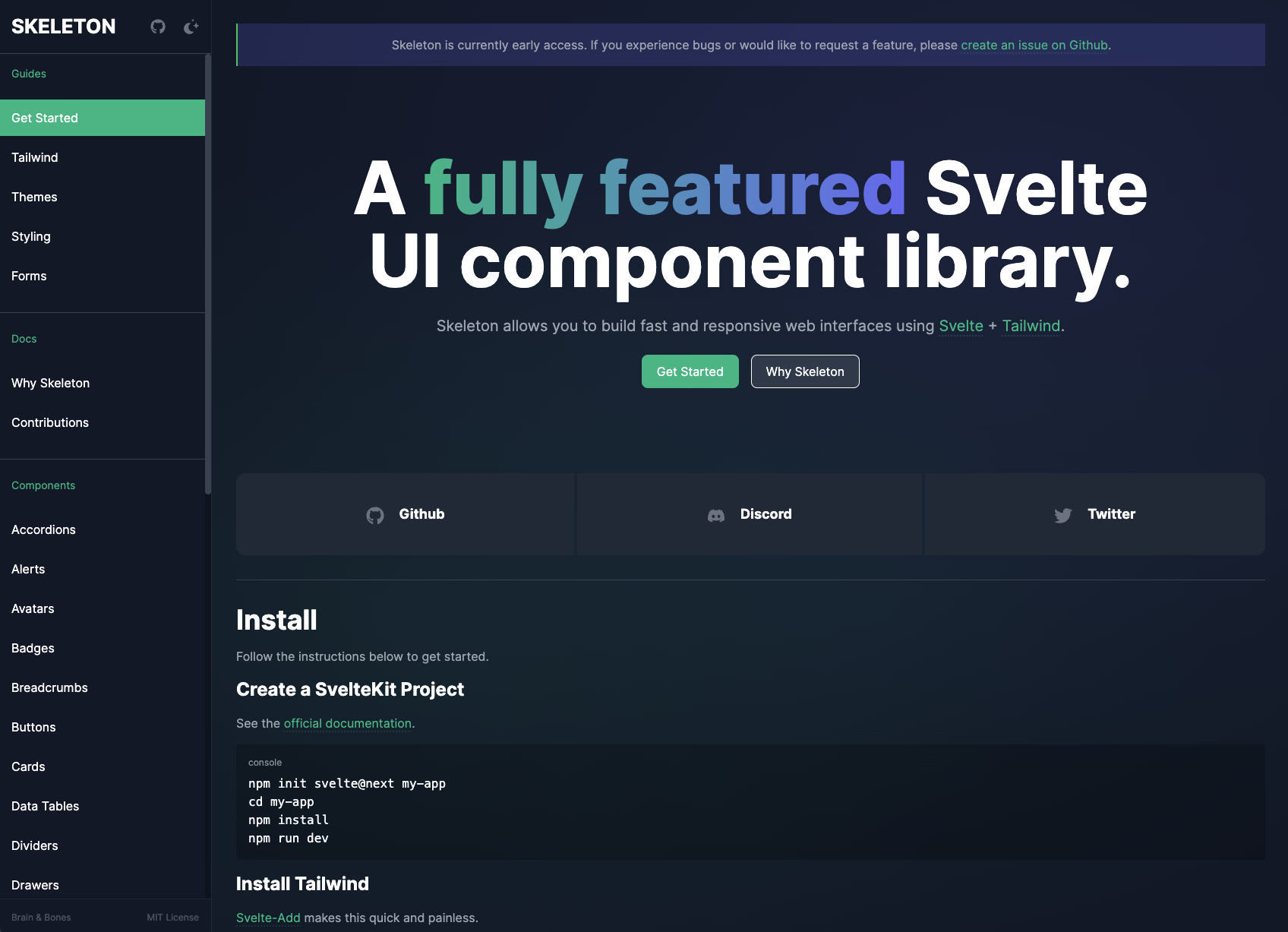
Introducing Skeleton
Now that you understand the benefit of each of these tools, I’d like to take a moment to introduce Skeleton — a new open-source UI component library that tightly integrates both Svelte and Tailwind. It provides a broad set of Svelte components that can easily be adjusted using Tailwind’s utility classes.
Skeleton was founded by the development team at Brain & Bones. The team, myself included, has been consistently impressed with Svelte and the tools it brings to the frontend developer’s arsenal. The team and I were looking to migrate several internal projects from Angular to SvelteKit when we realized there was an opportunity to combine Svelte’s intuitive component system with the utility-driven design systems of Tailwind, and thus Skeleton was born.
The team realized Skeleton has the potential to benefit many in the Svelte community, and as such, we’ve decided to make it open-source. We hope to see Skeleton grow into a powerful UI toolkit that can help many developers, whether your skills lie within the frontend space or not.
To see what we mean, let’s take a moment to create a basic SvelteKit app and integrate Skeleton.
Getting Started With Skeleton
Open your terminal and run each of the following commands. Be sure to set “my-skeleton-app” to whatever name you prefer. When prompted, we recommend using Typescript and creating a barebones (aka “skeleton”) project:
npm create svelte@latest my-skeleton-app
cd my-skeleton-app
npm install
npm run dev -- --open
This will generate the SvelteKit app, move your terminal into the project directory, install all required dependencies, then start a local dev server. Using the -- --open flag here will open the following address in your browser automatically:
http://localhost:5173/In your terminal, use Ctrl + C to close and stop the server. Don’t worry; we’ll resume it in a moment.
Next, we need to install Tailwind. Svelte-add helps make this process trivial. Simply run the following commands, and it’ll handle the rest.
npx svelte-add@latest tailwindcss
npm install
This will install the latest Tailwind version into your project, create /src/app.css to house your global CSS, and generate the necessary tailwind.config.cjs. Then we install our new Tailwind dependency.
Finally, let’s install the Skeleton package via NPM:
npm i @brainandbones/skeleton --save-devWe’re nearly ready to add our first component, and we just need to make a couple of quick updates to the project configuration.
Configure Tailwind
To ensure Skeleton plays well with Tailwind, open tailwind.config.cjs in the root of your project and add the following:
module.exports = {
    content: [
        // ...
        './node_modules/@brainandbones/skeleton/**/*.{html,js,svelte,ts}'
    ],
    plugins: [
        require('@brainandbones/skeleton/tailwind.cjs')
    ]
}
The content section ensures the compiler is aware of all Tailwind classes within our Skeleton components, while plugins uses a Skeleton file to prepare for the theme we’ll set up in the next section.
Implement A Skeleton Theme
Skeleton includes a simple yet powerful theme system that leans into Tailwind’s best practices. The theme controls the visual appearance of all components and intelligently adapts for dark mode while also providing access to Tailwind utility classes that represent your theme’s unique color palette.
The Skeleton team has provided a curated set of themes, as well as a theme generator to help design custom themes using either Tailwind colors or hex colors to match your brand’s identity.
To keep things simple, we’ll begin with Skeleton’s default theme. Copy the following CSS into a new file in /src/theme.css.
:root {
    /* --- Skeleton Theme --- */
    /* primary (emerald) */
    --color-primary-50: 236 253 245;
    --color-primary-100: 209 250 229;
    --color-primary-200: 167 243 208;
    --color-primary-300: 110 231 183;
    --color-primary-400: 52 211 153;
    --color-primary-500: 16 185 129;
    --color-primary-600: 5 150 105;
    --color-primary-700: 4 120 87;
    --color-primary-800: 6 95 70;
    --color-primary-900: 6 78 59;
    /* accent (indigo) */
    --color-accent-50: 238 242 255;
    --color-accent-100: 224 231 255;
    --color-accent-200: 199 210 254;
    --color-accent-300: 165 180 252;
    --color-accent-400: 129 140 248;
    --color-accent-500: 99 102 241;
    --color-accent-600: 79 70 229;
    --color-accent-700: 67 56 202;
    --color-accent-800: 55 48 163;
    --color-accent-900: 49 46 129;
    /* warning (rose) */
    --color-warning-50: 255 241 242;
    --color-warning-100: 255 228 230;
    --color-warning-200: 254 205 211;
    --color-warning-300: 253 164 175;
    --color-warning-400: 251 113 133;
    --color-warning-500: 244 63 94;
    --color-warning-600: 225 29 72;
    --color-warning-700: 190 18 60;
    --color-warning-800: 159 18 57;
    --color-warning-900: 136 19 55;
    /* surface (gray) */
    --color-surface-50: 249 250 251;
    --color-surface-100: 243 244 246;
    --color-surface-200: 229 231 235;
    --color-surface-300: 209 213 219;
    --color-surface-400: 156 163 175;
    --color-surface-500: 107 114 128;
    --color-surface-600: 75 85 99;
    --color-surface-700: 55 65 81;
    --color-surface-800: 31 41 55;
    --color-surface-900: 17 24 39;
}
Note: Colors are converted from Hex to RGB to properly support Tailwind’s background opacity.
Next, let’s configure SvelteKit to use our new theme. To do this, open your root layout file at /src/routes/__layout.svelte. Declare your theme just before your global stylesheet app.css.
import '../theme.css'; // <--
import '../app.css';
To make things look a bit nicer, we’ll add some basic <body> element styles that support either light or dark mode system settings. Add the following to your /src/app.css.
body { @apply bg-surface-100 dark:bg-surface-900 text-black dark:text-white p-4; }For more instruction, consult the Style documentation which covers global styles in greater detail.
Add A Component
Finally, let’s implement our first Skeleton component. Open your app’s home page /src/routes/index.svelte and add the follow. Feel free to replace the file’s entire contents:
<script lang="ts">
    import { Button } from '@brainandbones/skeleton';
</script>

<Button variant="filled-primary">Skeleton</Button>
To preview this, we’ll need to restart our local dev server. Run npm run dev in your terminal and point your browser to http://localhost:5173/. You should see a Skeleton Button component appear on the page!
Customizing Components
As with any Svelte component, custom “props” (read: properties) can be provided to configure your component. For example, the Button component’s variant prop allows us to set any number of canned options that adapt to your theme. By switching the variant value to filled-accent we’ll see the button change from our theme’s primary color (emerald) to the accent color (indigo).
Each component provides a set of props for you to configure as you please. See the Button documentation to try an interactive sandbox where you can test different sizes, colors, etc.
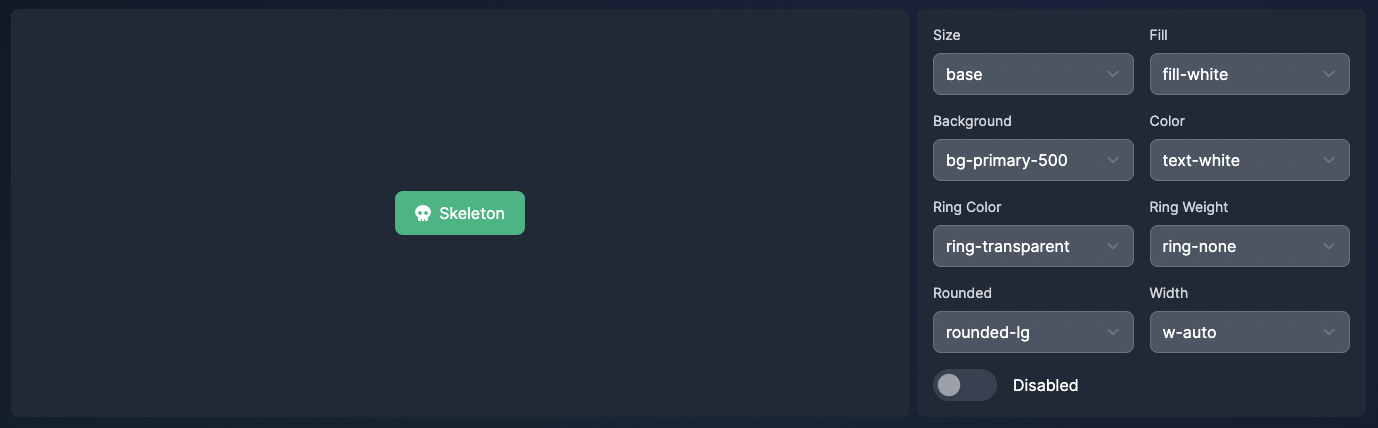
You may notice that many of the prop values resembled Tailwind class names. In fact, this is exactly what these are! These props are provided verbatim to the component’s template. This means we can set a component’s background style to any theme color, any Tailwind color, or even set a one-off color using Tailwind’s arbitrary value syntax.
<!-- Using our theme color -->
<Button background="bg-accent-500">Accent</Button>

<!-- Using Tailwind colors -->
<Button background="bg-orange-500">Orange</Button>

<!-- Using Tailwind's arbitrary value syntax -->
<Button background="bg-[#BADA55]">Arbitrary</Button>
This gives you the control to maintain a cohesive set of styles or choose to “draw outside of the lines” with arbitrary values. You’re not limited to the default props, though. You can provide any valid CSS classes to a component using a standard class attribute:
<Button variant="filled-primary" class="py-10 px-20">Big!</Button>Form Meets Function
One of the primary benefits of framework-specific libraries like Skeleton is the potential for deep integration of the framework’s unique set of features. To see how Skeleton integrates with Svelte, let’s try out Skeleton’s dialog system.
First, add the Dialog component within the global scope of your app. The easiest way to do this is to open /src/routes/__layout.svelte and add the following above the <slot /> element:
<script lang="ts">
    // ...
    import { Dialog } from '@brainandbones/skeleton';
</script>

<!-- Add the Dialog component here -->
<Dialog />

<slot />
Note: The Dialog component will not be visible on the page by default.
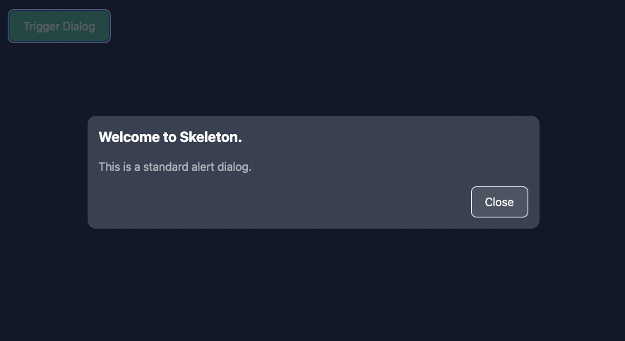
Next, let’s update our home page to trigger our first Dialog. Open /src/routes/index.svelte and replace the entire contents with the following:
<script lang="ts">
    import { Button, dialogStore } from '@brainandbones/skeleton';
    import type { DialogAlert } from '@brainandbones/skeleton/Notifications/Stores';

    function triggerDialog(): void {
        const d: DialogAlert = {
            title: ‘Welcome to Skeleton.’,
            body: ‘This is a standard alert dialog.’,
        };
        dialogStore.trigger(d);
    }
</script>

<Button variant="filled-primary" on:click={() => { triggerDialog() }}>Trigger Dialog</Button>
This provides all the scaffolding needed to trigger a dialog. In your browser, click the button, and you should see your new dialog message appear!
Skeleton accomplishes this using Svelte’s writable stores, which are reactive objects that help manage the global state. When the button is clicked, the dialog store is triggered, and an instance of a dialog is provided to the store. The store then acts as a queue. Since stores are reactive, this means our Dialog component can listen for any updates to the store’s contents. When a new dialog is added to the queue, the Dialog component updates to show the contents on the screen.
Skeleton always shows the top-most dialog in the queue. When dismissed, it then displays the following dialog in the queue. If no dialogs remain, the Dialog component hides and returns to its default non-visible state.
Here’s a simple mock to help visualize the data structure of the dialog store queue:
dialogStore = [
    // dialog #1, <-- top items the queue, shown on screen
    // dialog #2, <-- the next dialog in line
    // dialog #3, <-- bottom of the queue, the last added
];
It’s Skeleton’s tight integration with Svelte features that makes this possible. That’s the power of framework-specific tooling — structure, design, and functionality all in one tightly coupled package!
Learn More About Skeleton
Skeleton is currently available in early access beta, but feel free to visit our documentation if you would like to learn more. The site provides detailed guides to help get started and covers the full suite of available components and utilities. You can report issues, request walkthroughs, or contribute code at Skeleton’s GitHub. You’re also welcome to join our Discord community to chat with contributors and showcase projects you’ve created with Skeleton.
Skeleton was founded by Brain & Bones. We feed gamers’ love for competition, providing a platform that harnesses the power of hyper-casual games to enhance engagement online and in-person.
Further Resources
- Skeleton by Brain & Bones
- Skeleton’s GitHub repo
- Skeleton’s Discord community
- Featured in the official Svelte August 2022 community showcase
 (vf, yk, il)

