Say Goodbye To Frustrating Navigation, With Navigation Queries

Email Newsletter
Weekly tips on front-end & UX.
Trusted by 200,000+ folks.


 Register!
 Flexible CMS. Headless & API 1st
When designing interfaces, we often focus on the usual suspects. How do we design better mega-menus and carousels? How do we support users with better breadcrumbs? How do we better display our sidebar navigation? And how do we provide a better search experience, along with decent filtering, sorting and search?
While all these features for navigation are absolutely important and useful, there are also a few other navigation patterns that are often forgotten or dismissed. We can think of them as navigation shortcuts, helping users get where they want to go, faster — without having to use traditional navigation at all.
As it turns out, sometimes they are much more effective, especially on large sites with thousands of pages, many of which have been gathering dust over the years.
This article is part of our ongoing series on design patterns. It’s also a part of the upcoming 4-weeks live UX training 🍣 and will be in our recently released video course soon.
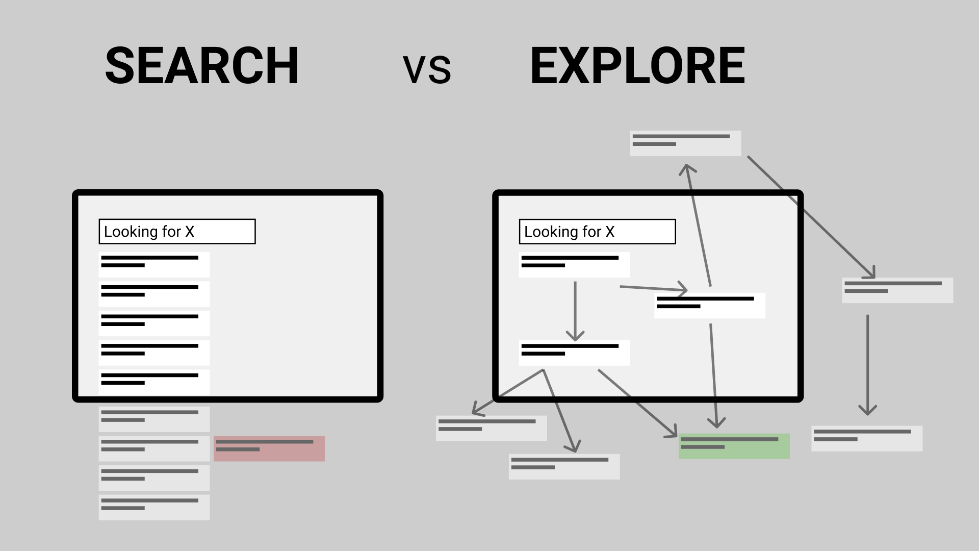
Designing For Exploration
Our typical experience on the web is somewhat unusual. We visit websites with all kinds of various intents, yet to address that intent, we usually have to translate it into a meaningful combination of keywords, clicks, taps and selections. We rarely get the answers we need immediately; instead, we discover the answers in a long-winded journey between pages and sub-navigation items.
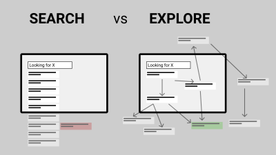
Gerry McGovern once rightfully suggested that more people have been on top of Mount Everest than have been to the 10th page of Google’s search results. This is probably true, yet usually, our interfaces provide long lists of options and are rarely designed for exploration. We surface a multitude of options rather than taking advantage of context and association, as Marcin Ignac has put it recently.
In fact, we leave users on their own with a few signposts along the way. They need to survey the landscape, jump between menu items, iterate on search queries, and scout tags and footer links.
It works, but it’s slow. To minimize the distance between intent and action, we can query users about their intent and then assist users in their journey. That’s when navigation queries come into play.
Navigation Queries
The idea behind navigation queries is not new. We’ve seen all kinds of variations of Madlib pattern, natural language forms and chatbots, all of which present a human-friendly way to specify intent without having to use input fields or navigation menus. Usually, we’d see the entire form presented as a sentence in front of us, with a few drop-downs allowing us to specify what is it exactly what we are looking for. However, we can also apply this concept more dynamically.
The idea, then, is to create a “query constructor” for the user’s intent. In our interface, we could show options to choose from and based on one answer, provide further options, all the way to the point where we guide a user to the page of interest. And that’s what we would call a navigation query.
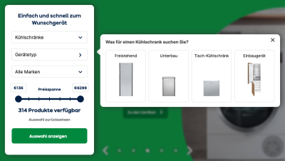
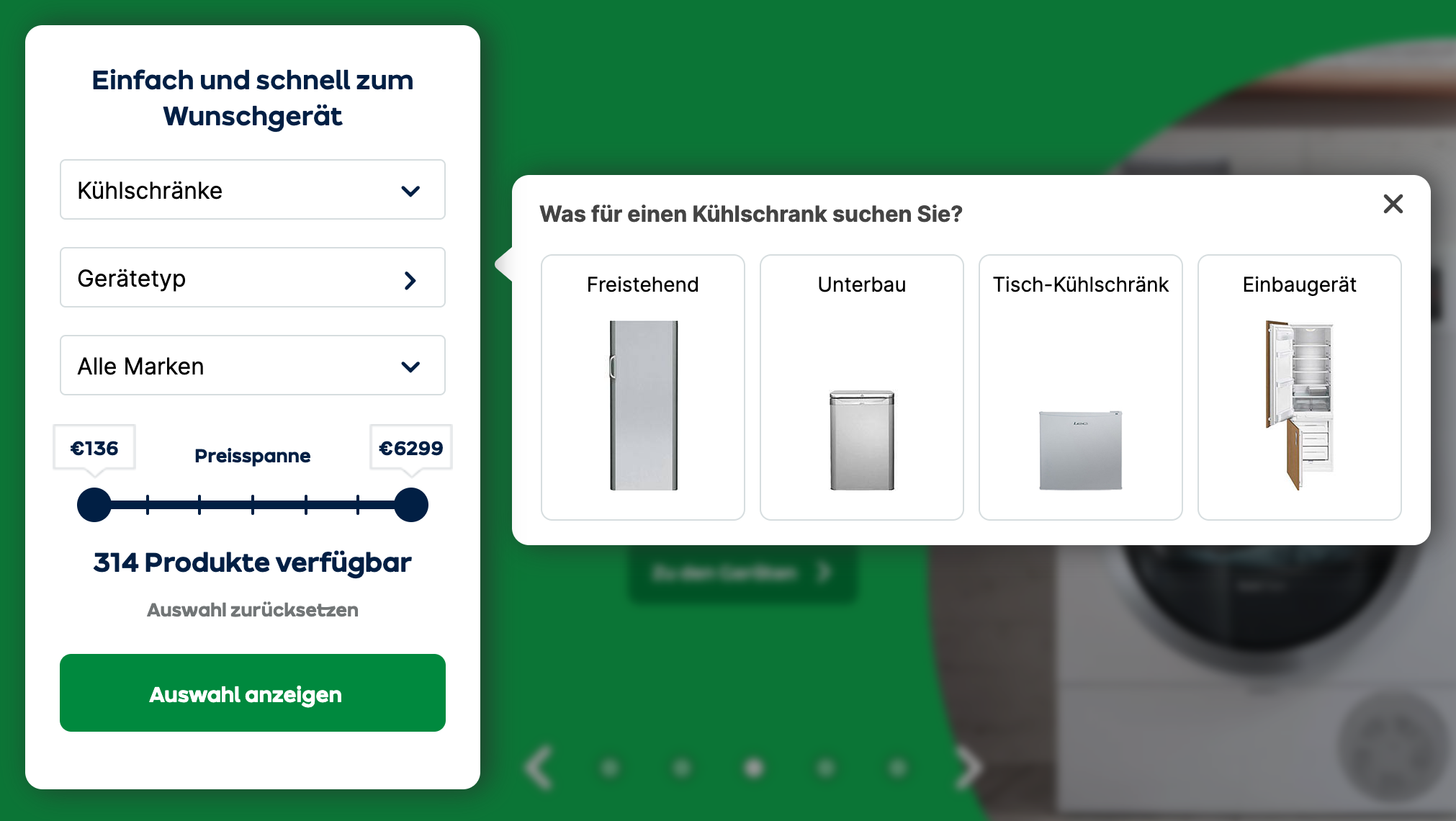
On AO.de, the front page is dedicated to query the type of device that the customers are interested in. Once it’s selected, another selection appears, allowing users to specify one of the filters that could be applied to their query. And depending on that input, the third filter selection appears. Finally, a slider helps users to pick the right price range for the product.
In that example, customers don’t need to use the navigation or search at all to get relevant results. Obviously, it wouldn’t harm to replace a drop-down with a smart autocomplete to avoid dead-ends, but this works here, too.

On Commonbond.co, you could define your intent using a navigation query pattern. In a dedicated area on the page, additionally to the primary navigation on the top, users are presented with a drop-down. They can specify what exactly they’d like to do on the website, or what they are looking for. Once one option is selected, another drop-down appears, allowing them to specify their intent even further.
This experience mimics the drill-down navigation with multiple levels. Yet the difference is that users are making small decisions, one after another, without being confronted with the entire navigation at every step of the way.
Similar to mega-menus, there is no need to load a new page, and users can easily go between options without having to recalibrate their mouse pointer or finger in the menu. In fact, you could potentially also select multiple options at once and get only a selection of pages that are relevant to you.

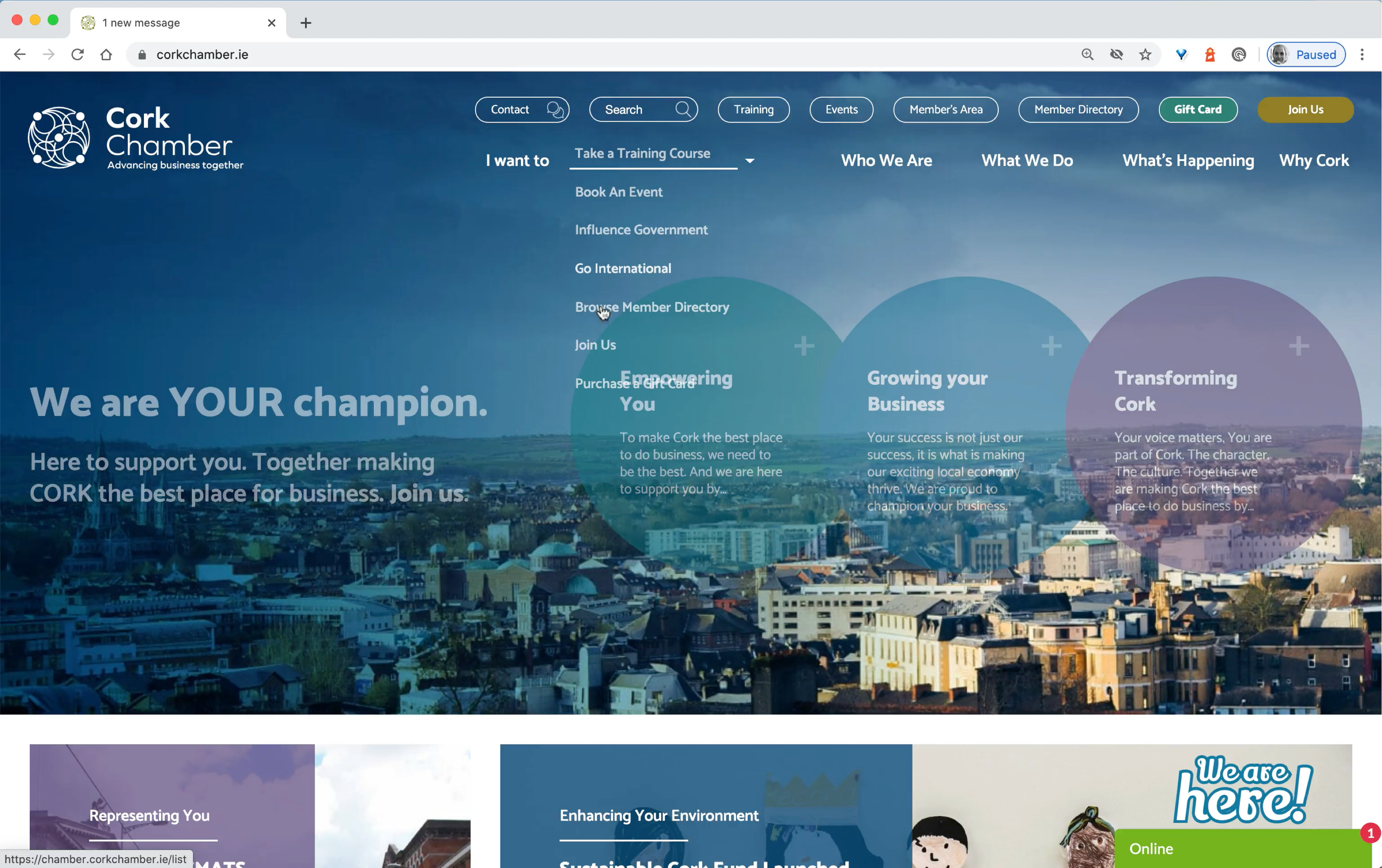
Cork Chamber uses a navigation query in addition to the rest of the navigation. ”I want to” is taking a primary spot in the navigation, driving users directly to the page of interest. Essentially it’s just a drop-down that provides users with a few options. But it could be extended with second and third-level selections. Notice how user-centric the navigation is though: “I want to” is focused on what the visitors of the page plan to do.
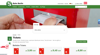
Sbahn.berlin, a public transportation service in Berlin, allows users to choose the view that fits them best and brings them directly to a page that they might not be able to easily spot otherwise. By choosing one of the options, they jump directly to the 4th-level navigation, without having to interact with a hover or click the menu at all.

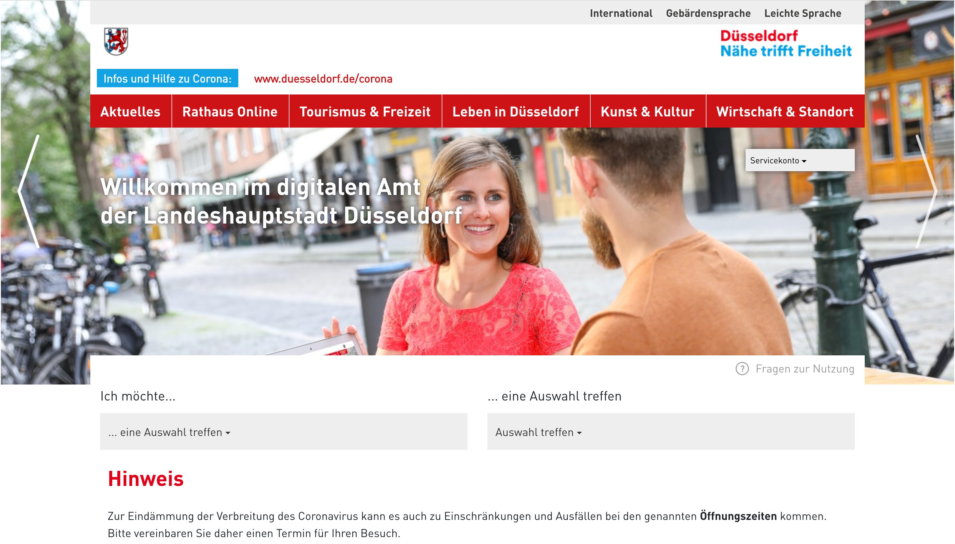
Figuring out just the right page to book an appointment on City of Düsseldorf might take quite a while when going through the global navigation or external search. However, two drop-downs in the central area allow citizens to specify their intent and choose a location. The result, then, is a link to the page where they can complete their task. No need to use the navigation or search at all.

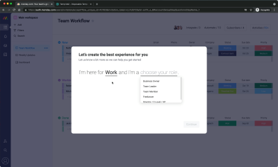
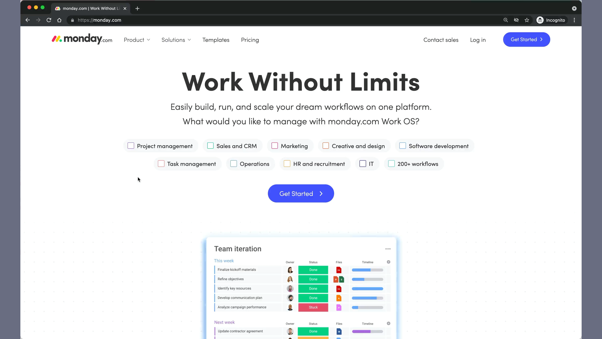
Monday.com is using a similar pattern for their onboarding flow. On the homepage, prospect customers can first select what they’d like to manage using the Monday.com product. Based on that input, one of the onboarding flows is triggered, guiding users to relevant boards. A great way to bring people to relevant views is by minimizing the distance between the intent and value.
Feature Comparison
Imagine that you’ve added a few headphones for comparison on an eCommerce retailer site. You probably don’t plan on purchasing all of them, but rather want to find the option that works best for you. What kind of experience are you expecting when comparing these items?
Most of the time, it will be a good ol’ feature comparison table, with multiple columns, one for each product, and hundreds of attributes to browse through. To navigate it, we’ll probably be using a lown mower pattern, going through the tables row by row, from right to left and back again. Admittedly, that’s a quite tiring and time-consuming undertaking.
In fact, nobody wakes up in the morning hoping to finally compare products by features in a comparison table matrix. As customers, we actually want to find out what a better option is, yet we need to do quite a bit of work to get there. Even though we might have very specific attributes in mind that we care about most. To improve their experience, we can just ask our users what their intent is.

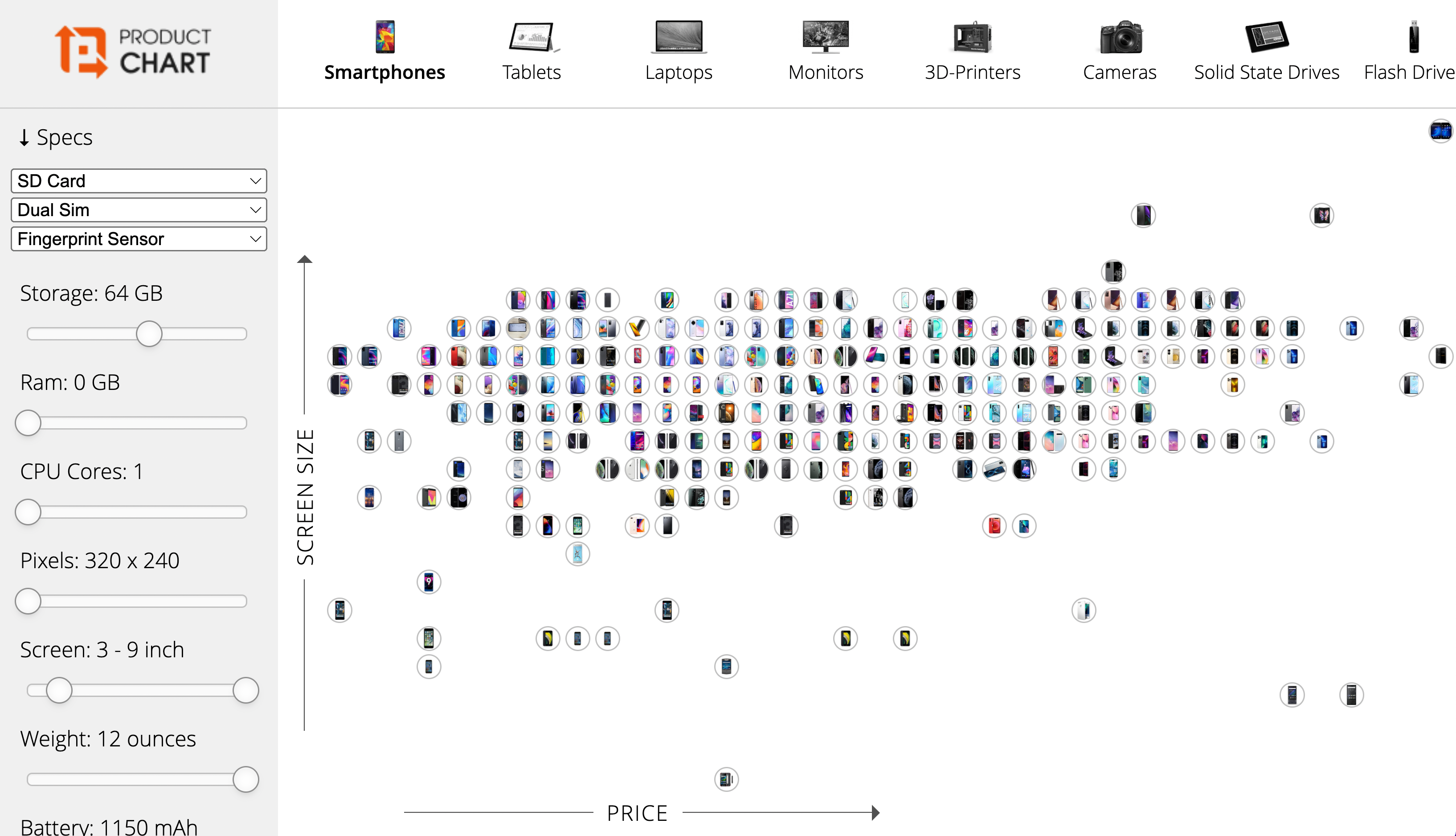
Not a typical feature comparison on Productchart.com. Instead of using a feature comparison table, Productchart maps all products in a two-dimensional space. Customers can choose the attribute on each axis, and they can also use filters to reduce the overall number of options to a more manageable selection. They can also highlight products of interest and compare them side by side.
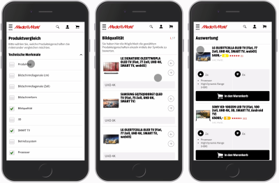
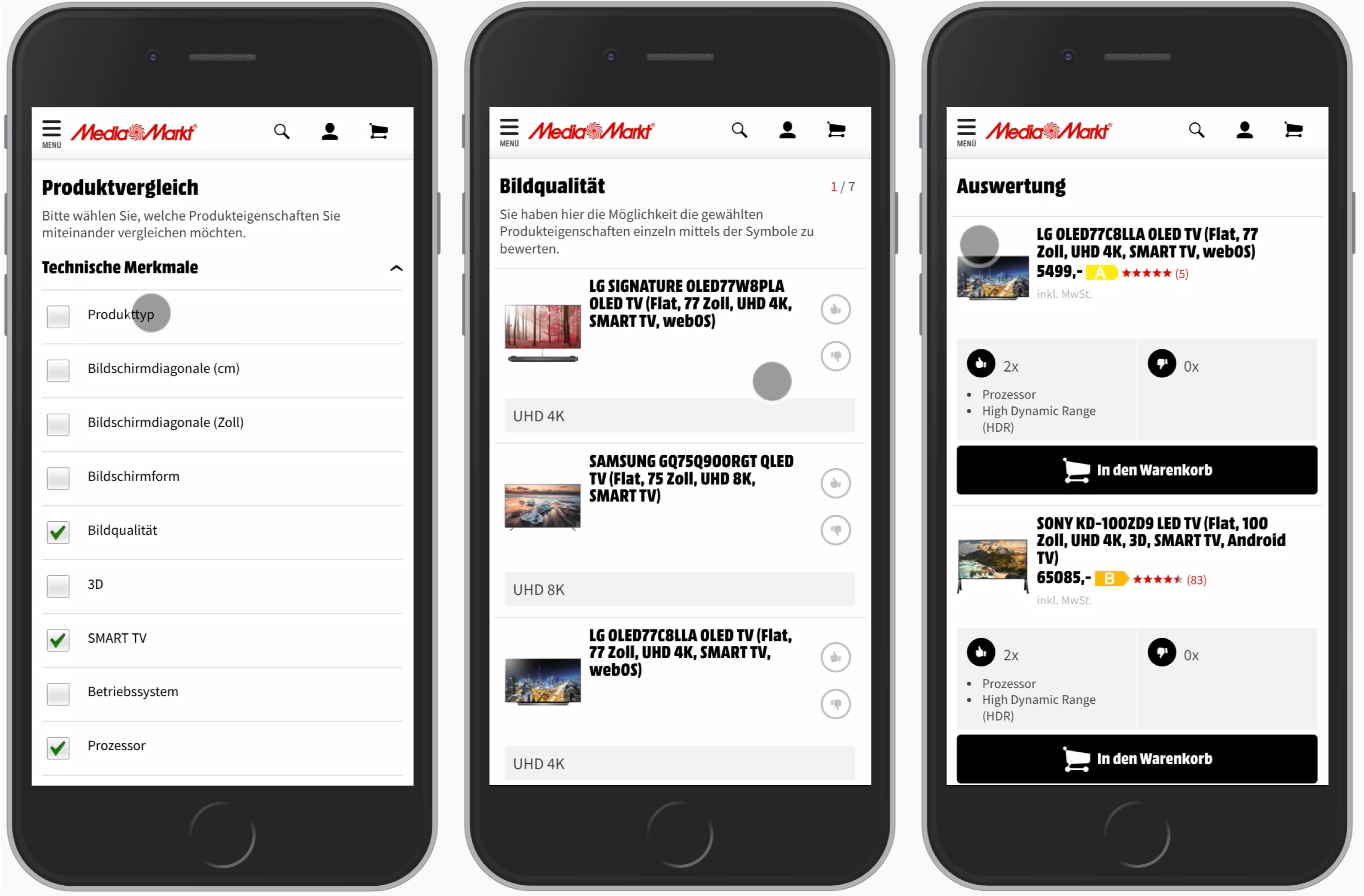
On Mediamarkt, feature comparison is happening without tables altogether. Instead, when users choose to compare products, they are asked to choose relevant attributes first. Potentially it could even be an autocomplete multi-combo-box, complemented with all available features grouped into accordions.
Each selection becomes a single step in the evaluation journey, where customers can vote up and vote down products based on the features that they have. Once it’s done, they are presented with the winning option — based on their interests and preferences. Additionally, there is an option to see the entire feature comparison matrix and even download it as a PDF for convenience.
A-Z Index Pattern
Once a website keeps growing, it gets into navigation decay. New navigation items are added all over the place just because there don’t seem to be good existing categories under which they could live. So new categories get added, while older categories and partially outdated content never get deleted or archived. And because there are many different content managers involved, with many different content management systems, tags become inconsistent, categories are mislabeled and content is often duplicated — just in case.
The right way to address this issue is to redesign the information architecture and established guidelines for publishing, categorizing, archiving and deleting. That’s the role of governance, of course, and as such, it might be years until any significant changes get implemented. Yet during that time visitors of the site can hardly find any information on the site, and had to rely on Google or Bing instead, often landing on competing websites altogether.
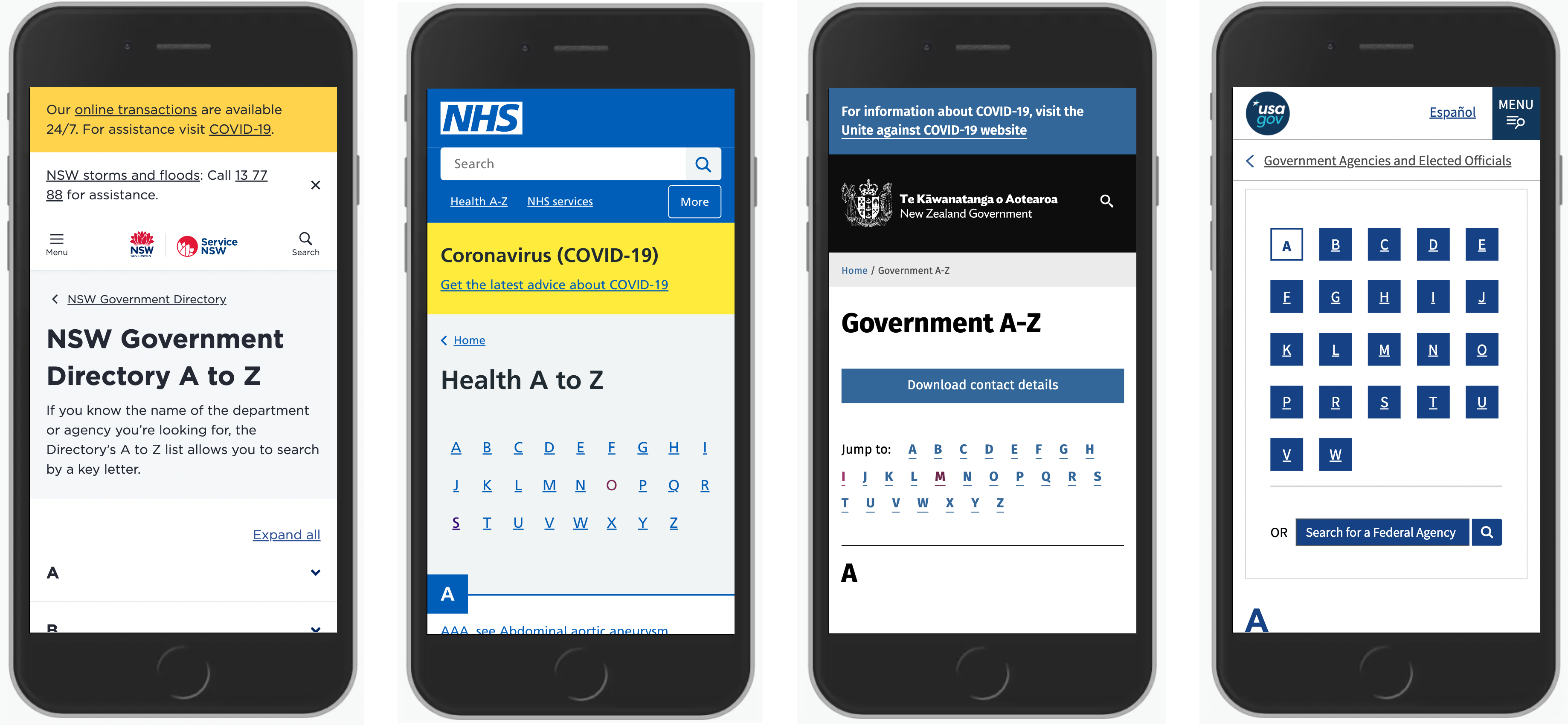
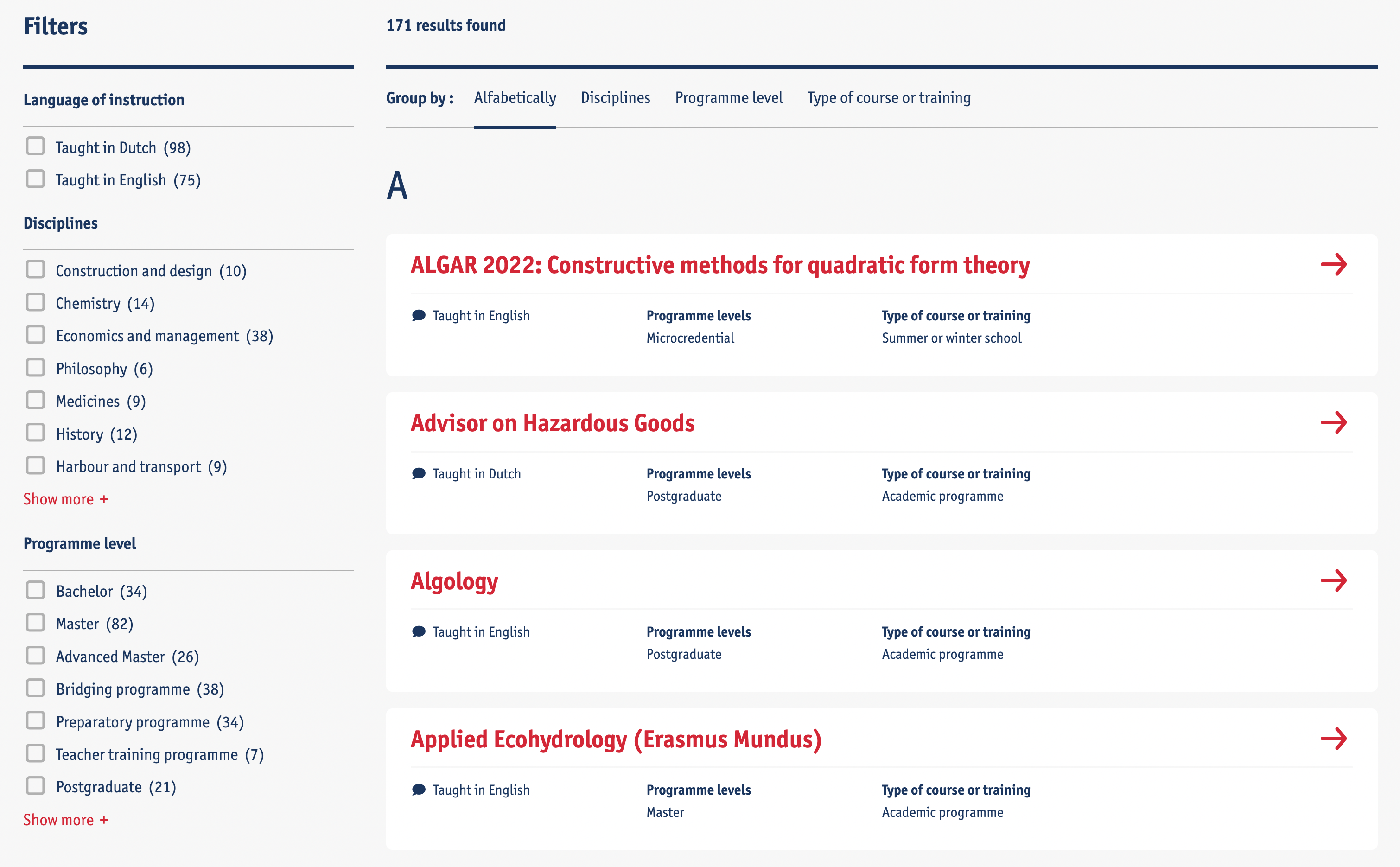
One way to address that is by using an A-Z Index pattern. We identify the top tasks that users perform on the site. For each task, we define a set of keywords that they associate the task with. We run tree testing to ensure that they can find the pages that they are looking for. And then we surface the A-Z catalog of keywords on a single page.
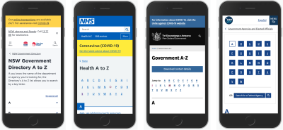
In fact, that’s a very typical approach that many large websites, especially public service websites, will use — alongside search and global navigation. Every keyword is of course a link, driving users to the page of interest.
Sometimes each letter is represented on a separate page, and sometimes vertical accordions are used. In usability tests, the best way to show an A-Z index appears to be by listing all keywords on a single page — mostly because users can use in-browser search to look something up quickly without having to go and explore multiple pages.

To take it one step further, we could also expose relevant information right in the A-Z index. Rather than driving users to a dedicated page, they could choose what information they want to learn — opening hours, location, booking appointment links, etc. — and study that information without ever heading to individual pages.
A good example of a similar idea is University of Antwerp which surfaces useful information directly on the A-Z index page. Of course, this information could also be accessible within an accordion, but then we’d also need a button to open and collapse all accordions at once.
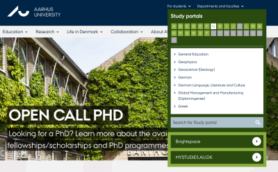
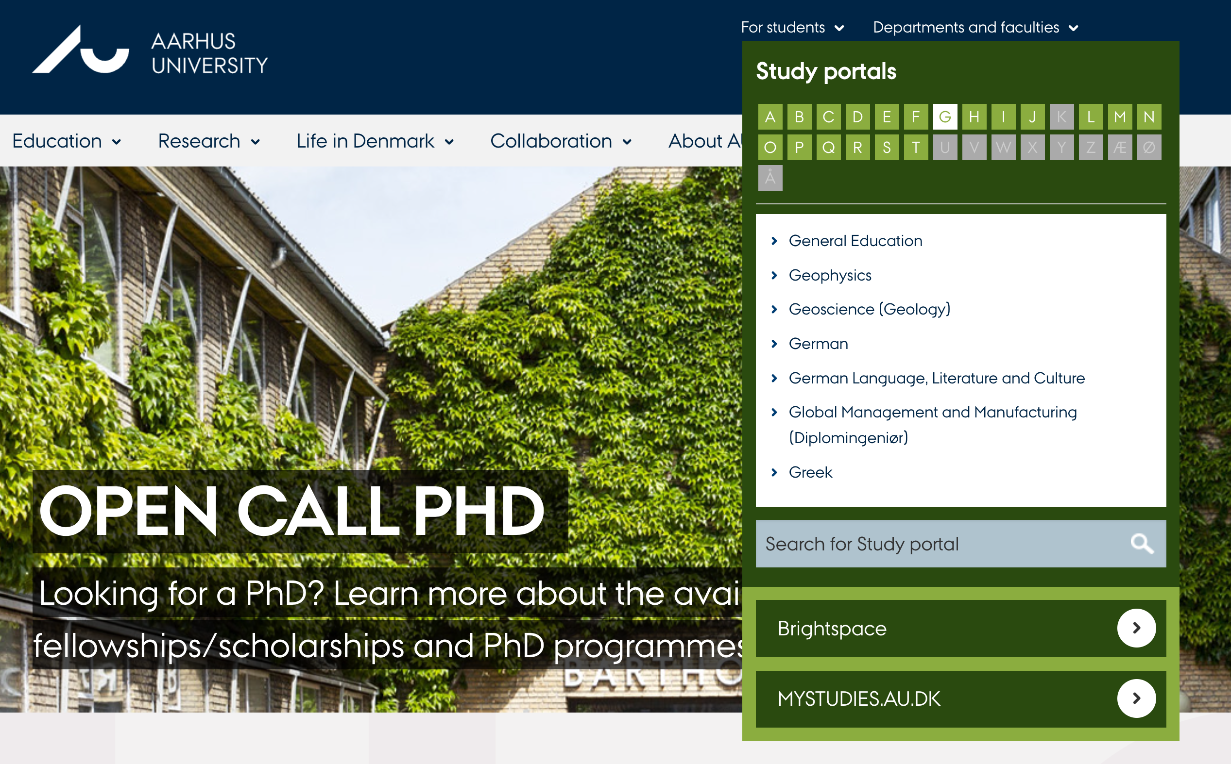
Aarhus University highlights the A-Z index as part of global navigation. Visitors can choose their role first, then choose a letter, and then explore the overview of all options available, jumping to a specific department or faculty.
Most importantly, visitors can quickly jump from any page to any other page. In this case, the A-Z index is permanently accessible in the header of each page. That’s not something other navigation patterns provide out of the box.
The only caveat here is that keywords appearing in the A-Z index have to be thoroughly tested to ensure that users actually find what they need in the index. And sometimes the index is complemented with an in-index search, which is very similar to autocomplete.
Tap-Ahead Autocomplete Pattern
We tend to use autocomplete to highlight relevant keyword suggestions. However, We could also drive users directly to relevant categories, specific products, brands, or even collections of items or records that we’ve prepared ahead of time.
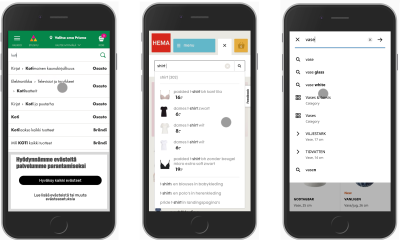
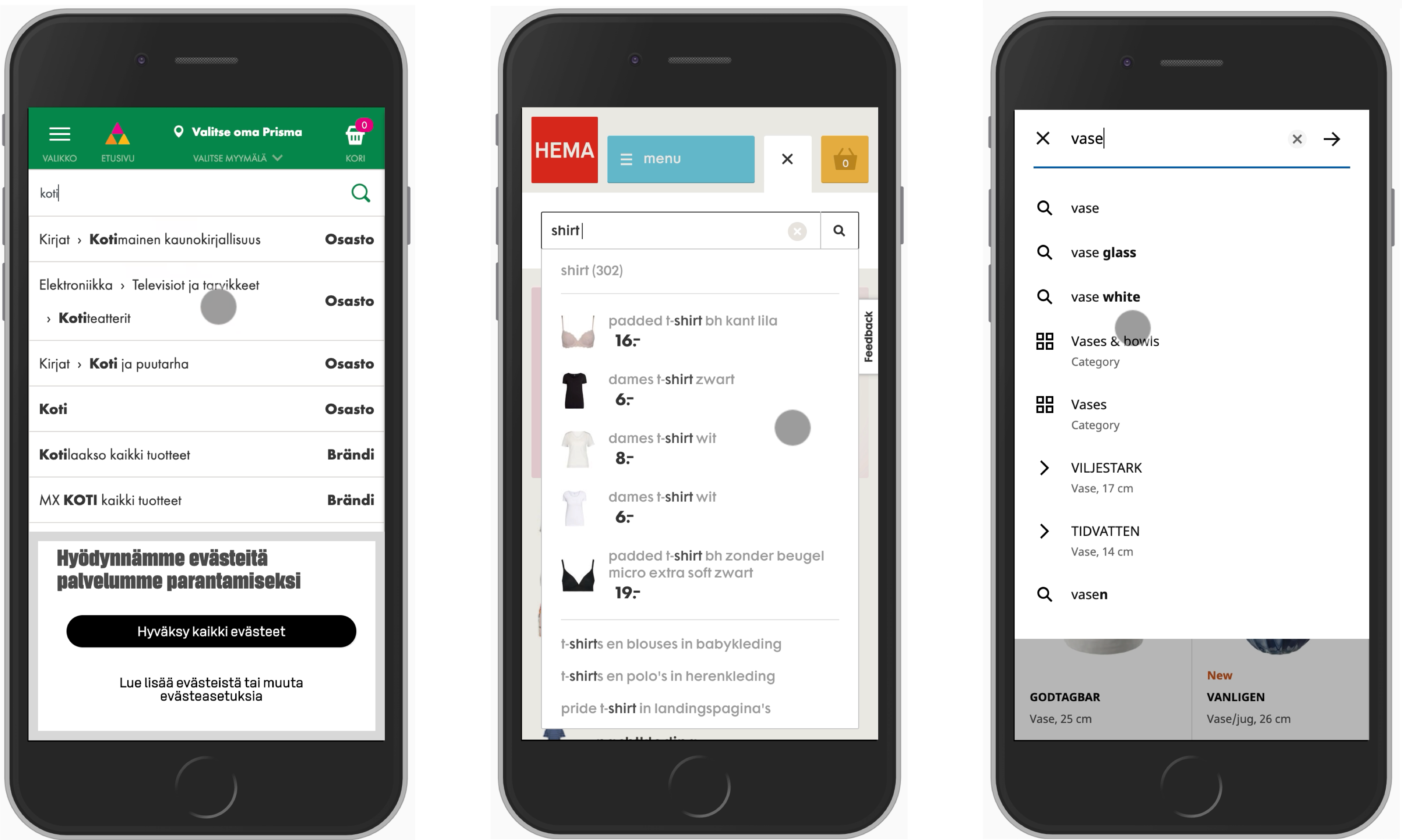
On Prisma.fi, Hema.nl and Ikea.com, autocomplete prompts category suggestions, products, frequent searches as well as products and information about each product, from their length to their prices. Rather than focusing on a list of keywords, the autocomplete actually provides an overview of items that the users might be looking for.
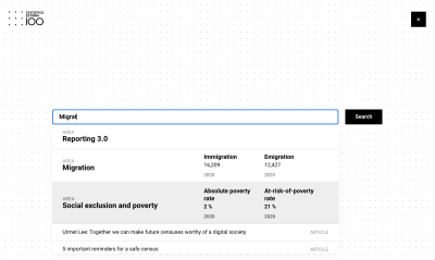
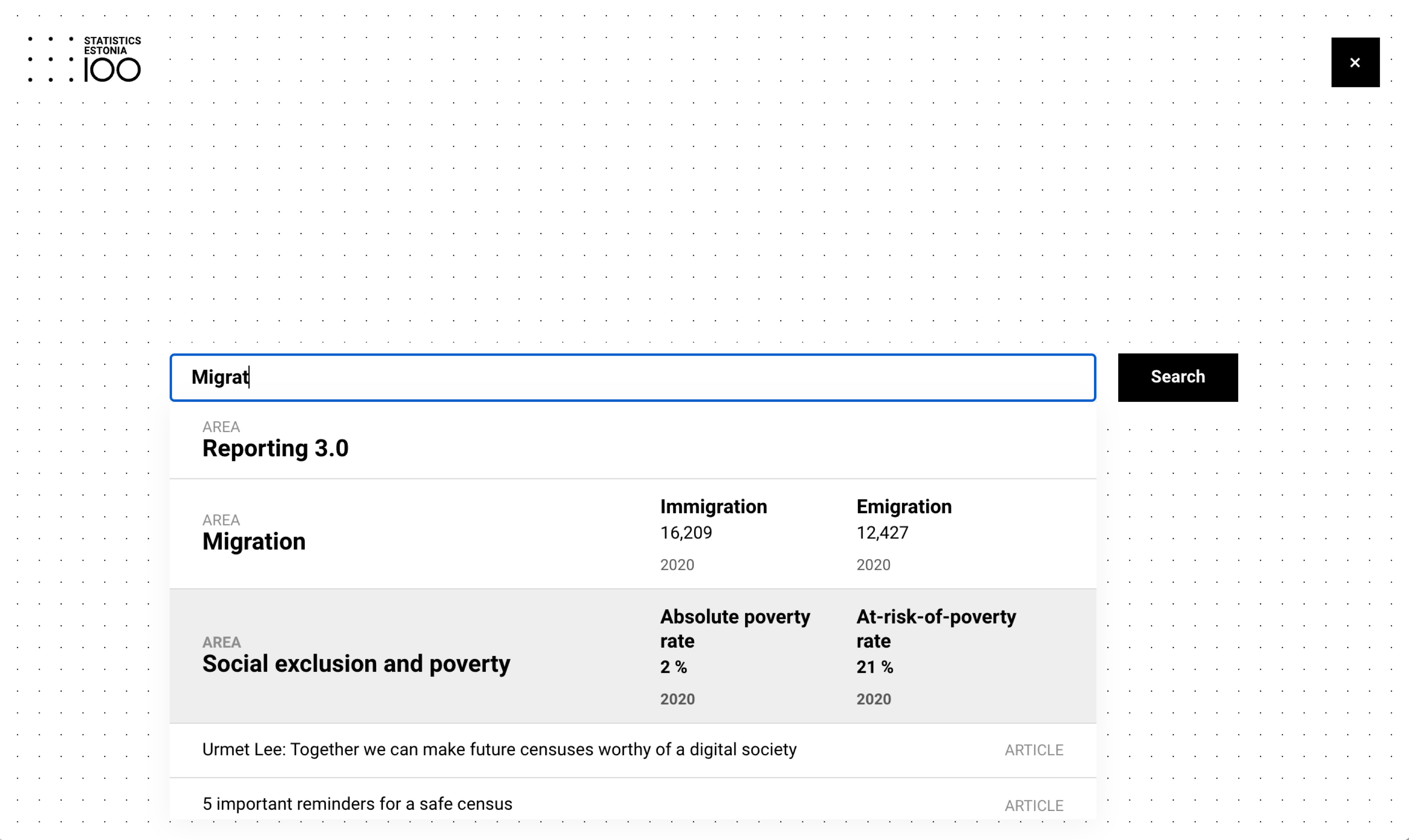
Statistics Estonia 100 highlights an overview of articles but also the actual query results that a visitor might be looking for. Each type of data is marked, along with the recent statistics provided right in the autocomplete.
However, we could also take it to the next level entirely. We can provide users with helpful feedback on their query and guide them towards a better keyword query that would also bring them better results. And that’s exactly what the tap-ahead autocomplete pattern provides.
With tap-ahead autocomplete, we allow users to construct a query based on autocomplete suggestions. As users hit the autocomplete field or start typing a keyword, suggestions appear. Users can either jump directly to the keyword, or append frequently used keyword combinations to their query, hence “constructing” their query based on the suggestions.
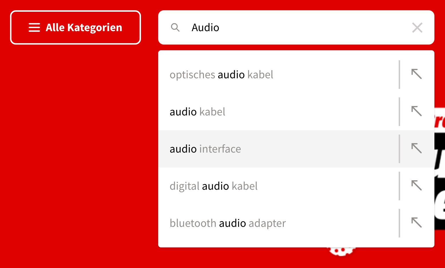
Some large websites are using the tap-ahead pattern extensively. On Mediamarkt.de, users can click through to the keyword that matches the interest, or click on the arrow on the right-hand side. The user’s query is then replaced with the selected query, while still leaving the user within the search input. They can continue their iterations on search queries until they feel confident in specifying their intent well enough.
Tap-ahead minimizes the amount of effort needed for typing, but also drives customers to relevant results and gives them the confidence that they are actually on the right track.

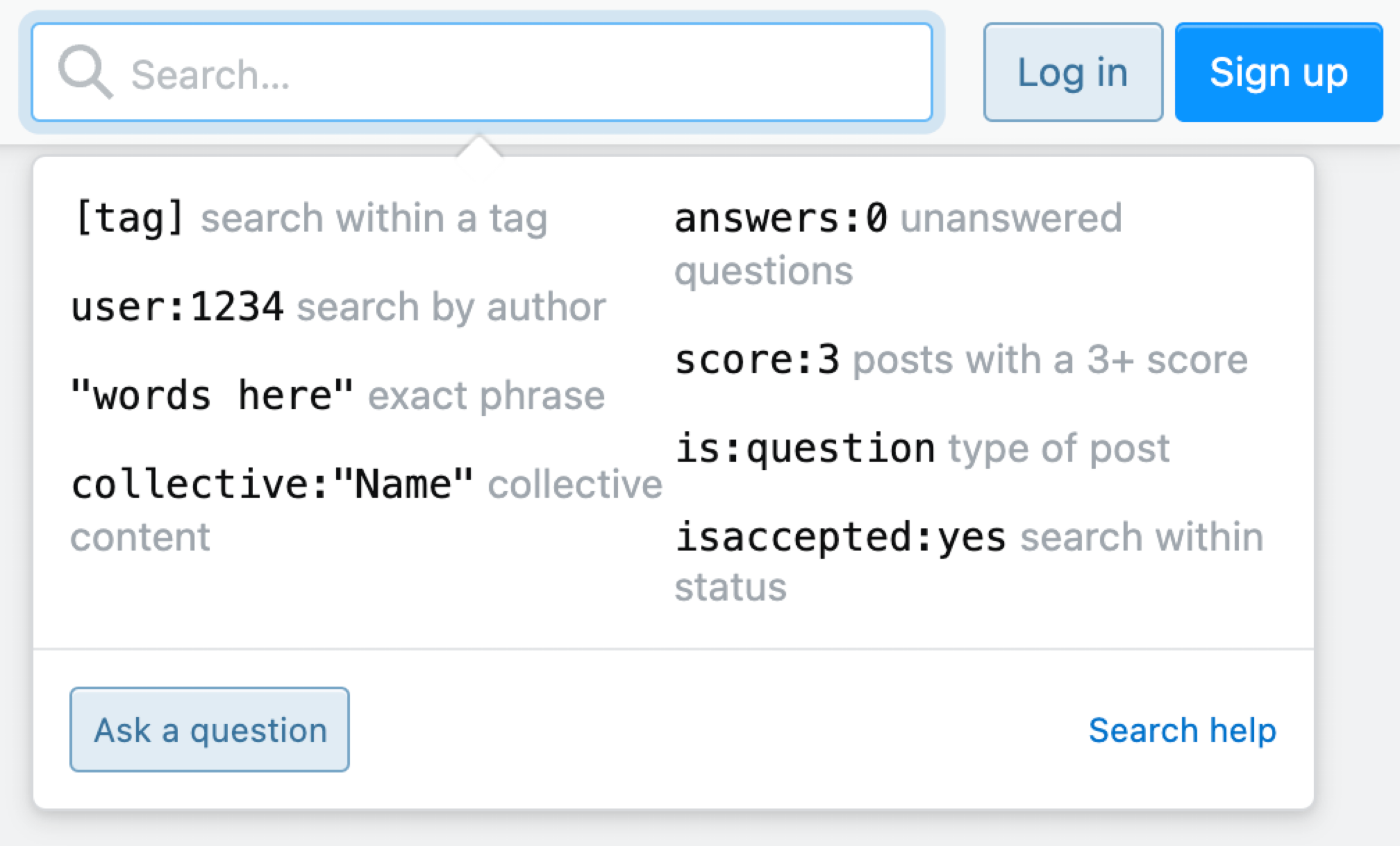
If you are designing an interface for expert users, perhaps slightly more advanced ways to use search might be reasonable. Stackoverflow allows its users to specify a filter right in the search box, without having to rely on filters, tags, or any other modes of navigation. Only focus users receive hints about how to use search in a more advanced way — should they wish to do so.

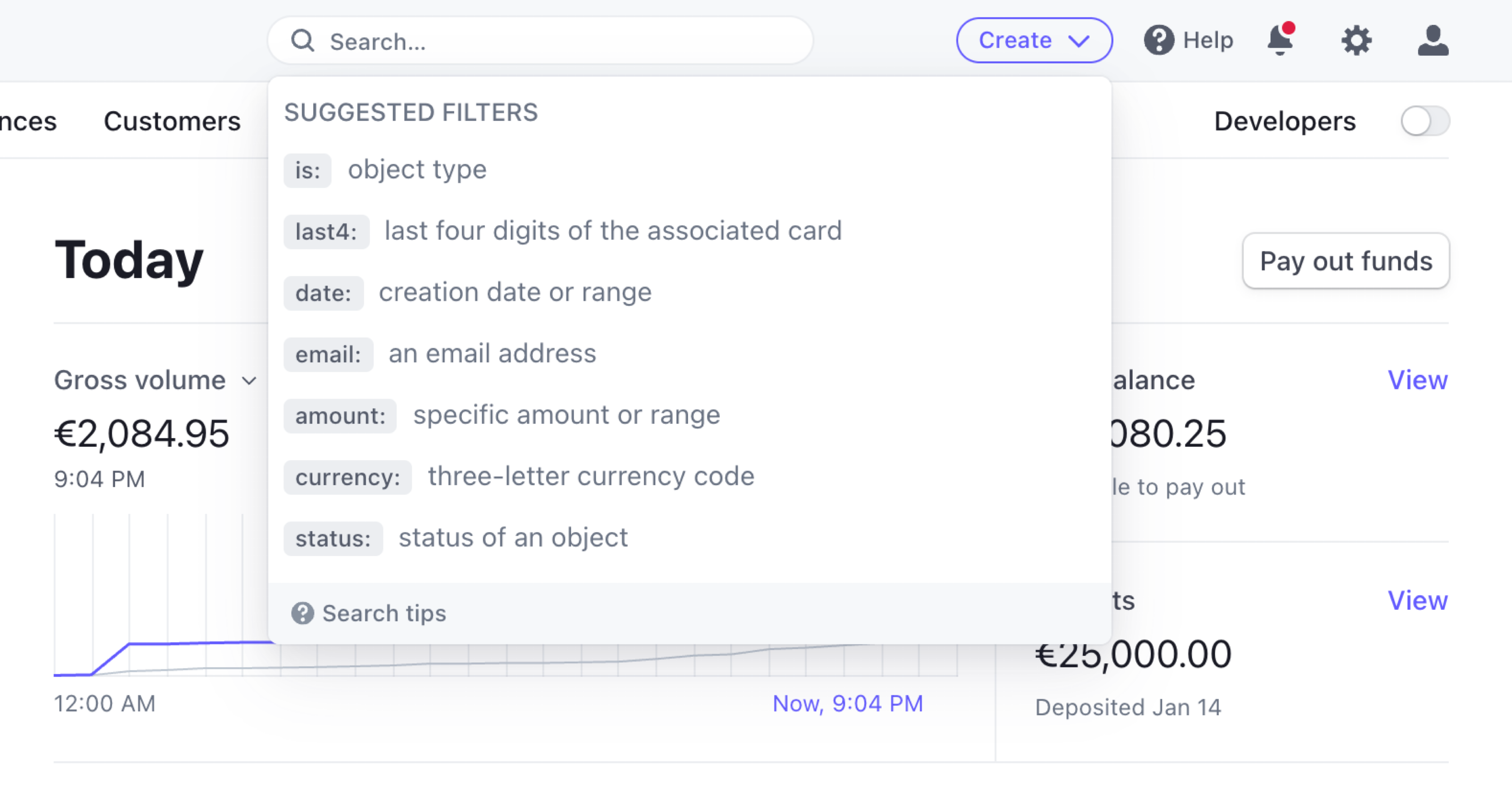
Stripe also allows customers to specify filters right in the search box. Users can focus on typing their query in the search input, and as they do, they also see the results immediately.
Wrapping Up
When designing navigation, we often rely on predictable patterns. That’s a good thing as our outcome is usually predictable, familiar, and hence obvious to our customers.
However, sometimes navigation might be just a bit too tiring and time-consuming, and in such cases, we can use navigation queries to pick up our users whenever they are and gently guide them toward the page that is of interest to them. They are unlikely to help you resolve all IA issues on the site, but they could help users get where they want to be faster.
All the techniques mentioned above can help us get there. By no means do they replace established navigation patterns; they complement and add to the experience, especially on large and slightly outdated websites.
Next time you are working on navigation, consider designing more explorative interfaces for navigation and search; explore navigation queries, evaluation journeys, A-Z index, and tap-ahead autocomplete. They are unlikely to help you resolve all IA issues on the site, but they could help users get where they want to go be, faster. And sometimes that’s just what is needed at the current stage of the project.
Meet Smart Interface Design Patterns
If you are interested in similar insights around UX, take a look at Smart Interface Design Patterns, our shiny new 10h-video course with 100s of practical examples from real-life projects. Plenty of design patterns and guidelines on everything from accordions and dropdowns to complex tables and intricate web forms — with five new segments added every year. Just sayin’! Check a free preview.

100 design patterns & real-life
examples.
10h-video course + live UX training. Free preview.
Related Articles
If you find this article useful, here’s an overview of similar articles we’ve published over the years — and a few more are coming your way.
- Designing A Perfect Infinite Scroll
- Designing Perfect Breadcrumbs
- Designing A Perfect Carousels
- Designing A Perfect Accordion
- Designing A Perfect Responsive Configurator
- Designing A Perfect Birthday Picker
- Designing A Perfect Date and Time Picker
- Designing A Perfect Feature Comparison
- Designing A Perfect Slider
- “Form Design Patterns Book,” written by Adam Silver
 (il)
(il)

