Intuitive Design? No Such Thing!

Email Newsletter
Weekly tips on front-end & UX.
Trusted by 200,000+ folks.
 Flexible CMS. Headless & API 1st


 Register!
Let’s start off by taking a quick glance at the definition of the word “intuitive” presented on Dictionary.com:
“Using or based on what one feels to be true even without conscious reasoning: instinctive.”
At the same time, Cambridge provides us with this definition:
“Based on feelings rather than facts or proof: an intuitive approach/judgment. Most people have an intuitive sense of right and wrong.”
Based on these dictionary definitions, intuition is associated with a gut instinct or feeling that allows us to make decisions with no conscious proof of reasoning. While it may serve us well during various life situations, does our intuition really function to provide us with unconscious guidance when relating to digital interfaces? In reality, the intuitive behaviour that designers strive to create must rely on using familiar design patterns that the users have experienced before. In this context, an intuitive design interaction is not grounded in unconscious reasoning, but from a feeling of familiarity.
As a UX designer, how many times has a client or stakeholder said to you “It needs to be intuitive”. While this is a common request or even a requirement for an interface or software app design, it’s not really something that is easy to measure, or even define.
Most of us have had a gut feeling or an instinct about a decision or an outcome. I have had intuitive feelings about my teenage daughter where I just feel like something bad has happened. I’m not always right (thankfully), but it still feels like a gut impulse tapping into my emotions. If this is an example of how intuition can behave for us in a particular circumstance, it is hard to imagine having these same kinds of instinctive feelings when interacting with an interface.
The truth is, what is intuitive for you or your client, would probably not be intuitive for your mother, for example, or even for their clients. An interface can feel familiar if you (the user) have experienced a similar interface or interaction before, and it is this familiarity that is often referred to as intuitive.
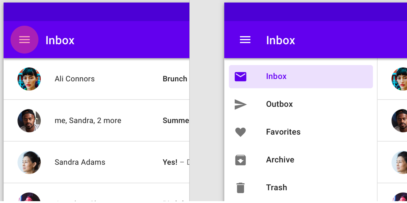
For example, the first time I saw that non-descript hamburger menu on a mobile app, it didn’t intuitively call out to me and say “Tap on me, I’m a menu!”. It was only through tapping around that I discovered that those three bars when tapped gave me a menu. Now, when I see a hamburger menu, I know what it does. Not intuitively, but because I’ve done it before. Nothing instinctive about that.
Here is an example of the ubiquitous hamburger menu.
As another example, take a simple registration form on a mobile app where you need to enter your email address to receive email updates. Because we understand that you need to tap into the field and start typing, it makes sense and is a simple interaction. We’ve all done it many times before. But if my father were trying to use this, he probably wouldn’t understand that you need to tap into the field and start typing. How would he know, unless someone gave him step by step simple instructions.
In an article published by Jeff Raskin, most famously known for starting the Macintosh program at Apple in the late 70s, he says:
“It has been claimed that the use of a computer’s mouse is intuitive. Yet it is far from that.”
When I was teaching Pagemaker (Adobe’s InDesign® predecessor) classes back in the 90s to corporate employees, one action by one of the students in the class still makes me chuckle. I asked the participants to use the mouse to click on the OK button on the screen. One woman picked up the mouse and clicked it on the screen. We can’t imagine anyone doing this now because we have learned how a mouse works, but this demonstrates that it is not an intuitive device.
We know that intuitive design isn’t a thing, but we also know that familiarity with certain types of interactions that we have experienced before are easier to understand. For those users that are even slightly tech savvy, we can make use of already existing and familiar interface patterns to base our design decisions on. These users will most likely recognize these previously established patterns in our interface design, referred to as design patterns. According UI Patterns, design patterns are recurring solutions that solve common design problems.
What Are Design Patterns And Why Are They Important?
Design patterns are important because they provide recognizable interactions so that users spend less time trying to understand how to interact.
Reducing time and effort for users will create a better user experience and minimise the time spent on achieving an outcome. For UX designers, the benefits are in the time saved by not having to reinvent a proven design component.
Below is a pattern template table that provides a structure for defining or identifying patterns, originating from the authors of the book Design Patterns. Although this was originally aimed at software developers, most of the criteria are relevant to UX designers.
| Term | Description |
|---|---|
| Pattern Name | Describes the essence of the pattern in a short, but expressive, name. |
| Intent | Describes what the pattern does. |
| Also Known As | List any synonyms for the pattern. |
| Motivation | Provides an example of a problem and how the pattern solves that problem. |
| Applicability | Lists the situations where the pattern is applicable. |
| Structure | Set of diagrams of the classes and objects that depict the pattern. |
| Participants | Describes the classes and objects that participate in the design pattern and their responsibilities. |
| Collaborations | Describes how the participants collaborate to carry out their responsibilities. |
| Consequences | Describes the forces that exist with the pattern and the benefits, trade-offs, and the variable that is isolated by the pattern. |
Source: What Are Design Patterns and Do I Need Them? by James Maioriello
To explore the idea of design patterns further, below are some examples of common design patterns as found on the UI Patterns website. This site is a great reference tool for designers to help recognize existing patterns for use in your design process. While there are too many design patterns to include here, I chose the following patterns as ones I have used over the years.
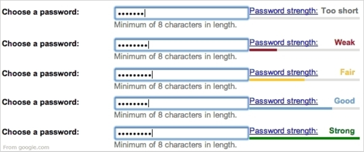
Password Strength Meter Design Pattern
This pattern provides the user with both instruction and feedback on their interactions.
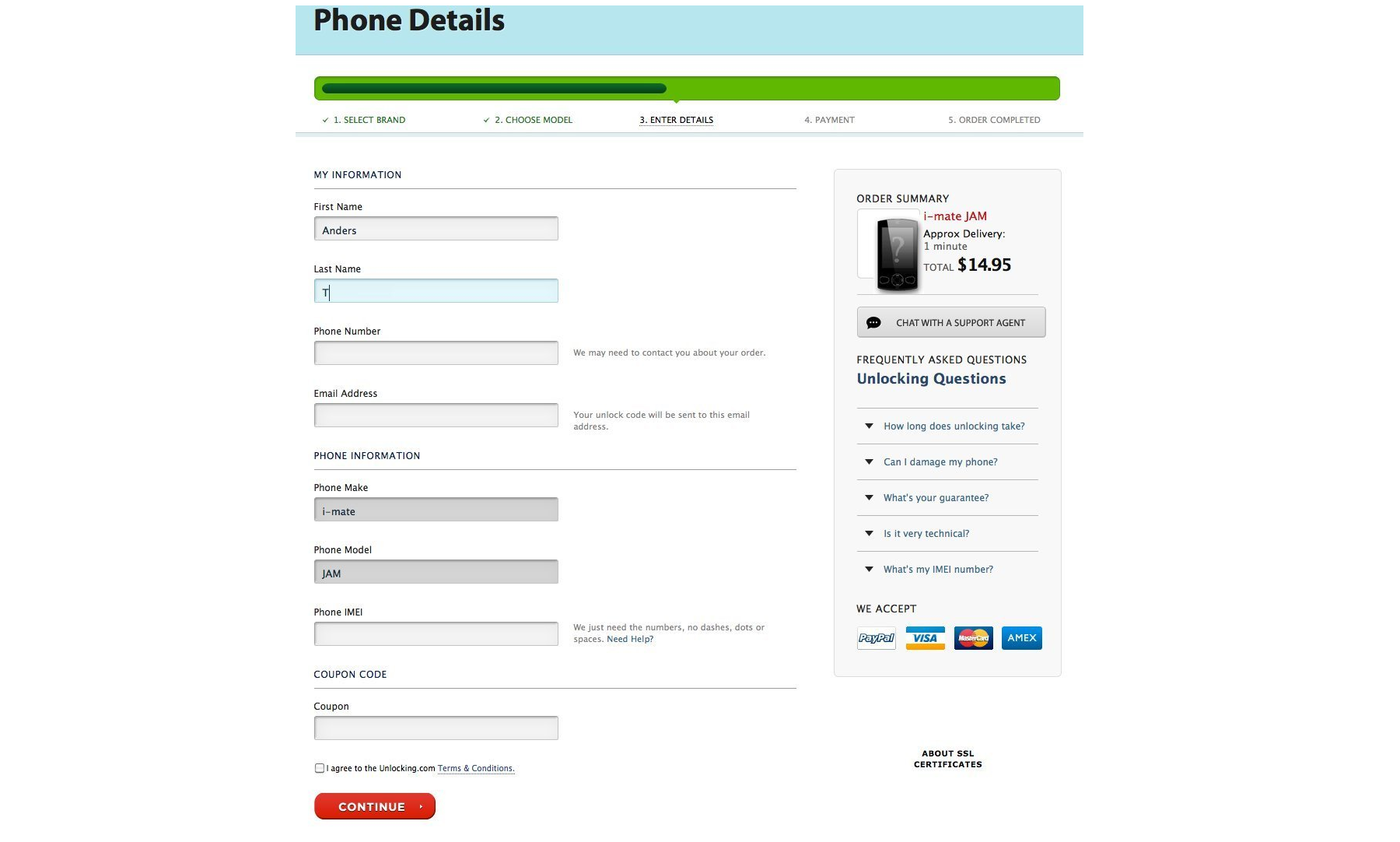
A wizard is another common design pattern that you may have encountered. It’s often used for form-based interactions where the user needs to complete a predefined sequence of steps. The wizard structure is used to direct the user through each section of the process.
Wizard Design Pattern
Wizards are used when you want to guide a user through a series of steps to achieve a single goal. The pattern below indicates where the user is in the process, a summary of completed steps on the right, contextual help, and a CONTINUE button to move to the next step in the process. All these components as commonly used in a wizard pattern support the users interactions by providing context of what they’ve done, what step they are at, and what to do next.
Calendar Picker Pattern
This pattern is used when the user needs to add in a date or dates to complete a task. It’s important that a date could also be entered in a text field if this is a more efficient or preferred way to do so. In this example, a calendar icon indicates that there is a calendar drop down, which is a commonly used pattern. Calendar widgets like this don’t always work well when you have to choose a birth date unless you have the ability to change the year easily.

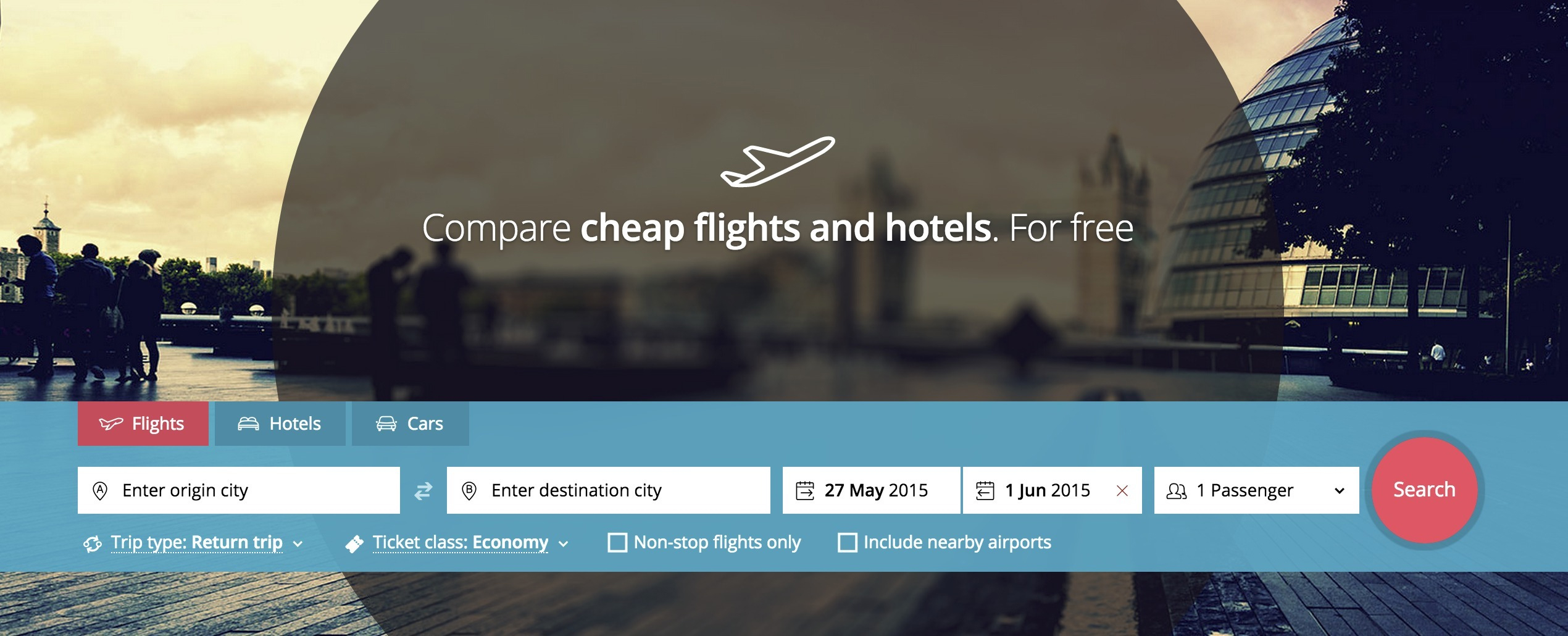
Form Defaults
Form defaults can be used to pre-fill certain form fields to match a typical user selection. It creates a quicker and easier way to complete a process. This travel site has prefilled data for dates based on the current date, and also the number of passengers.
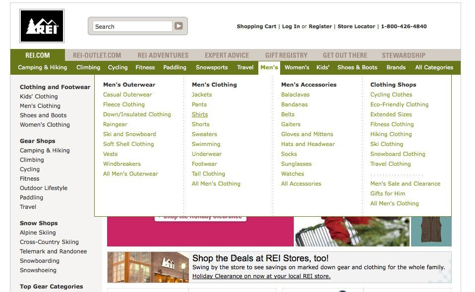
Navigation Tabs
Navigation tabs are commonly used to break up content into distinct categories and to visually indicate what content you are viewing. The example here demonstrates a content rich website with the first tab selection displaying the subcategories and a third level below.
When you are implementing an existing design pattern in your design, it’s all about using the pattern to create context, as well as familiarity for the user. You may need to adapt any existing pattern to provide this context, as described for the calendar picker widget.
We’ve explored the pitfalls of “intuitive design” and how we can mitigate this with design patterns. So if we utilize common design patterns to reduce the cognitive load for users, how do we introduce new design patterns when we are designing something fresh and innovative? Let’s look at this concept by investigating this in the context of emerging technologies.
Why Design Innovation Can Be Risky
Any design that is new or unfamiliar to a user will create a learning curve that we as designers strive to minimize or eliminate altogether. How do we balance the need to innovate quickly, while still providing a solid, contextual experience that makes sense to our users?
By considering the business outcomes, carrying out enough user research to ensure a good market fit, and user testing your design flow with the intended audience, we can ensure that our design solution hypothesis can be validated as much as possible. This helps to mitigate the additional risks inherent in any product or service design execution. Ideally, we can design to incorporate interactions that measure the users level of comprehension and allow them to personalize their path to achieve their desired outcomes in an unknown environment.
Innovation With Artificial Intelligence
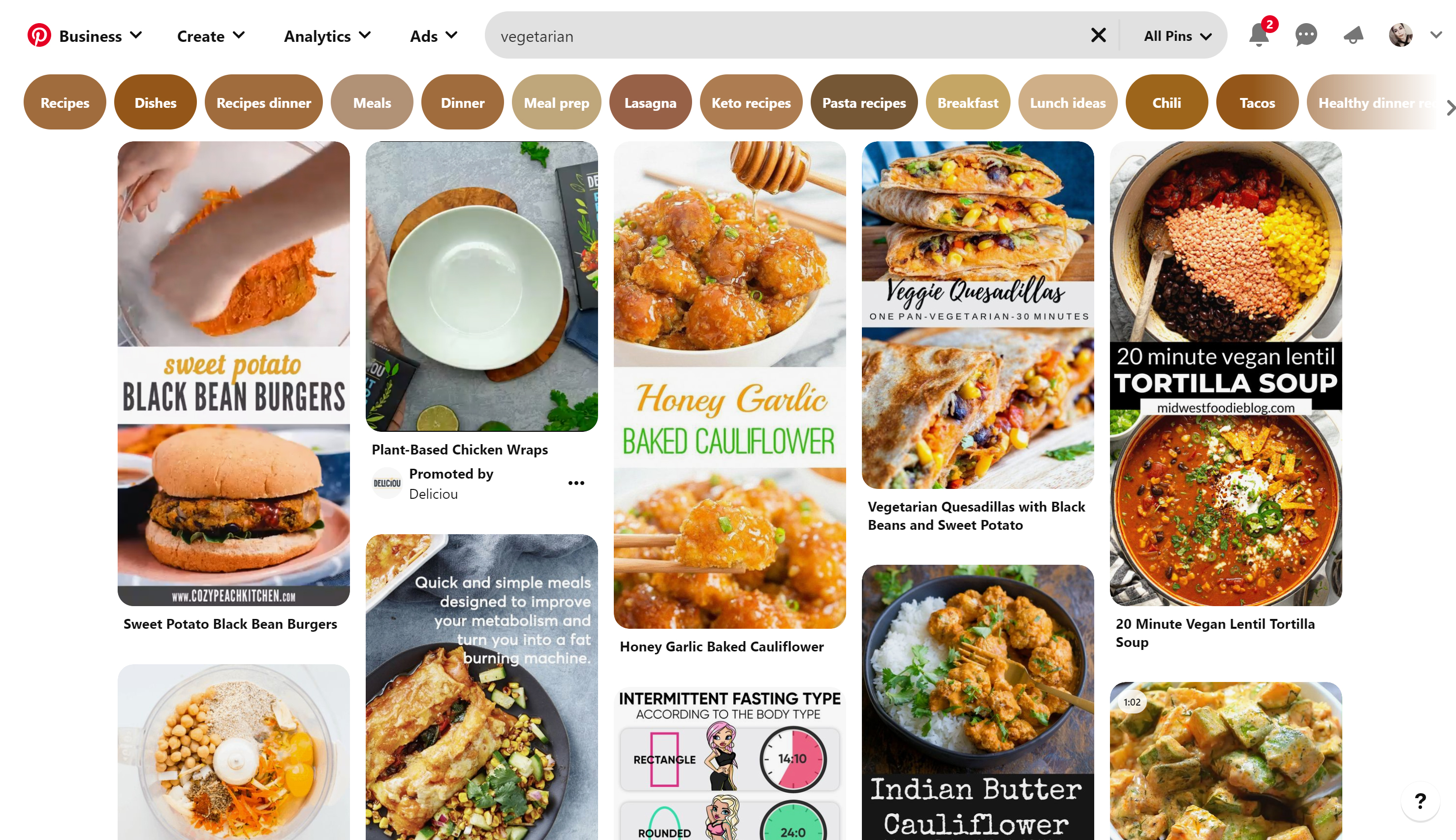
Artificial Intelligence (AI) technology is innovating all the time, but organisations still manage to create a good user experience with these advancements. For example, Pinterest’s AI is used to understand the intention behind a simple search to deliver highly personalized results. According to this article in Wired, 80 percent of users are more likely to make a purchase if their experience is personalized.
Below is an example of a search for “vegetarian”. Pinterest uses an AI engine to return a whole lot of related topics to allow discovery and displays them as tags across the top of the page.
AI is fast becoming integrated into many products and services. AI relies on big data and can be used to create interventions or notify the user to take a specific action (or not). This can create a more passive experience for the user as previously manual tasks are automated behind the scenes.
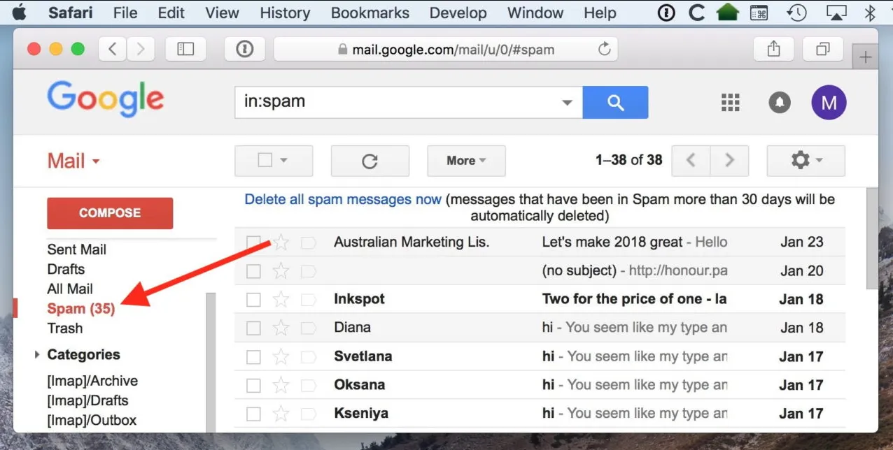
For example, a spam filter that is used in your email account automatically moves suspicious emails into a junk folder, without any user intervention required. Google has been using AI and rule-based filters for years, but continuing innovation now sees the ability for Google AI to recognize those weekly newsletters you may not be interested in moving them straight to the spam folder. The Google spam filter can now identify and respond to individual preferences.
Where to from here? With technology advancing at a rapid pace, let’s explore how interfaces may evolve in the coming years.
The Future Of Interfaces
If interfaces don’t provide natural interactions for humans, what can? Speaking is our natural communication tool and advances in technology have seen speech recognition devices come into our homes and our lives.
It’s no secret that large design driven software developers, such as Apple, Amazon, Google and Microsoft are all investing in speech recognition and natural language technologies. Advances in this technology could see us relying less on interacting with interfaces for our desired outcome. Personalisation and context is the key, although it means that our devices will need to use our data to learn about our habits and desires to provide a truly personalized experience.
Picture a world where we can simply talk to our device and ask for what we need, and better still, we can be asked for or given what we need at exactly the right time by our device. Wait, isn’t this what Siri already does? Yes, but there is so much further to go.
Bill Stasior, Apple’s former Siri chief, says that the next advancements to virtual assistants will see improvements to the understanding of how people naturally speak.
“I think everyone learns what commands work with the assistants and what commands don’t work with the assistants. And while that’s improving very rapidly right now, I think there’s still a long way to go.”
— Bill Stasior
Although there has been major advancements in the use of natural language processing since 2011 when Siri was first released, we will see it become more mainstream and more advanced across multiple industries such as health and education over the coming years. This could be life-changing particularly for older people that are not tech-savvy.
For instance, imagine an older person who needs medical attention simply talking to their device to arrange a doctor’s visit. Or the patient is given medical advice based on their medical history and current symptoms. Imagine someone suffering from mental health issues being able to talk to an artificial intelligence bot for advice or to just to relieve loneliness.
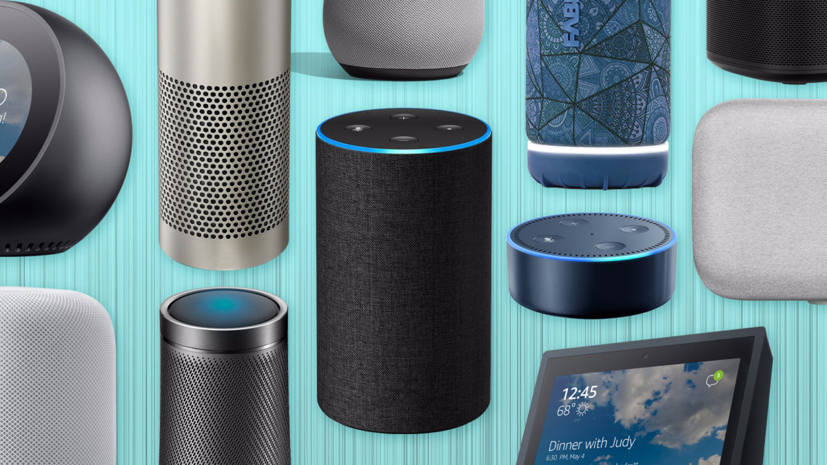
There is already an array of “virtual assistants” that have been designed for the home market that use speech recognition technology. Below is an image displaying the “smart speakers” that are readily available for the consumer market.
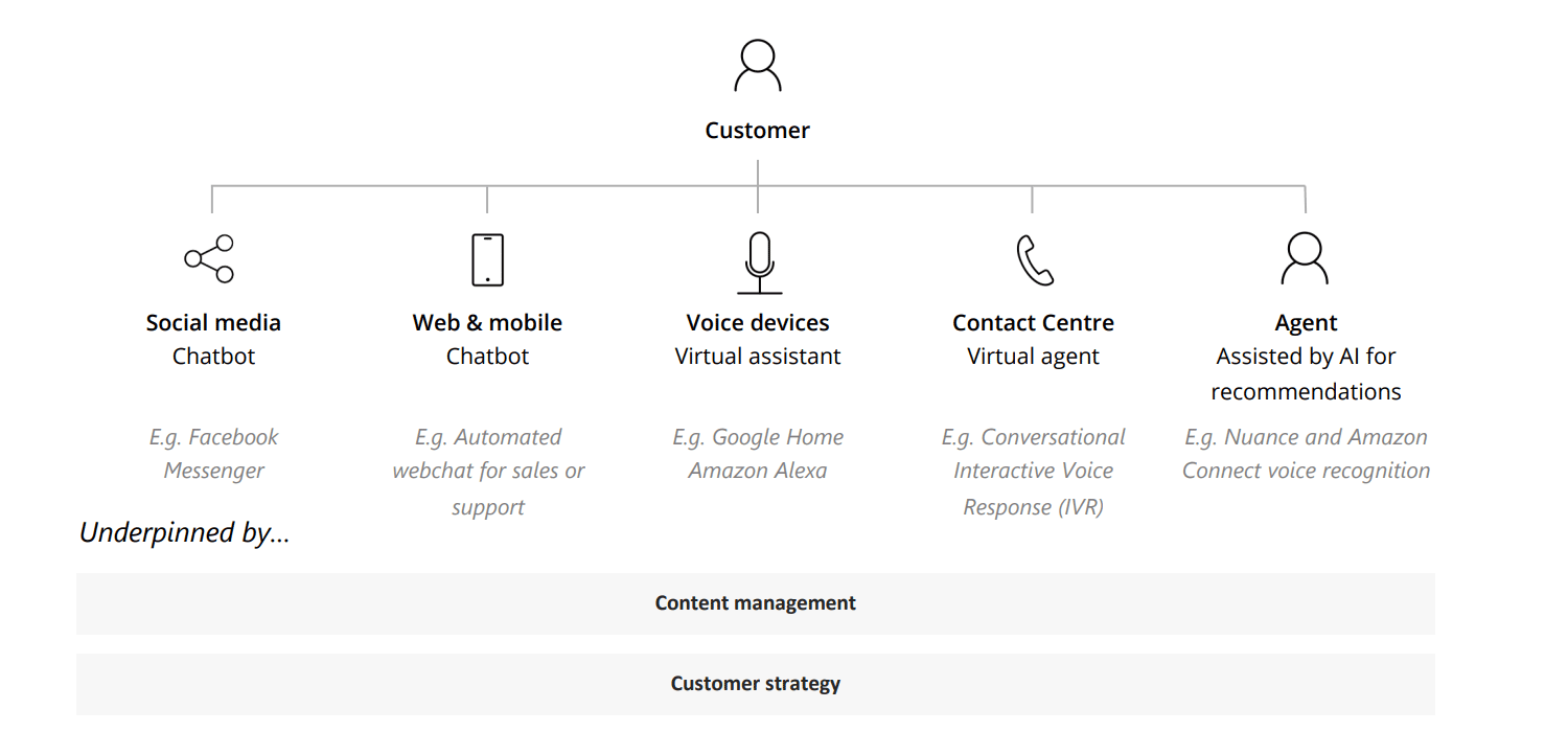
Although speech recognition channels may not require a typical user interface, they still require a design process to create an usable outcome. The diagram below illustrates conversational AI touch points as described in this article by Deloitte Digital.
In order to design effectively for speech recognition tools, Deloitte suggests that the following aspects need to be considered:
- The business objective and outcomes.
- Carrying out testing, and tuning. The algorithm needs to account for pronunciation across different geographical locations, natural pauses in conversation, and pitch and pace that may convey emotion.
- Consideration for the given scenario, rather than attempting to design a broader outcome.
- Ongoing iterations and improvements. By focusing on a clear goal, designers can continue to enhance their voice assistants to be more human sounding with each new iteration.
What Does All This Mean For The Common User Interface?
Will the pervasiveness of natural language recognition technologies see the death of the user interface as we know it? While no one can accurately predict the future, the fact remains that we are still visual creatures, and we still need to see things as part of our learning process. Research shows that the human brain processes images 60,000 times faster than text, and 90 percent of information transmitted to the brain is visual.
For example, can you imagine having to make a purchase decision on a clothes item by listening to a description of it rather than seeing an image of the item? As they say, a picture is worth a thousand words, and in many instances an image is a much more powerful way to convey meaning. While we could still specify what we are searching for by speaking, in many scenarios we would expect to see an image as part of the response. And what if we didn’t know what we were looking for, we would still need the ability to browse through the available options.
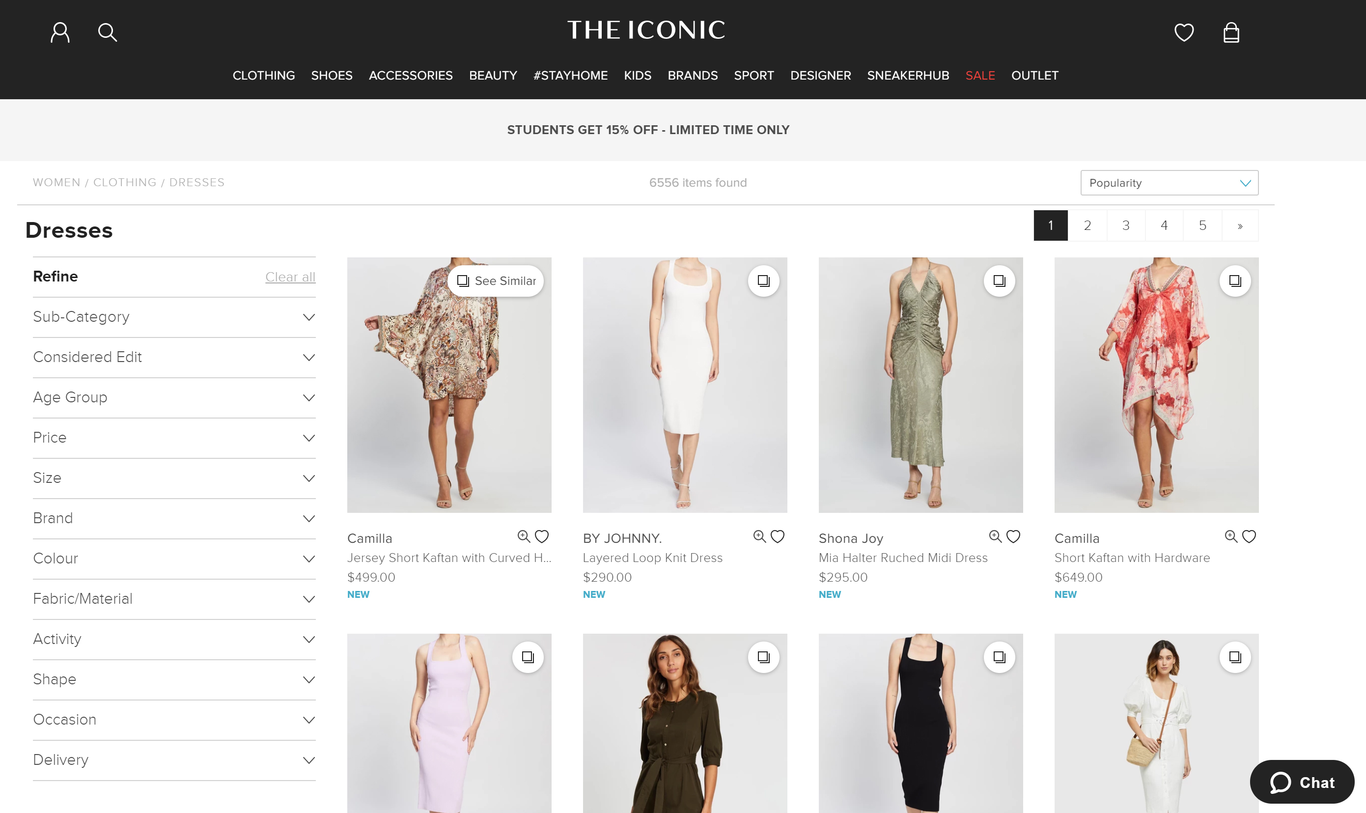
Below is a typical example of an e-commerce site where images are an integral part of how we make purchasing decisions.
Another recent technology that is becoming more pervasive is Augmented and Virtual reality. Let’s explore what it means and how it is applied.
What About Augmented And Virtual Reality?
Then there is the world of augmented and virtual reality. Augmented reality is the integration of digital elements into a live camera view commonly used on a mobile phone, and virtual reality is an fully immersive experience in a digital world typically using a headset. Applications of these technologies have already been applied to areas such as education, retail, training, navigation, entertainment, health and enterprise, and the future applications are limitless.
For designers, it’s a new and exciting world that can involve creating new design standards. This article from Toptal describes the main considerations for designers venturing into this space. Firstly, the design moves from the 2D world of interfaces into 3D design, where an understanding of spatial design and UI elements is required. There are new input elements for users that may involve gestures, eye movements, and voice which are very different from the standard 2D interactions that we as designers are familiar with.
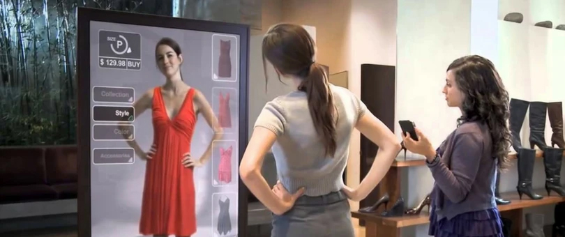
The image below illustrates an example of how augmented reality can be used in retail scenarios. Here, the customer is able to virtually try on clothes without the need for a physical change room.
Conclusion
We know that intuitive interfaces are difficult to define, design patterns are important, and natural speech, AR and VR technologies are advancing at a rapid pace. With the continued innovation of artificial intelligence and its integration with speech recognition, AR and VR, we will see increased personalization as our software learns about us and in turn, assists us in our interactions. As designers, we can learn to adapt our design solutions to fit the context of these emerging tools.
While the future of the interface as we know it is uncertain, the interface as a tool is going to be around for a long time to come. As designers, we need to ensure that we can design and importantly, test our designs to validate the market fit and usefulness. Here’s to a world where speech recognition, virtual reality and interfaces work seamlessly together to provide us with constantly enhanced life experiences.
Further Reading on SmashingMag:
- Better Notifications And Permission Requests
- Speed Up Your Website With WebP
- Tips For Managing Design Systems
- A/B Testing For Mobile-First Experiences


