Improve Your Designs With The Principles Of Closure And Figure-Ground (Part 2)

Email Newsletter
Weekly tips on front-end & UX.
Trusted by 200,000+ folks.


 Register!
 Flexible CMS. Headless & API 1st

Have you ever wondered how elements come together to create successful designs? It’s no accident that compelling design just seems to work. What most of these designs have in common is the use of gestalt grouping principles to organize information that helps us understand the relationships and differences between elements. As designers, we can use these principles to create our own engaging and successful work.
Let’s begin with the Gestalt principle of closure.
Closure
According to the Universal Principles of Design, this principle states that we have a tendency to perceive a set of individual elements as a single, recognizable pattern, rather than multiple, individual parts. Using closure effectively decreases complexity by reducing elements to the fewest possible parts needed to complete an object. Provided with enough information, we will fill in the missing parts to create a whole. This is achieved through the use of positive and negative space.
In the example below, our minds complete the lines to form a circle, even though the shape doesn’t exist. Positive and negative space combine to form our perception of the circle.

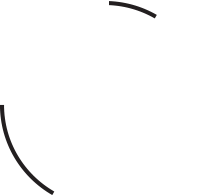
Closure can be used to make us perceive objects or patterns using the smallest amount of information. Our minds are so eager to fill in the missing information that it can be done with very few elements. However, if we don’t provide enough information to complete the pattern, then we cannot perceive the object and closure fails, making the circle much more difficult to form in our minds. Take a look and see if you can complete it in your mind. It’s a lot more difficult, isn’t it? We can’t quite put it together now with the sparse amount of information given.
Creating Effective Closure
The examples above are very basic illustrations of how we perceive patterns to form closure. In reality, there are many visual elements that we can use to help us form effective closure:
- Positive and negative space. As mentioned earlier, positive and negative space combine in closure to form a whole. This can be achieved by looking for the hidden forms in the negative space of a design or within type. Additionally, removing elements from the foreground can create interesting negative shapes, and in doing so, simplify a design.
- Contrast. Key to forming closure is creating a strong contrast between the foreground elements and background. As always, black and white creates the best contrast, but you can also experiment with complementary colors for strong contrast as well.
- Color. Color not only adds life to a design, it also can be used to reinforce relationships, especially if using abstract shapes to represent forms.
All closure uses many if not all of the above visual elements. Using these and experimenting with reduction in your designs will help you discover new forms. Let’s now take a look at closure in the real world and see how it all comes together.
Closure In Practice
Using closure, we can reduce the elements needed to convey visual information, reducing complexity and making designs more engaging. One of the more common uses of closure is in the design of company logos, precisely because closure can simplify a design to quickly convey a brand’s identity.
Seen below is the famous logo we recognize as the NBC peacock. In comparing the current logo (on the right) with the old logo, you can see that they’re not wildly different. But by reducing the elements and working with negative space, the current logo becomes much more simplified and elegant. Closure is successfully achieved using tightly grouped, positive shapes as feathers, with our perception of the peacock’s body formed through the use of the negative white space in the middle.
Another well-recognized logo that employs closure successfully is from FedEx. In this logo, closure is achieved with negative white space, using the parts of the uppercase E and the lowercase x to form the familiar forward-moving arrow. The designer experimented with many designs, eventually pulling the letters closer and closer together until he saw the arrow forming between the e and x. This shows that experimenting with reduction in your designs, and looking for the spaces in between, can yield fantastic results. For the story behind the creation of the logo, check out Matthew May’s great article at Fast Company. Can you see the arrow in the logo? You’ll never miss it from now on!
The examples above are well-known logos that use closure in somewhat obvious ways. However, there are less famous logos that use closure more subtly. For example, Houzz employs closure more conceptually. At first glance, the green, black and white shapes may resemble a shelf, part of a building, or wall pattern, suggesting what the website is about. But a closer look reveals something else as well. Our mind’s desire to fill in the spaces and complete patterns allows us to combine the separate shapes into a whole, forming an uppercase H in three-dimensional space.

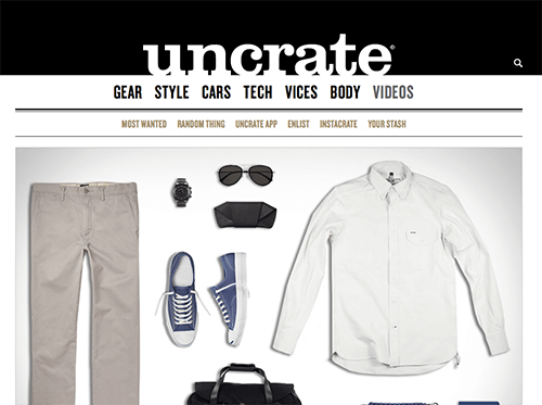
While closure is great for the creation of interesting logos, it can work in other ways as well. Websites can also use positive and negative space in the design of their interfaces to produce effective closure. Below, the Uncrate logo uses positive space against a black, negative background to form the letters of its logo and create the branding of the site. This is also a good example of figure-ground which we’ll get into shortly.
Using Closure When Creating Icons
Icons are useful for when we need to convey a message or reinforce a concept within a small space. They need to be simple and stripped down to their basic elements to help people quickly understand their meaning. Closure works well in the creation of icons, utilizing positive and negative space to decrease complexity, while still suggesting shapes or objects that we perceive as wholes, as in these examples from the Noun Project’s website.
Abstract Closure
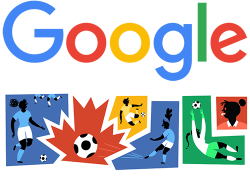
Closure can get quite abstract and still allow us to form recognizable patterns. One of my favorite uses of closure is in the Google doodle. Google employs closure often in its doodles, relying on our inherent need to fill in the missing information to create a whole object. Google doodles depend on our familiarity with the Google logo which allows us to read the image below despite containing very abstract shapes. Here, color helps to reinforce the relationship between each letter of Google’s logo as well.
As you can see, using positive and negative space creatively, and reducing elements in our designs, we can create some really interesting designs with closure. We can take advantage of the need to fill in the missing parts to decrease complexity and simplify our designs. Next, we’ll take a look at how we can use positive and negative space to create good figure-ground relationships.
Figure-Ground
What is the principle of figure-ground? According to Universal Principles of Design, figure-ground is the state in which we perceive elements as either the objects of focus or the background. Like closure, figure-ground works through the use of positive and negative space. Figure-ground exists in practically everything we visually perceive, whether a scene, a composition, a website, a logo or an icon.
Figure-ground is stable when objects are distinguishable from the background and the background holds no interest. Stable figure-ground provides a setting for objects and allows us to focus attention where we want it. For example, we perceive the image below as a circle on a background. The circle is the focus and holds our attention while the background is of little interest. This example exhibits strong figure-ground stability as the figure has shape and is perceived to be in front, while the background is shapeless, continuing behind the figure at a further depth.

When figure-ground is not stable, as in the example below, perceptual ambiguity is introduced and the relationships between elements become unclear. In this deliberately oversimplified example, the figure and ground are reversible, causing us to alternate between seeing one item and then the other as the figure and then the ground.

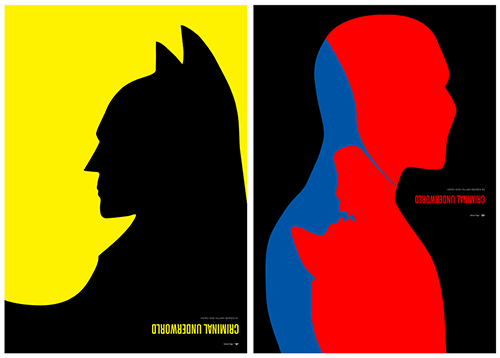
However, ambiguity isn’t necessarily a bad thing. This lack of stability can be used to our advantage when designing. Purposefully destabilizing the figure-ground relationship can introduce discord or tension, adding excitement and interest to our designs. One of my favorite uses of this tension in figure-ground is in the Criminal Underworld poster series by Simon C. Page. Here, Page deliberately destabilizes figure and ground, pitting the principle against itself as figure and ground battle it out for our attention, much like the hero and villain in the poster battle against one another.
Creating Good Figure-Ground Relationships
There are many visual elements that we can use to reinforce the figure-ground relationship in our designs. Using these elements can help us focus attention where we want it, assisting in the memorability of a website or other design:
- Contrast. White or black, paired with color, as seen in the Criminal Underworld posters, creates very strong contrast. Likewise, complementary colors are excellent for creating contrast. If pure colors are too intense, alter the value (how dark or light the color is) to create more effective contrast.
- Color. Warm colors, such as yellows, oranges and reds, are perceived as approaching and can be used to strengthen figure. Cool colors, such as purples, blues and greens, are perceived as receding and can be used to strengthen ground.
- Size. When a large element fills the majority of the ground, it will be perceived as the figure. Conversely, a small element within a large ground will be perceived as the figure.
- Position. Elements positioned in lower areas will be perceived as figure while elements positioned in upper areas will be perceived as ground. This plays with our perception of distance, as we perceive objects positioned in lower areas to be closer to us and objects positioned in upper areas to be farther away.
- Focus. Elements that are in focus will be perceived as figure while elements that are out of focus, blurred, faded, or tinted, will be perceived as ground.
Most good figure-ground relationships are created with a combination of many of these visual elements. Next, let’s take a look at some real-world examples and see how these elements work together to create successful figure-ground.
Figure-Ground In Practice
The example of figure-ground in the Criminal Underworld poster series above shows the principle in an unstable state, where figure and ground battle each other for attention. Unstable figure-ground works well when there are few elements and the design is simple. However, this may not necessarily be the desired use of the principle when we’re designing websites, although that depends on the content and context of the website. Websites need to convey complex information and still be clear and usable. With stable figure-ground, we can guide attention where we want it and avoid any ambiguity of the message we’re trying to communicate.
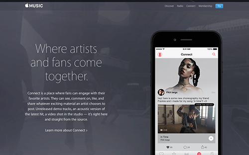
Take a look at the example below from the Apple Music website. Most likely, your eye is drawn to the image of the smartphone, which, along with the copy to the left of it, are the figure elements. While the background begins to fight for our attention, the figure elements are enhanced through the use of multiple visual elements. First, figure is strengthened through large copy and the large size of the smartphone. Positioning the smartphone at the bottom of the screen also assists in bringing figure forward. The figure is further enhanced by tinting back the video animation in the background, causing ground to recede. Finally, contrast between the bright screen and the dark background provide good separation between figure and ground.
In the next example, from Naya’s website, the size of figure is the strongest visual element used to create good figure-ground. Here, we perceive the woman (and her very large hat!) as figure as she fills the majority of the ground. Furthermore, the use of a cool color in the background, as well as clever use of overlapping elements, assists in helping the background recede. Finally, like the Apple Music example, there is good contrast separating the foreground from the background.

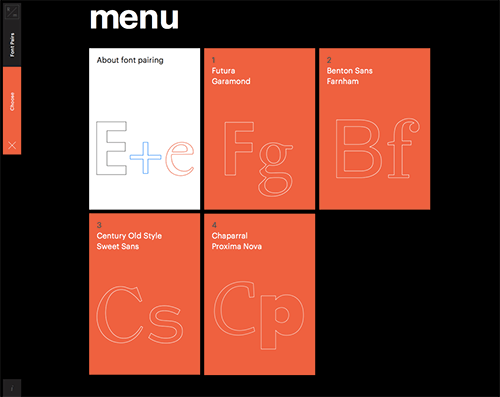
Finally, excellent contrast between figure and ground is the strength of R/m Design School’s website. Here, the menu exhibits strong contrast, using bright color and black to separate figure from ground. In addition, warm color is used to strengthen the perception of the figure coming towards us. Don’t you just want to reach out and grab those red tiles!
Conclusion
Understanding how to use closure and figure-ground will help you build strong relationships and differences between elements in your designs.
- Look at the negative space just as much as the positive space to discover interesting forms;
- Play around with removing elements in the foreground and use the negative space to form shapes instead;
- Finally, mix visual elements such as contrast, color, size, position and focus to create both stable and unstable figure-ground relationships.
Now that you know how to use these two principles in your work, go forth and create your own engaging and successful designs!
In the third and final part of this series, we’ll focus on the principles of continuation and common fate, which involve movement, both implied and animated, to create relationships.
Resources And Good Reads
- “Gestalt Principles” on Scholarpedia.
- Universal Principles of Design revised and updated: 125 ways to enhance usability, influence perception, increase appeal, make better design decisions, and teach through design by William Lidwell, Kritina Holden and Jill Butler. Rockport Pub, 2010.
- Information visualization: perception for design by Colin Ware. Elsevier, 2012.
Further Reading
- Design Principles: Visual Perception And The Principles Of Gestalt
- Connecting And Separating Elements Through Contrast And Similarity
- Compositional Balance, Symmetry And Asymmetry
- How To Improve Your Email Workflow With Modular Design


