Why I Moved From A Square To A Circle Calculator Interface Design

Email Newsletter
Weekly tips on front-end & UX.
Trusted by 200,000+ folks.


 Flexible CMS. Headless & API 1st
 Register!
They’re probably the most familiar interfaces on the planet: the numeric keypads on our mobile phones and calculators. Yet very few notice that the keypads’ design has remained unchanged for nearly half a century in the face of evolving global design norms and conventions. Even fewer users notice another startling design feature: the phone’s keypad is the inverted version of the calculator’s.
This article explores the roots of this disparity and proposes a better solution. We will discuss how to simplify and adapt a traditional numeric interface to a minimalist design norm by taking advantage of modern touch–driven modes of human–mobile interaction. We’ll also tackle the design logic behind developing a new interface for the basic calculator.
Look at the two images below. Does anything strike you?
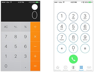
Did you notice that the two keyboards are flipped opposites of each other? Though both keypads have zero at the bottom, the remaining numbers go from bottom to top on the calculator, and top to bottom on the phone.
I was intrigued. Surely both designs could not be ergonomically equal? Who decided that the two devices needed different keyboards? Why? And how come no one has challenged the arrangement so far?
More critically, I wondered if either keypad was even relevant to users who interact with their apps in ways unimaginable barely ten years ago, using swipes, touches, taps, and force presses. With Apple upending skeuomorphism (the design concept of making software objects resemble their real–life counterparts) I felt it was time, as a designer and developer, to challenge the numeric keypad design orthodoxy and ask the unasked question: why should a 2015 calculator keypad look, feel and work like an 1960s Casio calculator?
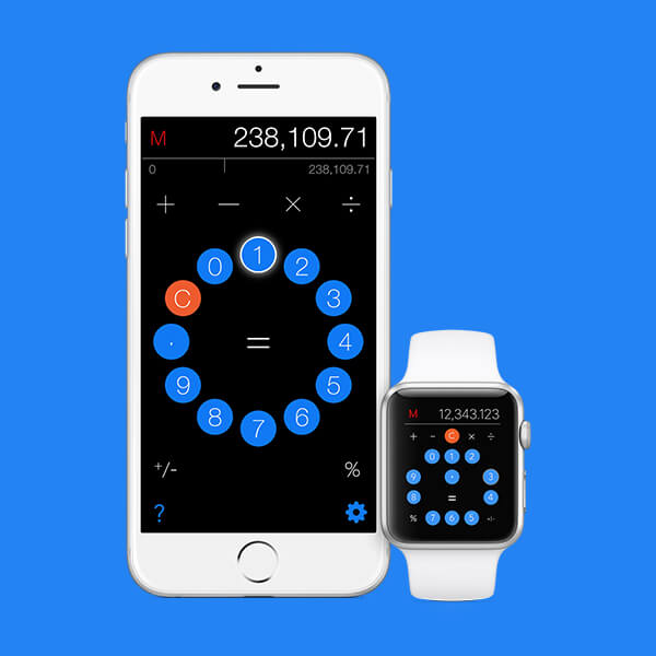
The answers to this question finally led to my radical redesign of the calculator interface in my app, Calcuta.
It became apparent early in the design process that there is no logical or self–evident way to arrange ten digits within a rectangular space. Alphabets can be laid out according to their frequency of usage on a QWERTY keyboard, but numbers follow no such patterns. With any number equally likely to be pressed, what would be the most logical and ergonomic arrangement for human fingertips?
Isolating the zero in its own line allowed the remaining nine numbers to be arranged in a three–by–three square. It may have seemed logical to Casio to arrange the remaining numbers from bottom to top.
The inverted ten–key numeric keypad made its appearance in 1957 when Tadao Kashio, founder of Casio, released the world’s first electromechanical desktop calculator, the Casio 14–A. However, the layout of the ten digits was apparently decided quite arbitrarily by Kashio-san. When Bell Laboratories, exploring keypad design for its first touchtone telephones, asked Casio about the logic behind its numeric keypad, they apparently received a “big shrug”.
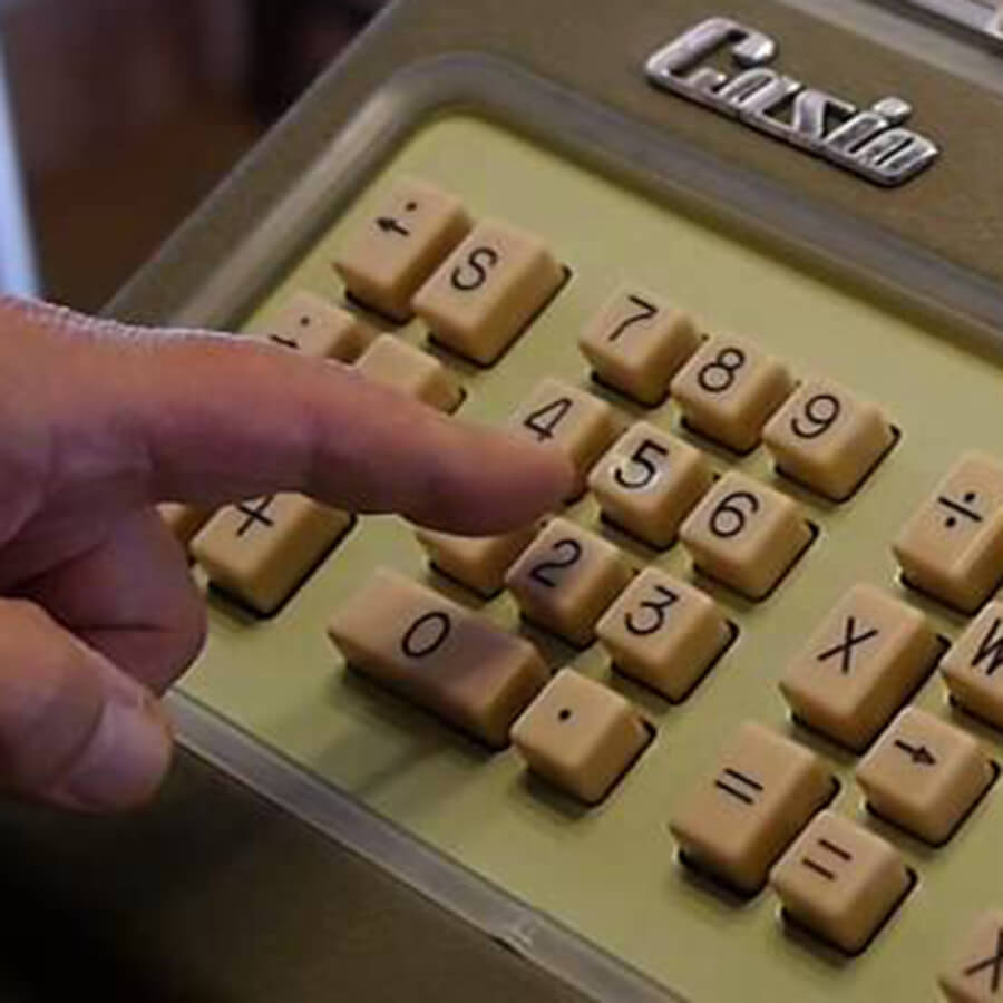
Casio’s numeric keypad went unquestioned and unchallenged for decades, appearing on ever sleeker models of calculators, including miniaturized wristwatch devices.
How The Calculator Was Belled
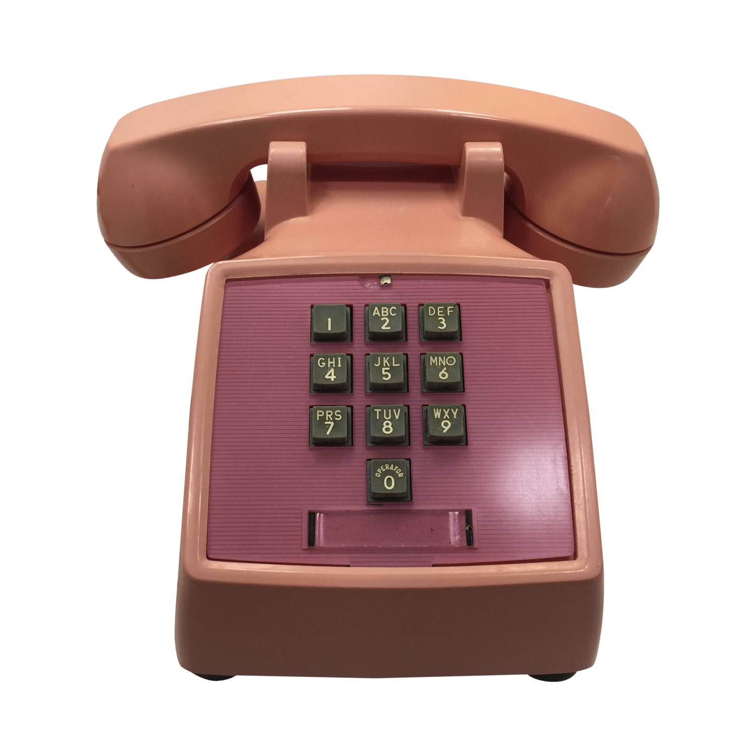
In November 1963, Bell Laboratories introduced the world’s first touch–tone telephone, the Western Electric Model WE 1500, with a keypad that vertically flipped Casio’s design, although zero remained at the bottom. The design change apparently emerged from research conducted by Dr Alphone Chapanis and his assistant Mary C Lutz in the 1950s.
Chapanis designed a test that examined where people expected to find numbers on keys, and administered it to 300 people divided into three age groups, and divided further depending on whether they were technologically naive or sophisticated. Six different arrangements of keys were tested. Overwhelmingly — and not surprisingly — people preferred an arrangement where the numbers increased from top left to bottom right.
Numberphile dug up a little–known research paper from the July 1960 issue of the Bell System Technical Journal, which listed the 18 different keypad designs their engineers had field–tested. Among them: “the staircase” (II–B in the image below); “the ten–pin” (III–B, reminiscent of bowling–pin configurations); “the rainbow” (II–C); and various other versions that mimicked the circular logic of the existing rotary dialing technology.
The winner (IV–A) probably felt the most familiar to users. But was it the most ergonomic and aesthetic?
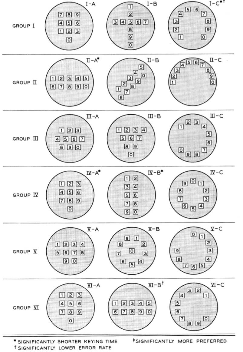
Numberphile’s Sarah Wiseman noted, “They did compare the telephone layout and the calculator layout, and they found the calculator layout was slower.”
But there is another, more worldly–wise story also on the grapevine. Bell Labs was apparently concerned that its switching exchanges might not be able to keep up with users who typed too fast. To slow them down just a tad, they deliberately inverted the keyboard, while keeping the zero at the bottom, to make it a little less familiar to users.
If It Ain’t Broke, Why Fix It?
The mobile calculator’s design has always vexed me. From a design point of view, it has several demonstrably serious flaws.
- The keypad was not designed for the small rectangular screens of today’s mobile phones. It has never been reviewed for its synergy with gestures and modern modes of user interaction with mobiles.
- Most calculators offer little or no feedback to users. For instance, if they are interrupted in the middle of a calculation, they have no intuitive way of knowing the last thing typed. There is no way to verify if a mistake was made, a number omitted, an extra number typed, or the wrong operator punched. If a mistake is suspected or detected, the entire calculation has to be keyed in again. In these respects, most mobile calculators repeat the weaknesses of old handheld calculators.
- Memory operations, which still mimic the way physical, handheld calculators used to work, are often opaque and confusing. There is a plethora of Ms: M, M+, M–, MC, MR, MS. There is also no clear way to know what’s stored in memory, or how it has been altered by operations that change memory contents.
- Though many calculators now include a delete key, this merely adds to the clutter. Some calculators allow deletion by swiping, but this is often a hidden feature, so users, unaware of its existence, simply retype the entire calculation.
- Some calculators include the digital equivalent of a roll of paper tape, familiar to anyone who has seen a credit card machine print a slip after the transaction is authorized. But this once again mimics a long–gone mechanical reality. As a user, I would wish to correct mistakes more intuitively and with less effort.
Redesigning The Calculator
My design process began with a close study of Bell Laboratories’ 17 keypad designs. An asterisk next to the design number indicated ‘significantly shorter keying time’; a dagger meant ‘significantly lower error rate’; and a double dagger indicated ‘significantly more preferred.’ Designs II–A, IV–A and IV–B all scored an asterisk for ease of keying; only VI–B scored a double dagger. I noticed, however, that the only design that rated an asterisk and a dagger was I–C, a radial design. The radial design scored against square design I–A, which was part of the same Group I.
The redesign involved four steps.
1. Reinventing The Numeric Keypad
Problem: The original Casio numeric keypad had physical buttons mounted on a panel, and square buttons on a rectangular grid was a logical way to use available space. The buttons on a calculator are punched in. What should the keypad look like on a handheld device sensitive to touch and without physical buttons?
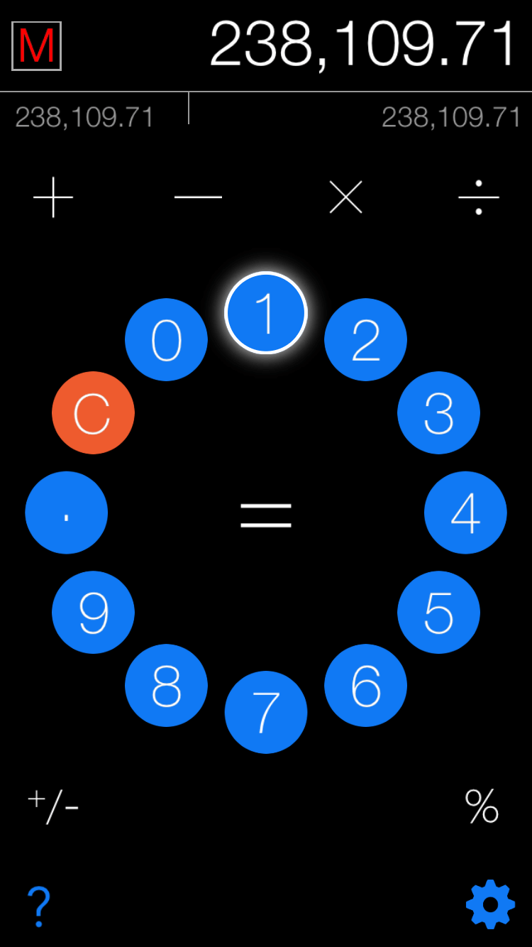
Design: I strung the numbers together in a radial garland. This made them available sequentially along a circle, and also easily accessible to the user’s thumb. The radial arrangement instantly made the numbers visible as a group, and also opened up the screen space.
In the radial garland, I included the decimal buttons, and the clear/reset button C/AC.
Color: Every color needed a purpose. The numeric radial was the single most important element in the design and needed maximum visibility. I chose a vivid blue, and a night black background to set it off. The C/AC button had to be visible distinctly from the numbers, so I picked a signature orange for that button.
Position: I expected to have more elements above the radial than below, so I positioned the numeric keypad slightly south of centre for balance.
2. Resectoring The Screen Real Estate Logically
Problem: Software calculators typically divide the screen into two parts: a display area and a keypad area. Within the keypad, numbers, operators, modifiers, and memory buttons are distributed whimsically and can vary from phone to phone. What is a logical, visually sensible arrangement for the different elements of a numeric keypad?
Solution: The most frequently used primary operators are +, −, × and ÷. Two modifiers usually included in basic calculators but used less frequently are % and ±. I placed the primary operators in a clear row above the calculator radial, and the two modifiers in a clear line below the radial.
Display: I allocated the top of the display to the numeric display, after opting to switch off the standard iPhone status display strip. The main display area included the current number or current result on the right, while on the left was a single M indicating temporary memory. Unlike in other calculators, I added a secondary display area where the user’s operations are mirrored. This provides live feedback to users, so they can notice errors in real time. The secondary display area under the M can display the current contents of memory, and can be toggled off in the settings.
3. Substituting Gestures For Buttons
The only way to communicate with an old style Casio was by pressing a button, and this input method has by and large survived intact in modern software calculators. This has led to a proliferation of keys, including a delete button and several Ms, one for each memory action. How could a calculator take advantage of gestures?
Gestures added:
- Swiping left or right in the main display area deletes numbers one at a time from right to left.
- Tapping the number in the main display once adds it to memory. Tapping it twice subtracts it from memory.
- The M button remains white when memory is empty, but turns red to indicate content.
- Tapping M once when it has content adds the number in memory to the number in the display. Tapping it twice subtracts it from the display.
- Swiping over the M erases the contents of memory.
4. Enabling Easy Correction Of Errors At Any Time
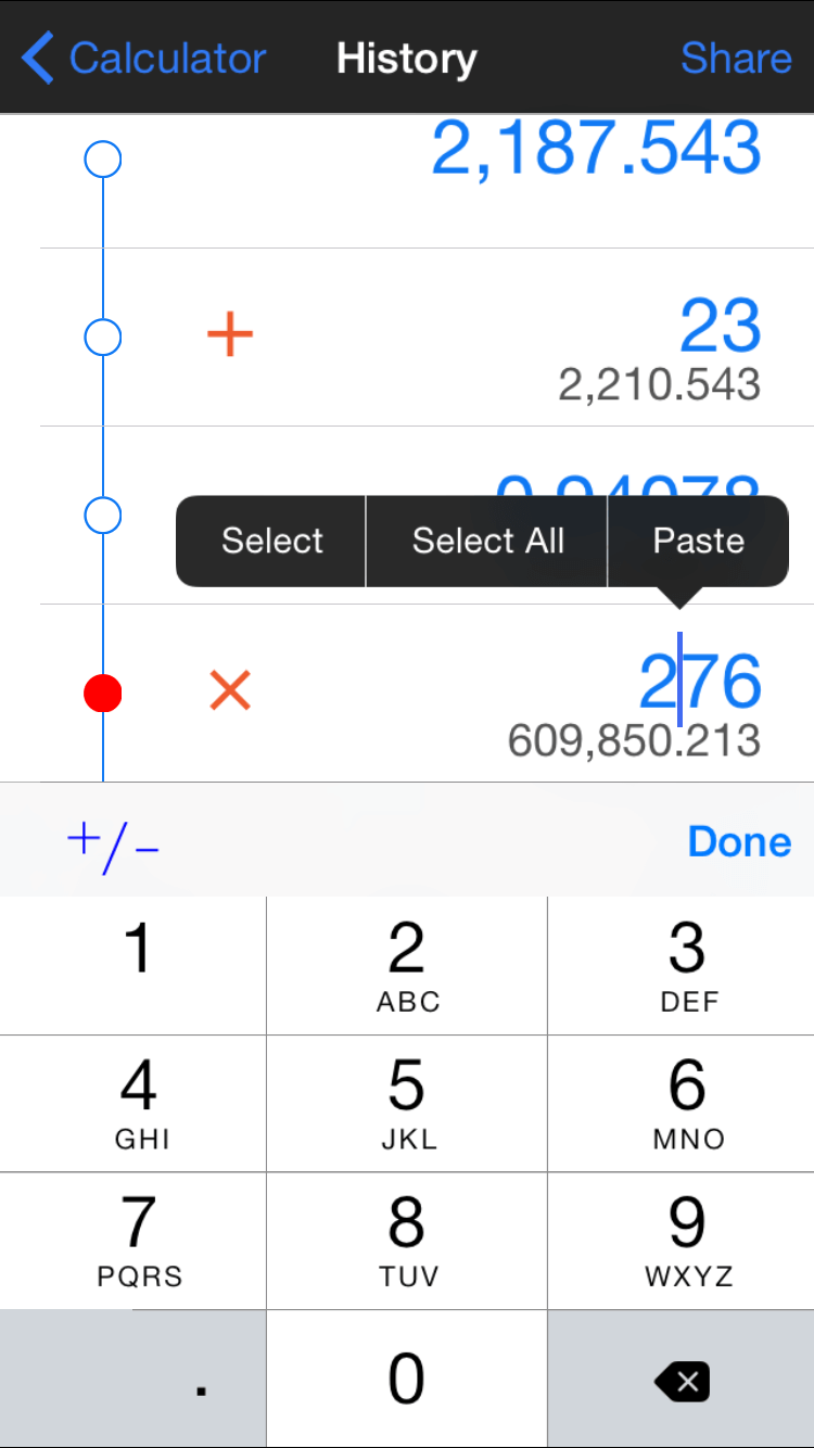
Problem: Errors cannot be corrected on a manual calculator. Mimicking the Casio calculator interface effectively transfers these limitations to software calculators. The earliest attempts to rectify this introduced a paper tape-like feature, revealing previous operations on a continuous scrolling page. How could editing be made easy and elegant on a modern calculator?
Edit history: The single most radical feature in the calculator redesign is the Edit History page, revealed by swiping the screen to the left. The Edit History screen allows touch-based editing of numbers and operators, including deleting entire lines by swiping left. The calculation results are updated in real time.
The Response And The Future
The word most consistently heard from users in response to the new interface is delightful. I believe there is room for a hard-working calculator that is also a pleasure to use. I am currently working to expand the app into a teaching tool that can inculcate a love of math in children and improve their numeracy. The clean interface is ideally suited to appealing to children.
I welcome your feedback, brickbats more than bouquets.
Resource Links
- “Expected Locations of Digits and Letters on Ten-Button Keysets” (PDF) by Mary Champion Lutz (Bell Telephone Laboratories) and Alphonse Chapanis (Johns Hopkins University). The Journal of Applied Psychology. Vol 39, № 5, 1955.
- “Why Phone Keypads and Calculator/Keyboard Keypads are Arranged Differently”
- “Human Factors” (PDF) by Henry Petowski. Reprinted from The Scientific American. 2000.
- “The 17 Designs That Bell Almost Used for the Layout of Telephone Buttons” by Megan Garber. The Atlantic, August 2013.
- Casio Wikipedia Article
- Apple Human Interface Guidelines
Further Reading
- “A User-Centered Approach To Web Design For Mobile Devices,” Lyndon Cerejo
- “The Elements Of The Mobile User Experience,” Lyndon Cerejo
- “A Guide To Designing Touch Keyboards (With Cheat Sheet),” Christian Holst
- “Beyond The Button: Embracing The Gesture-Driven Interface,” Thomas Joos


