Why Performance Matters, Part 3: Tolerance Management

Email Newsletter
Weekly tips on front-end & UX.
Trusted by 200,000+ folks.
 Flexible CMS. Headless & API 1st

 Register!

When technical performance optimizations reach certain limits, psychology and perception management might help us to push the limits further. Waiting can consist of active and passive phases; for the user to perceive a wait as a shorter one, we increase the active phase and reduce the passive phase of the wait. But what do we do when the event is a purely passive wait, with no active phase at all? Can we push the limits even further?

Waits without an active phase happen quite often in the offline world: waiting in a checkout line to the till, waiting for a bus, queuing in an amusement park, and so on. It is widely accepted that the longer the user has to wait, the more negative the reaction to the wait. User reaction to a wait online is no different from that in the offline world. Studies based on the analysis of more than a thousand cases identify 14 distinct types of waiting situations on the web. Being dependent on our users’ loyalty, we cannot leave them facing a passive wait.
This three-part series explores the perception of time that has also an effect on observed performance. The first part explored objective time and some techniques for managing it. We reviewed the ideas behind several widely adopted industry standards, such as page-loading time and system response time. Part 2 reviewed the preemptive start and early completion techniques which, by dealing with active and passive wait, allow us to manage a user’s perception of time.
This part finally discusses pure passive waiting on the web, how we can deal with it and what can be done to keep user satisfaction high even when the service cannot be delivered fast enough. In addition to the studies on waiting online, our analysis will employ the psychology of waiting lines, customer satisfaction and other tools applicable to offline waiting.

Psychological Time: Tolerance Management
In the first half of the 20th century, building managers received complaints about long waiting times for elevators. The managers were perplexed because there was no easy technical solution. To solve the issue, some expensive and time-consuming engineering had to be considered. From this point the stories vary, but someone (designers say a designer, engineers argue that it was an engineer) came up with the idea of tackling the problem from a different, non-technical point of view.
The solution, much simpler and less expensive was found: install mirrors in the elevators and floor-to-ceiling mirrors in the lobby. After installing the mirrors, the number of complaints dropped to nearly zero without any change in the objective time. Why?
“White Rabbit: Oh! Won’t she be savage if I’ve kept her waiting!”
— Lewis Carroll, Alice’s Adventures in Wonderland
I’m sure most of you can guess the answer. Simply put, the solution replaced the pure passive wait that people experienced while waiting for an elevator with an active one by engaging people with looking at themselves (and in surreptitiously looking at others). It didn’t try to convince people that the wait was shorter, didn’t do anything to the objective time or event markers. Instead, people were shifted into the active phase right from the beginning of the wait to its end. In so doing, people were much more tolerant of the wait.

Now it’s time to get all the way down the rabbit hole of the waiting problem. Let’s face it, it’s not always easy to convince a user that a wait is shorter than it really is. Nevertheless, waiting need not have a negative effect on consumers’ evaluations of websites if the waiting time is well managed. So why are people so intolerant of waiting?
In 1985, David Maister conceptualized eight “propositions” (that have been confirmed in experiments by P. Johns and E. Peppiatt, P. Jones and M. Dent, and others) concerning the psychology of waiting. Although Davis and Heineke and E. Peppiatt supplemented the list with two more propositions later, for simplicity’s sake we will call all of the propositions Maister’s list. You will find the list along with the possible recommendations on how we can deal with corresponding propositions in the table below.
| Proposition | Recommendation/comment | |
|---|---|---|
| P1 | Occupied time feels shorter than unoccupied time. | Balance between active and passive phases discussed in part 2. This is also how the elevator problem was solved. |
| P2 | People want to get started (pre-process waits feel longer than in-process waits). | Early completion and preemptive start techniques from part 2. |
| P3 | Anxiety makes waits seem longer. | Very subjective and hard to manage in the online world where there is no real contact with the user. |
| P4 | Uncertain waits are longer than known, finite waits. | |
| P5 | Unexplained waits are longer than explained waits. | |
| P6 | Unfair waits are longer than equitable waits. | Meet users’ expectations: match your waiting times to those of competitors or at least neutralize the waiting time of your services if you cannot reduce the wait otherwise. |
| P7 | The more valuable the service, the longer the customer will wait. | Increasing the value of your services is beyond the scope of this article. |
| P8 | Solo waits feel longer than group waits. | We can assume that most of the users are ‘queuing’ alone in front of their computers, hence we have no management control over this proposition. |
| P9 | Uncomfortable waits feel longer than comfortable waits. | Definition of “comfortable” is very broad and prone to subjective evaluations. |
| P10 | New or infrequent users feel they wait longer than frequent users. | As in P6, here we should meet users’ expectations considering a hypothetical user who comes to the site for the first time. |
P3, P8, P9 and P10 are either subjects for a much broader application than front-end development is capable of, or are altogether out of reach for management of a website. Hence, P4 and P5 are the only propositions that miss the management tools in this psychology of waiting puzzle. These two tell us that one of the main reasons people feel unhappy about waiting is uncertainty of different nature: how long will the wait take? What is going on now? Is the result worth the wait? To answer these questions, tolerance management steps in.

Show Me Your Progress
“I wonder how many miles I've fallen by this time?” she said aloud. “I must be getting somewhere near the centre of the earth.”
— Lewis Carroll, Alice’s Adventures in Wonderland
To partially resolve the uncertainty and provide information about the waiting time and current state of a process, good ol’ progress indicators are at our disposal. User researcher Steven C. Seow suggests dividing progress indicators into two main groups: dynamic (those updating information with time); and static (unchanging over time). Each of these can be split into two subgroups: determinate (projects completion by work units, time or some other measure); and indeterminate (does not project completion).
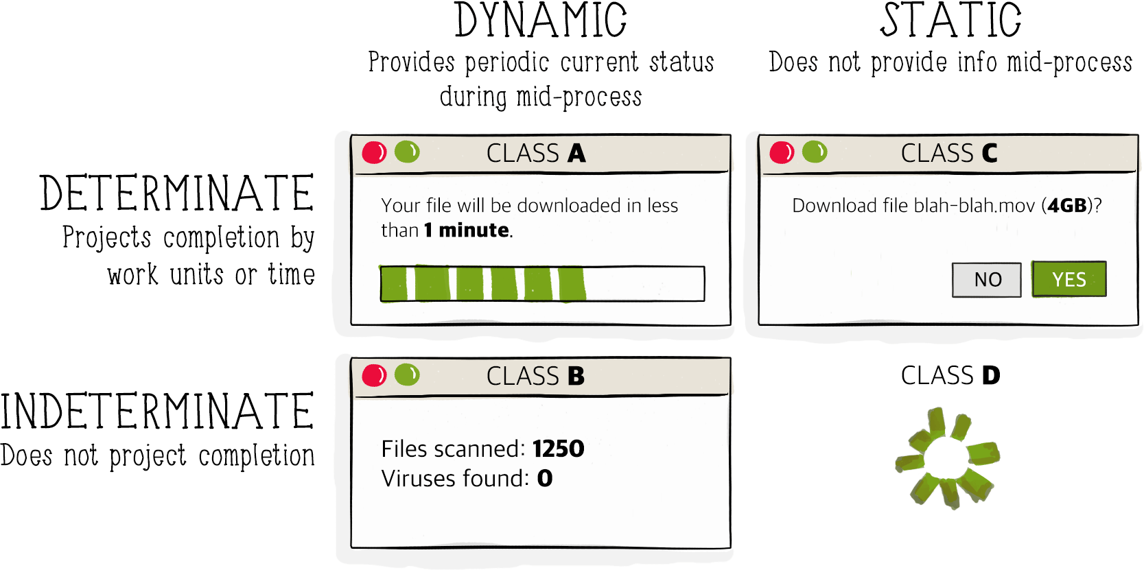
Now the question becomes when to use these. Obviously, if we show a class A indicator for every action the user performs, it will get very annoying very fast. So, we need some guidelines. When we talked about performance budgets in part 1 we defined some static time intervals. Let me remind you of those while mapping them to appropriate indicators.
- Instantaneous (0.1–0.2s)Obviously, we do not need to show an indicator for something that is perceived to be instantaneous.
- Immediate (0.5–1s)One second is the maximum time of a user’s uninterrupted flow of thought. Showing any complex indicator within this interval would introduce an interruption of this flow. But usually it does no harm to display a simple indicator without textual information. Indicators of class D, like spinners or very basic progress bard (simplified class A), are natural enough to avoid breaking a user’s flow of thought, while subtly indicating that the system is responding.
- Optimal experienceWithin this interval, we must give users an indication of input or a request being processed and that the system is responding. Again, the optimal indicator would be a class D or a simplified class A indicator – there is no need to draw a user’s attention to additional information.

Some, like GitHub (left) and Flickr, incorporate logos into the spinners or loaders shown during the optimal experience or even shorter intervals. - Attention span (5–10s)
This is the frontier of the user’s tolerance threshold and requires a more complete solution. For events within this interval or longer, we have to show more information than just a general ‘working on it’ indicator: users need to know how much longer they have to wait. Therefore, we should show a dynamic indicator of class A or B where the advance of the process is clear.
A progress indicator for durations longer than five seconds can be a simple progress bar with a percentage or more advanced information providing current status while mid-process.
To summarize these recommendations we could formulate our guidelines as simply as follows:
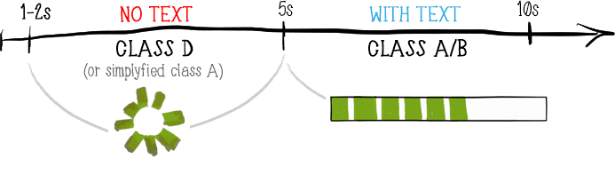
- For events lasting 0.5–1s, showing an indicator of class D (spinner) or simplified class A (progress bar) is advised on a case-by-case basis.
- For events lasting for 1–5s, a class D (spinner) or simplified class A indicator (progress bar) is required.
- For events longer than 5s, a dynamic indicator of class A or B is recommended
It is common for progress indicators to combine different classes or combinations targeted at different propositions in Maister’s list.

Note that in cases when you use other distracting tools (like animation) during the whole wait, there might be no need for an additional progress indicator: users’ are already busy processing the animation, thereby tolerating the wait more easily by default.
Progress indicators are capable of providing enough information to neutralize uncertainty in accordance with P4 and P5. But can we do better than just indicating loading? Can we address multiple propositions simultaneously? We certainly can.
Tolerance Beyond Progress Indicators
"Alice said nothing: she had never been so much contradicted in her life before, and she felt that she was losing her temper."
— Lewis Carroll, Alice’s Adventures in Wonderland
Let’s get to a quite interesting service: tripmydream.com. Users can find flights and hotel packages all over the world for a predefined budget. After the basic operations like choosing the theme of your trip and desired dates, the user sets the budget for the trip and gets to the search page.
From a performance point of view, searching for a flight and hotel combination all over the world to match a predefined budget is not a lightweight task at all. According to the DevTools, the results for my particular search kept coming in for as long as two minutes. Let’s examine what is done for tolerance management in this case.
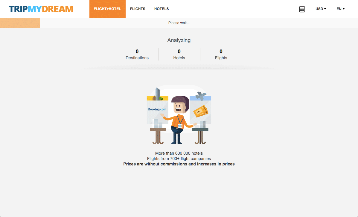
First of all, the early completion technique mentioned in part 2: the first results are rendered as soon as there are any that match the search criteria. But early completion alone is not enough: the first possible result was rendered after almost ten seconds of waiting.

Earlier, we reasoned that a dynamic progress indicator should be shown for such long-lasting processes. For tripmydream.com, this is the complex indicator of class B consisting of the orange progress bar and the “Analyzing” block right below the bar.

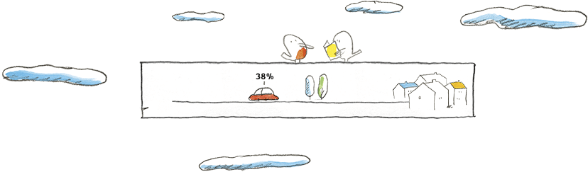
Finally, let’s address the illustrated character at the bottom. The character is aimed at coping with P9 (uncomfortable waits feel longer than comfortable waits): usually, smiling cartoonish characters evoke emotions related to light-hearted childhood memories, setting up more comfortable feelings while dealing with the wait. The character might even partially solve P8 (solo waits feel longer than group waits) for those of us who spend more time with virtual friends in front of the computer than with real people. Keep in mind, though, that the use of a cartoon character should not contradict users’ expectations of the service: such a character on a banking website, for example, would be inappropriate.
Overall, early completion helps manage a user’s acceptance of waiting time in accordance with P1 and P2; the complex progress indicator deals with P4 and P5; and the cartoon character at the bottom attempts to deal with P9 and P8. Quite a handful of harmful propositions are under control here!
But not everything is smooth with the cartoon character on this page: it not only soothes, but also communicates, providing the user with additional textual information. And here we have a problem. Because the character and the corresponding text in this element are changed to another character every six seconds or so, most of the time users have no time to read the full text.1
There are many good and bad examples of tolerance management on the web. But we will take a look at two which try to achieve the same result with a different approach.
SlideShare and Speaker Deck are arguably the two most popular services for uploading presentation slides online. Services like these are very useful for speakers to share their slides after an event with a wider audience. Both of these services have their own supporters based on aesthetics or for historical reasons, but for a user, the services are quite similar in functionality. What interests us in particular is the process of uploading presentation files to these services.
From a technical point of view, the process is the same in both cases: a user chooses a file, uploads it, writes the title and other meta information, then clicks a button to publish the presentation. From a psychological point of view, the process is also the same: uploading a file is a pure passive wait because the user has no control over the uploading process. Neither has the user options other than cancelling the upload altogether. But the interfaces for this process differ between SlideShare and Speaker Deck.
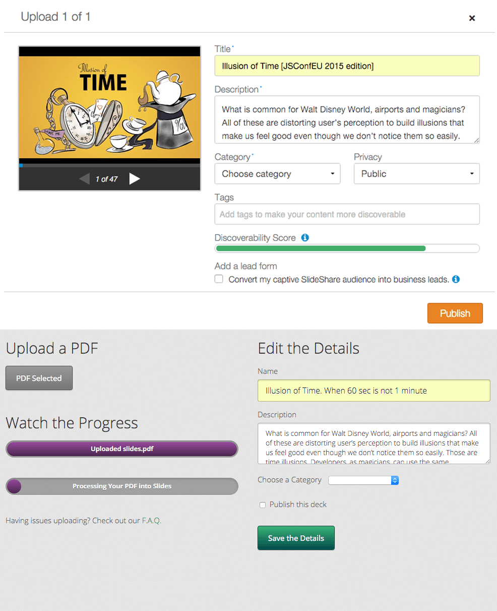
The good part first. Looking at these screenshots we can see how the services employ tolerance management for the process of uploading a file: the form suggests filling out the meta information not after, but while the file is being uploaded, thereby catering for P1 (occupied time feels shorter than unoccupied time) and P2 (people want to get started) propositions in Maister’s list. Instead of keeping the user passively waiting, the user’s brain is instantly triggered into the active phase by the suggestion of filling out this form.
But can you spot the difference between the two? I am sure you can: the two different progress indicators on Speaker Deck. And this is where things get out of control. The second progress indicator not only adds some confusion to the interface, it also significantly slows down the process as perceived by the user. With SlideShare, my presentation file had been uploaded the moment I finished filling out the form, hence I didn’t feel any delay or passive wait. But with Speaker Deck, even though my file had been uploaded comparably fast (the first progress indicator), I still had to wait for the second process to finish before my slides could be visible. And even if I could click the Save the Details button, it does exactly that – only saves the details while my presentation is still being processed. The situation gets worse because nothing in the interface tells the user what to expect after the “processing” is finished: will a user get any benefit that is worth the wait?
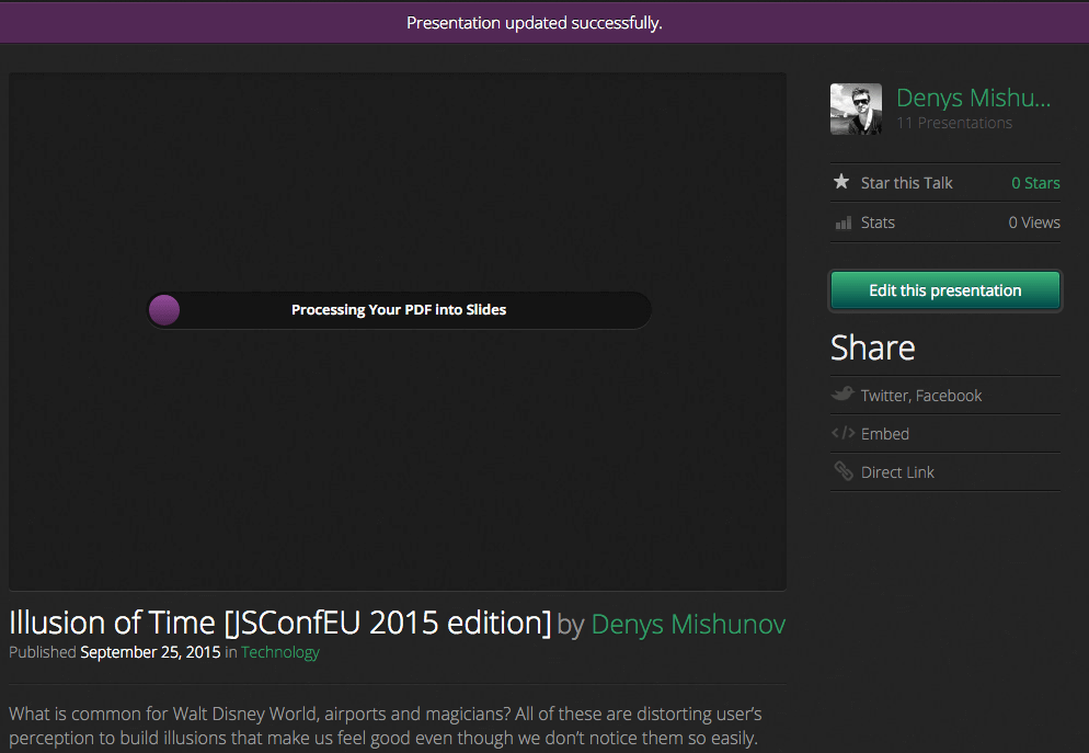
In this comparison, SlideShare shows impressive use of the tolerance management technique: users barely notice the passive wait while uploading files to the service. On the other hand, the same functionality at Speaker Deck, while employing the same technique at first, eliminates its success further in the process.
With tolerance management at hand, we could extend the performance optimization strategy, provided in part 2, to get the full picture of basic techniques for managing objective time, perception and tolerance in our projects.
Part I: Objective time management
- The 20% rule: to beat your own performance.
- Neutralization: to level the competition.
Part II: Perception management
- Preemptive start: keep the user in the active phase for as long as possible before switching to the passive wait.
- Early completion: give the user something to work with by switching from a passive to active wait as soon as possible.
Part III: Tolerance management
Anything that helps your users stay away from the harmful influence of the uncertain wait. Consider progress indicators, switching fully to an active wait, or combining multiple techniques at once.
But, be it objectively or psychologically, should we make everything as fast as possible? As you can guess, this is not yet the end.
Easy, Tiger!
“Are there moments when intentionally adding a few extra seconds—however artificial—creates a better experience?” asks Stephen P. Anderson in his article “Wait for It …”. Let’s figure this out.
Last year, discussion about a placebo progress bar on the website of South Africa’s First National Bank made respected minds claim it to be some sort of nonsense. But let’s not rush to judgement.

First of all, as William J. McEwen writes, “Faster can be better – but only when speed is exactly what the customer wants. Not all customers want to complete every contact with a company at lightning speed.” Do you like it when a bank website hurries you? The website provides an online interface to the offline interactions that a user can relate to in real life. Users have expectations about these operations and usually these interactions with banks do not happen at the speed of light.

Second, by adding this progress indicator, the bank tries to cultivate a particular emotional design quality: the idea of a complex product with many benefits. “A lot of things that are really valuable take time,” says Darrell Worthy, an assistant professor of psychology at Texas A&M University. This echoes Maister’s P7: the more valuable the service, the longer the customer will wait. The bank is not serving fast food; it is not expected to deliver results instantly. Simply by delaying its response to an average user (that is, without developer tools and a hunger for sensation), the bank tries to manage users’ expectations, building the perceived value of the service. By the way, progress indicators on Little Big Room mentioned above, similar to the progress indicator at First National Bank, are not connected to any real process as well: they manage expectation and have a function different from simple progress indication.
This brings us to the following point – as long as you don’t introduce a genuinely new way of interaction or operation, your users already have certain expectations of it. Sometimes, speeding up a process confounds those expectations and puts the user out of countenance, significantly reducing the perceived value of your service. In the long run, this might be more destructive than a slower process.
“Everything’s got a moral, if only you can find it,” said the Duchess in Alice’s Adventures in Wonderland. And this article humbly tries to communicate its own lesson. The performance and speed of our projects are very important, without a doubt. But they have to meet users’ expectations and needs before we slake our thirst for speed. A good developer knows how to make a website faster; an excellent developer knows when and why to do so. Know your users, know your tools and deliver your best.
Endnotes
1 According to a number of studies like the ones by M. Masson et al and K. Rayner, the reading speed for an average reader (native English speaker reading in English) is around 250 words per minute, or about 4 words per second. The graphical elements shown randomly at tripmydream.com contain 16–24 words; this means that to read and, most importantly, understand the textual information, an average user would need 4–6 seconds. And indeed, the pictures change every 6 seconds on average.
But these studies review reading speed for texts isolated from other distracting elements. Owing to saccadic suppression (the fact that we do not perceive information during an eye movement), the more elements on the page, the more time users need to process and understand the information.
Moreover, P. Carroll et al found that when presented with a captioned drawing, users tend to focus more on the drawing than on the caption, hence it requires more time to process textual information provided together with a drawing. This means that: a) being a supportive element, the illustrated character unnecessarily drags the user’s attention away from other more important elements, diluting their effect; and b) to read and understand the textual information coming with the drawings, users need more than six seconds. There is a risk in changing the picture during the reading process; instead of managing tolerance, this builds up frustration.
Further Reading
- Perceived Performance
- Perception Management
- Preload: What is it good for?
- Getting Ready For HTTP/2
- Everything You Need To Know About AMP
- Progressive Enhancement
- Improving Smashing Magazine’s Performance


