Rapid Cross-OS Mobile App Development: Lessons Learned

Email Newsletter
Weekly tips on front-end & UX.
Trusted by 200,000+ folks.

 Flexible CMS. Headless & API 1st


 Register!
Cross-OS mobile app development is often excruciating, between the multiple languages, the different expectations from users about interactions and the sheer development time. Our goal was to cut through the typical pains in the app development process and create a three-platform app in four weeks.
Yes, That’s 3 Platforms In 4 Weeks With 3 Developers!
We were working with Scripps, an American cable TV media company; their new business development team had been working on concepts for new, rapidly developable (is that a word?) apps. We wanted to prove that app development could be done leanly and agilely by working quickly, eliminating unnecessary clutter, utilizing cross-device user experience similarities and leveraging web views.
It was an ambitious task, but we knew that getting a proof of concept would be worth the hard work.
Although it was a short window, time proved to be in our favor because the Scripps National Spelling Bee was right around the corner. Our initial idea was a word-of-the-day app, but that changed almost immediately.
We randomly ran into the bee’s director one morning and gave her a high-level overview of our idea and goals. She had a better idea based on a spelling bee competition that meshed well with our rapid development model: a pool for spelling. This entailed randomly distributing spellers to users to follow during the competition. It needed some fleshing out, but ESPN had done something similar manually and that proved to be a success.
With that broad premise, the project began.
The team members complemented each other well in their skill set, and we’d worked together on projects for the past year, so there was an unspoken understanding of what each of us was expected to do:
- My role in the project was to orchestrate both UX and UI components. These duties spanned from wireframing to developing the front end to creating the actual graphics and user interface. This proved to be extremely challenging because UX and UI are two different tasks, but wearing multiple hats was something I was used to and was crucial to the success of the project.
- The back-end developer’s main responsibilities were to create the models, handle authentication, and manage and architect the data.
- The front-end developer built the main structure of the project based on wireframes that the team created. He also took the data from the back-end developer and displayed it on pages, helped with user profiles and implemented UI components that I created.
With large corporate projects, approval from many sources is often needed. With each team member balancing multiple tasks and expanding beyond what they normally would do on a daily basis, our team could remain small and nimble and keep more cooks out of the kitchen.
Days 1 To 5
The high-level goals for the first week were to develop a business plan, architect information, determine the user audience, needs and goals, and a do a technical assessment to set expectations regarding development.
The project began on March 30th. The bee started at the end of May, so our self-imposed deadline was April 30, to give sufficient time for quality assurance and app submission.
Because the deadline was so tight and the resources so limited, it was decided that the app would be primarily based on web views. For those unfamiliar with app development, this means that many of the app’s displays would actually present a web URL, instead of native app displays and functionality. All in all, it is a quick way to build an app for multiple platforms while maintaining the smallest amount of code (often written once, instead of three or four times). At the beginning of their existence, companies such as Instagram and Slack used this method to get products into production quickly for mobile operating systems and limit the amount of code needed.
This is not ideal for performance because each web view is loading an entire web page. The advantage of this method is control: If there is an issue with the application, it can be fixed on the web, instead of in the native code and without having to resubmit to each store.
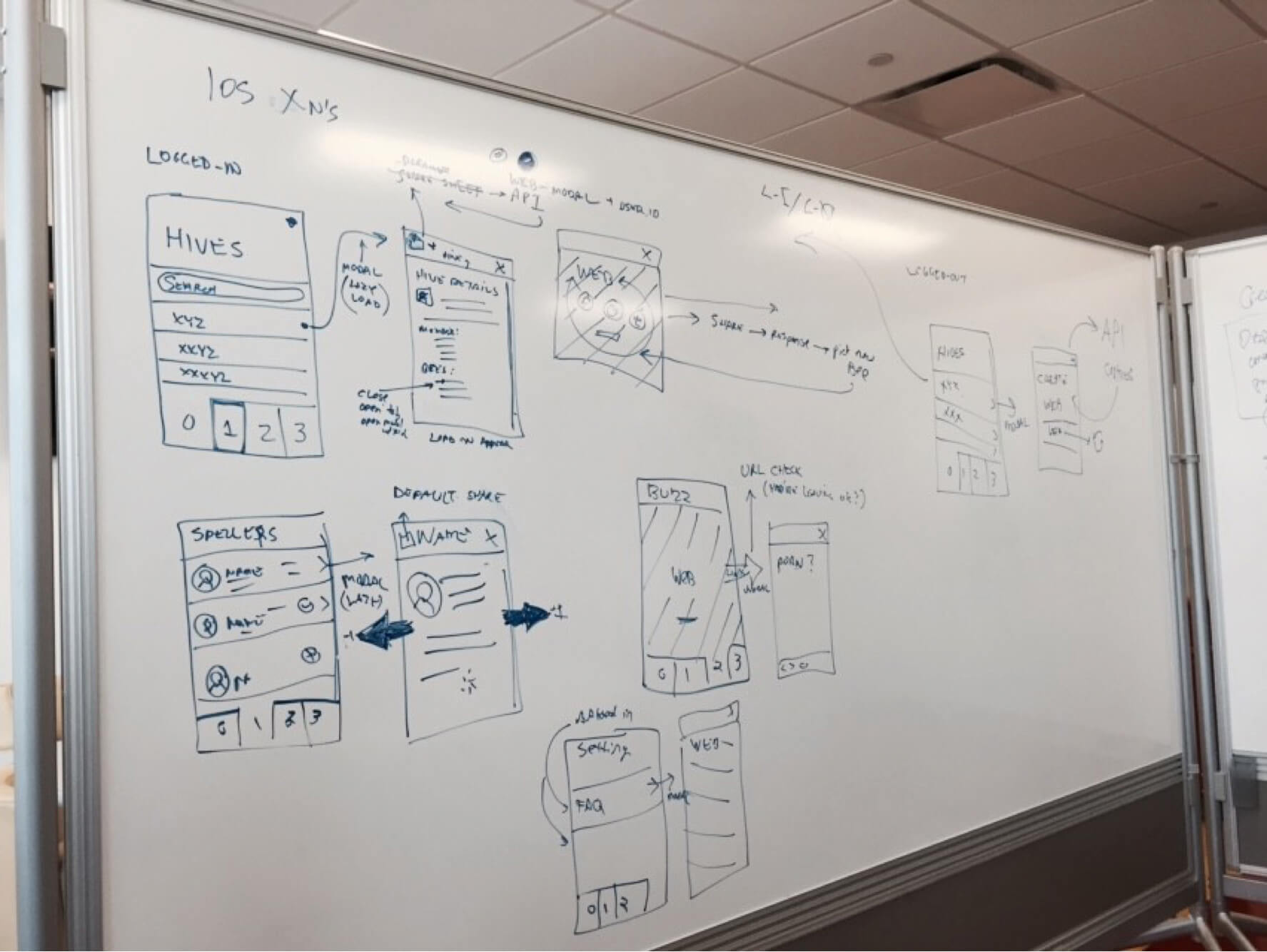
Structurally the app would be split into four areas (in the form of tabs):
- Area 1: The spellers Following the random office pool concept, each user was given five spellers to following during the bee. For each word correctly spelled by their spellers, users would accumulate points. Users could also learn more about their spellers and receive push notifications on their progress. Additionally, word-prediction functionality was included in area 1 — points for correctly predicted words. The bee’s director initially requested this as another form of engagement, so we added this on a per-user basis.
- Area 2: Groups To engage the community and add a social component, we decided that users could create and join groups (we called them hives) in the style of fantasy football, to compete against others and be a part of something larger than themselves. Joining a hive required a unique code, which encouraged users to share the code socially among friends and which allowed for exclusivity among groups.
- Area 3: The event feed We knew that the #spellingbee hash tag was extremely popular on Twitter the previous year, so we included this as a third area. Through this hash tag, users could see an event feed with real-time updates and could interact with the spelling bee directly.
- Area 4: User settings Because user management was inevitable, we included information about the bee and the app itself. These components were lumped into a settings tab.
The foundation was poured. Next were the specifics.
The back-end developer imported all of the spellers, created user and group models, and developed a REST API for the mobile developers to access. The four main tab areas would be native, pulling in high-level content from the back end. The rest of the screens, the detail screens, were web views, accessed on touch for each platform. Again, web views are not ideal for performance, but they gave us the most control because they could be directly adjusted on the server and would be updated within the app, without requiring us to resubmit to each app store.
Day 6
This all-day whiteboarding session involved creating high-level wireframes and determining user flows for the app.
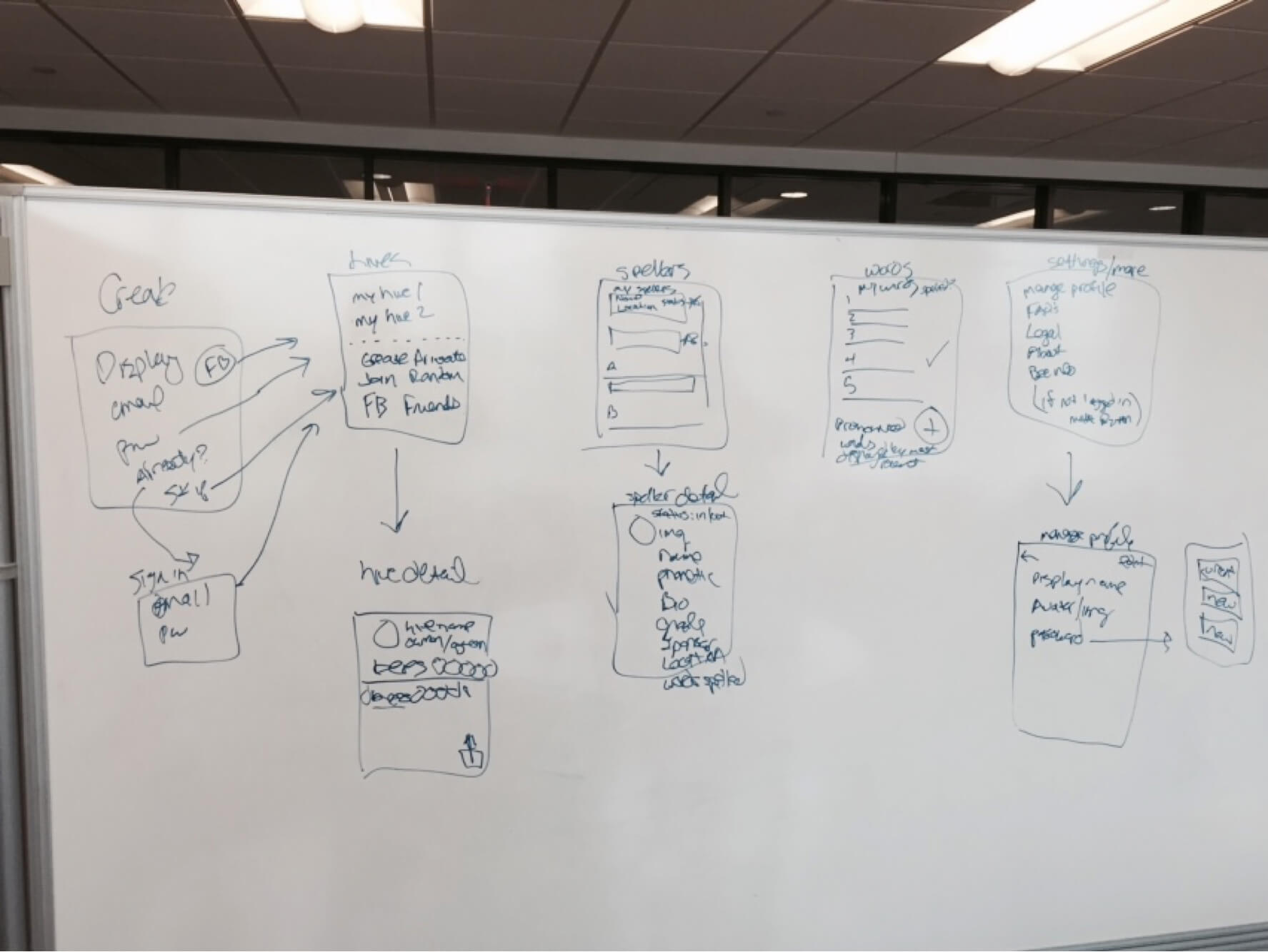
The entire team had experience creating content-based websites and apps, so importing and displaying content via a JSON file was a piece of cake. Determining gaming specifics and user flow would be the interesting part.
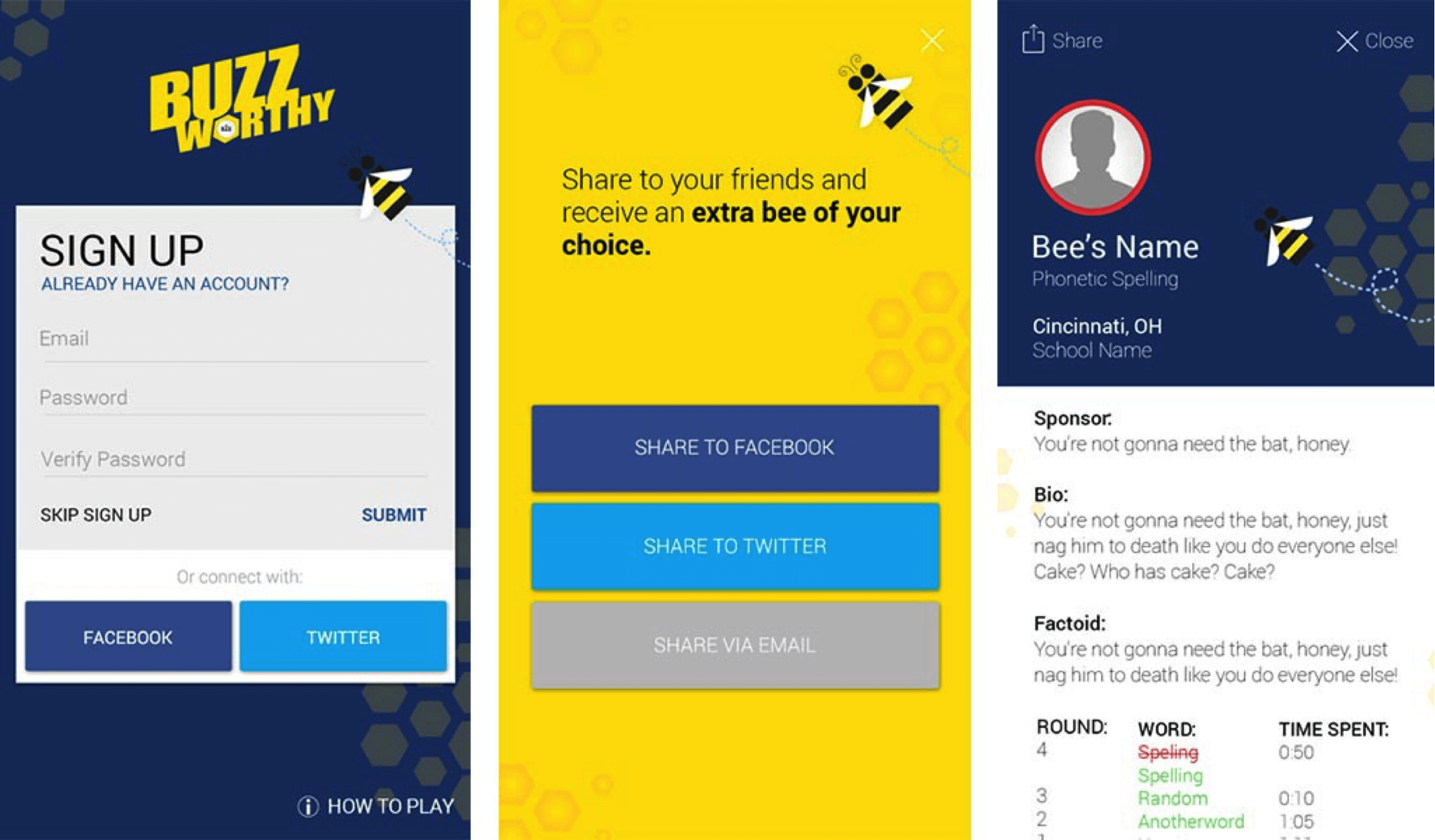
Naturally, the first screen in the app would be for the introduction and for signing in and signing up. A user model based on social authentication had been created in a previous project, so we reused that. Previous experience and user testing suggested that forcing users to sign in or sign up upon first use made them angry (and led to a lot of bad reviews) — people hate being forced to do that. As a solution, we included a “Skip” button so that users could explore the app and get an idea of its main functionality before submitting their information.
Users were randomly assigned spellers to follow during the competition. So, the ideal user path beyond signing in or signing up was to go to area 1, the tab for the spellers. The user’s spellers were prominently displayed at the top of the spellers list, so that users could learn immediately about their spellers and follow along with their progress.
(Note: Users should be able to access any page in the app within two taps.)
Beyond the tab screens, we needed a page for hive details and a page for speller details that would show members and hive statistics simply and intuitively. Although aesthetically boring, we decided to use simple table views as a quick and intuitive solution. These were all web-based and could be manipulated without editing the native code.
Days 7 To 14
Working in an agile environment allowed for the three of us to work simultaneously (the rest of the development team saw the excitement around the product and two more developers hopped into the project).
The full-stack developer could build out the entire Python and Django back end, starting with the user authentication model he’d already created, then progress to displaying several data feeds and creating a groups model. He and the system administrator prepared for heavy traffic spikes by dedicating multiple servers and load balancers to maintain the product. This back end proved to be extremely flexible and worked well for the project (we’ve since used it for several projects).
As they did this, the front-end developer and I worked together to build a mobile UX structure using Bootstrap and applying a material design theme as the basis for the UI, according to white-boarding sessions. While material design is Google’s design language, the hope was to use many of the generic components — particularly interactions and animations — and to customize the typically Google-specific components, such as the font family and colors. You can also check “Why This Apple Guy Believes in Material Design” article by Jordan Crone on UX Magazine.
Side note: Thankfully, someone on the bee team had an idea for a solid name, so that our terrible pun names, like Hive Five, were dismissed. Now that the bad puns were out of our system and while the back-end folks were working away, I was able to create app store submission assets and branding components for the Scripps folks and ESPN to advertise the app.
Days 15 To 18
With such a breadth of devices and operating systems to account for and the limited time to get the apps in their respective stores, testing was absolutely crucial. Our QA team of two tried in every way to break the app, and bugs were reported through various in-house devices and operating systems (and simulated through BrowserStack).
The team also distributed beta versions of the app through Test Flight (iOS) and straight downloads (Android). We scrambled to fix the bugs and push the changes straight to production. Normally, cross-browser and regression testing would be done independently to avoid having to rework, but with the limited timeframe, getting all of the testing done as quickly as possible was more beneficial than doing things “by the book.”
Days 19 To 21
Next was submission and marketing. If you’re not familiar with the app store submission process, it takes about two to three weeks for Apple’s approval and about two to three hours for Google’s. We’d never submitted a Windows Phone app, but we had a contact at Microsoft who guided the app down the right path.
An internal goal was to get the app featured in the iOS App Store. We knew this was an uphill battle because a thousand-plus apps are submitted daily, and our iOS app was not entirely native. While getting featured didn’t happen, we were able to get the app into the three stores quickly. Apple expedited the submission because the app was event-based.
With the lack of time and marketing resources, our external communication efforts were fairly limited. The three main promotions were ESPN’s on-air promotions, a corporate communications press release and an article on Scripps’ broadcasting website (thank you, Gavin).
Days 22 To 28
Once the app was in the wild, users were not shy about giving feedback, especially if they had found a problem with the app. Feedback was mostly gathered through app store reviews and internal emails, but many of the most valuable pieces were gathered through honest friends and family. Although these few days were stressful, as we coded and solved issues tirelessly, the end product improved tremendously.
One of the major technical hurdles was response time, particularly on iOS. Because the apps simply displayed web views, there was a slight lag between tap time and response time. Even with delays of under a second, users were quick to voice their discontent. Performance is best with native app components, but with the lack of time, we were forced to deal with web views.
Results
Then there was bee week — a whirlwind of excitement, feverous bug-fixing and hoping for the best. Here were the results:
- Total downloads: about 5000
- Registered users: about 2000
- Average time spent in app: 4:58 minutes
- Page views (each tab is considered a page): 150,743
- Pages per session: 6.92
What We Learned
Mobile Development Doesn’t Have To Be Painful And Time-Consuming
While it might have been hectic at times, we proved that creating a three-tiered mobile application in a short amount of time is possible, and this will serve as a model for the company moving forward.
Agile Works
Our agile activity was nontraditional — we stretched scrums to twice a week, and sprints were not formally documented — but it worked. Constant collaboration allowed for regular communication and updates, and (informally) managing tasks and boundaries allowed each team member to work in their respective areas to get the project done more quickly.
Native Is Ideal, But Control Is Key
Creating a native app for each platform is preferred by each app store and for optimal performance, but being able to make changes directly to production code proved to be one of the most important capabilities during our rapid development. Most of the areas in the app were web views, so any changes that needed to be made could be made on the web, and the app would then just load the updated pages (we didn’t have to resubmit the app after every bug fix). This proved to be extremely convenient for such a tight deadline.
New Users Need Guidance
One of the most frequent pieces of feedback from users was that they didn’t understand the gameplay component. Although they were presented with introduction screens, most users quickly dismissed them without reading the instructions. A better approach would have been to walk users through the app step by step and have them dismiss the screens by performing an action.
The Stress And Chaos Were Worth It
It took a polished and finished product to change their minds, but management eventually came around to supporting the product once we were able to prove the concept. They saw the team’s passion and loved the proof of concept, and now the company is using it as a model for similar projects moving forward.
Not only that, but the sheer excitement and joy on the spellers’ and their parents’ faces during bee week made the long nights and stress worth it.
Working on this project was an incredible experience, and working on version 2 will be fun because we’ll have more than four weeks to create it next year! Of course, you can download the free Buzzworthy app as well.
A huge shout out to all who contributed to the project, especially Robb Hedrick, Tolu Apapa, Sean Butts, Eric Rohlman, Greg Banta, Todd Morgan and the entire Spelling Bee staff.
Related Links
Buzzworthy App (Spelling Bee Vlog 4)
Further Reading
- Providing A Native Experience With Web Technologies
- Cross-Platform Native Apps With A Single Code Set
- Diverse Test-Automation Frameworks For React Native Apps
- Why You Should Consider React Native For Your Mobile App


